0

I'm working on a dashboard for a SaaS application. I'm having a hard time selecting the right colors for each of the graphs despite all of the data visualization color resources I've gone through. Here are the steps I've done:

1.) I took the brand color (blue #3454E2) and corresponding accent colors from our company style guide.

2.) I used Eva Design System to generate shades 100-900 for each of these colors.

3.) I then took shades 500-900 from each of these colors and used the chevron-skipping pattern (as described in this Medium article)

enter image description here

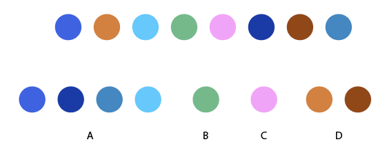
which generated the below color palette enter image description here

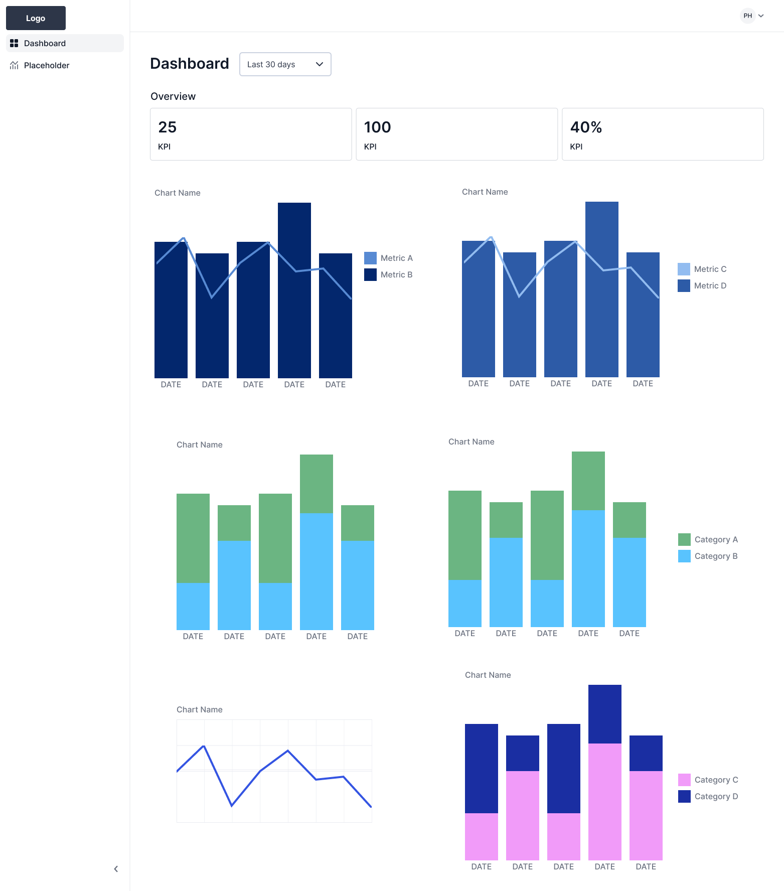
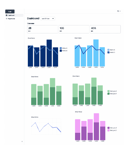
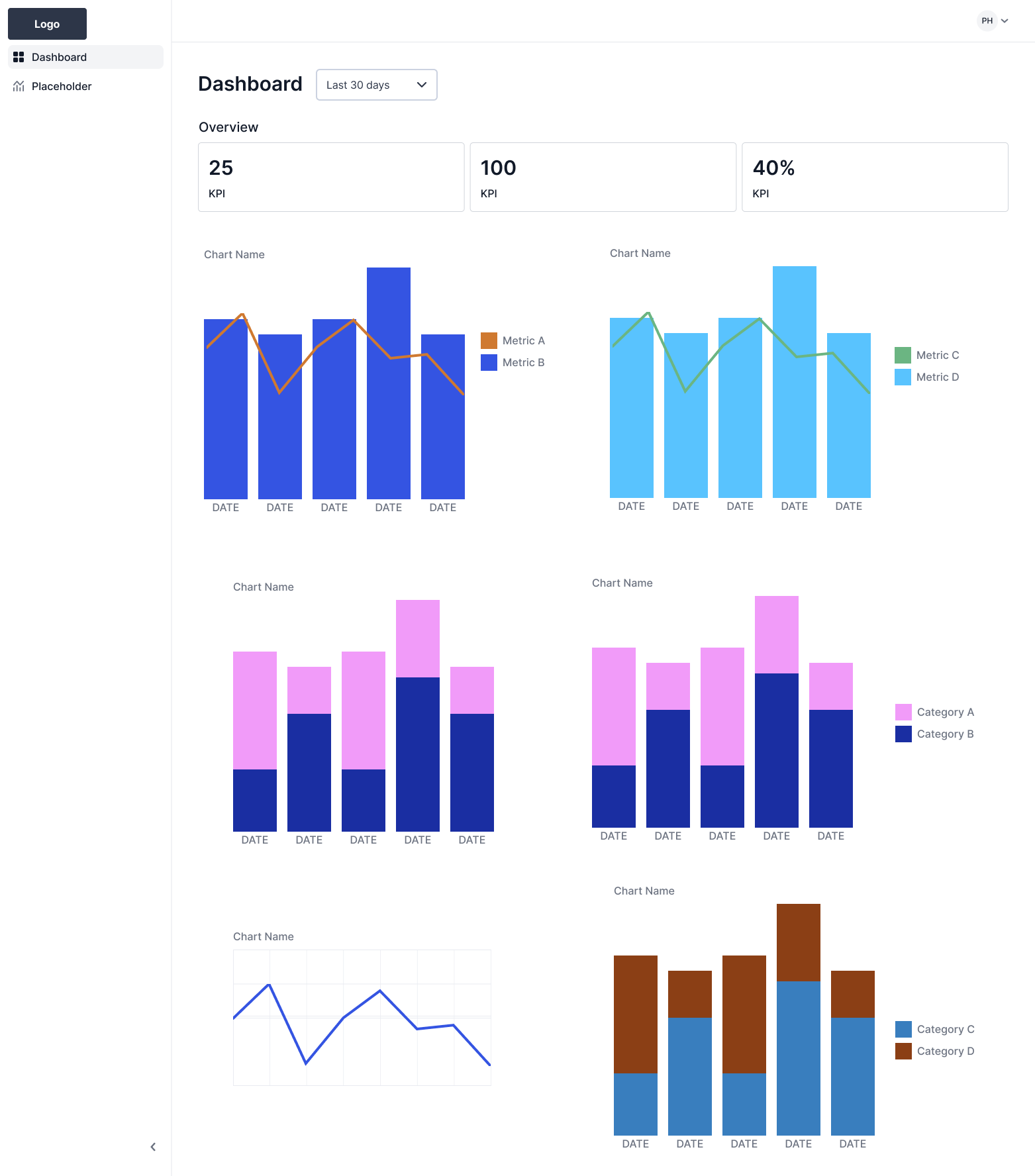
However, I'm having a hard time determining which colors to use on each chart. As you can see in my dashboard mockup, I have two combo bar/line charts at the top, followed by two stacked bar charts, a line graph, and another stacked bar chart. I tried applying the colors to the graphs in order, but I'm concerned there's too many colors on the dashboard.

enter image description here

In my next iteration, I tried applying a monochromatic color palette to the top combo bar/line charts instead since the metrics can be distinguished by shape (the bar vs the line) and reserved the categorical color palette for the stacked bar graphs instead. For the line graph, I'm using the primary brand color since it is the only metric.

enter image description here

Any suggestions to make this better?
1 Answer 1

0

Beyond studies, formulas and selection patterns, to work with color it is extremely important to know the design bases; great help in choosing a functional color palette.

The three color variables are:

  • Hue: the color itself
  • Brightness: from color to white or black
  • Saturation: from the color to its gray value

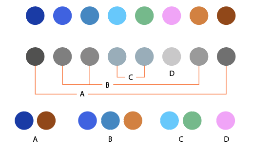
Taking the chosen palette as an example and organizing each color with respect to the HUE variable, we obtain four divisions (blue is perceptually the same ink), causing possible combinations depending on the color with the highest number, blue. This will always give a "mismatched" result: 4 inks in subgroups of 4, 1, 1, 2.

hue

If we start from the tonal or gray value that corresponds to each color, there are also four groups and equally irregular in terms of number: 4 inks in subgroups of 2, 3, 2, 1.

value

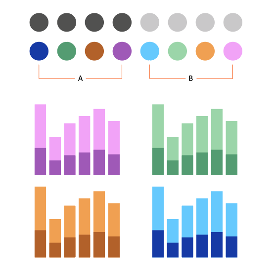
I would try to reduce the number of combinations of variables to use and consequently unify criteria. For example, 4 inks in two tonal values ​​that generate 4 x 2 subgroups:

4X2

From there, choose possible combinations that offer better contrast, either by hue or by brightness/saturation:

saturation

This would result in a more harmonious and homogeneous combination on a global level:

end

1
  • Thank you so much, this is so helpful! I can see how these color combinations make the dashboard look more homogenous on a global level, given the bar charts only have two categories each. If in the future, I need to create a bar chart with 4 categories for example, what would be the best approach to selecting those 4 colors?
    – Cindy
    Commented Jul 10 at 16:33

Your Answer

By clicking “Post Your Answer”, you agree to our terms of service and acknowledge you have read our privacy policy.

Not the answer you're looking for? Browse other questions tagged or ask your own question.