0

UI that shows deviation on top and total on bottom

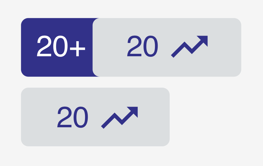
I was initially trying to create a component, that would by default show changes in deviation over time. On hover, the badge would slide over to show the exact total in change.

ie if you started with 20 apples and gained 10 more apples. You would see an increase by 50% on top and +10 on the bottom.

However, we noticed that when starting from zero it was impossible to measure.

Anyone have a similar issue and how did you handle it?

Part of the reasoning for the change in percent is to create a sense of urgency to the user. If something goes by 50% you might feel more pressed than if it was just the total alone.

Thanks for any assistance.

2 Answers 2

1

What you are looking at is a classic 'empty state' design issue. According to the NNg article, empty states designed well allows you to do one (or more) of three things:

  • communicate system status
  • increase learnability of the system, and
  • deliver direct pathways for key tasks

So depending on the context in which this badge is shown (remember, you should never implement design changes in isolation to the rest of the design system), you can either display the badge but indicate that there isn't sufficient data to show the necessary details, and/or help the user trigger actions that will lead to the necessary, and/or teach the user something about the data used in the system (maybe using an information icon to hint at some content to read.

1

Part of the reasoning for the change in percent is to create a sense of urgency to the user. If something goes by 50% you might feel more pressed than if it was just the total alone.

For all increases that have a previous value to compare it to, this percentage is realistic and informative. If there isn't a previous value to compare it to, it obviously isn't realistic and informative. In that case, there is not much more you can do than showing the absolute number. Users should always be in control of how they judge numbers. If you try to give a sense of urgency when you can't base it on anything (for example by showing 100% increase), this would be incorrect, biased and possibly give the opposite of the desired effect.

So the answer is, don't overcomplicate things. You can even keep the hover effect for consistency.

enter image description here

Your Answer

By clicking “Post Your Answer”, you agree to our terms of service and acknowledge you have read our privacy policy.

Not the answer you're looking for? Browse other questions tagged or ask your own question.