1

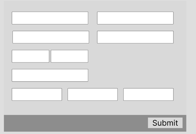
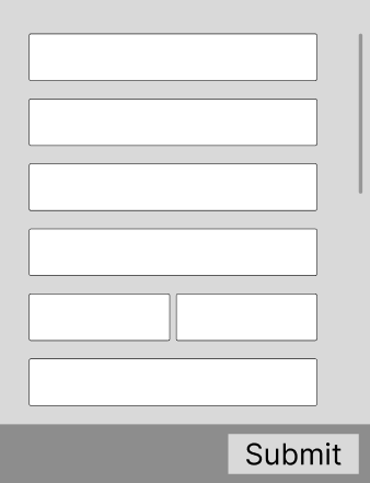
I am currently dealing with lots of modals that contains a lot of forms. One problem I am facing is how to organize the forms, and I have implemented a mostly single column form, unless the forms are related, then they are side by side. Here is a very rough example:

enter image description here

My worry is that users might think they are finished with the from after filling out the bottom box and hit submit, not knowing that there are more fields underneath it. My question is, should make it wider so that it all fits on a single, non scrollable modal? I would of course only group like items together, but I would probably have to be more liberal on what items can be grouped together.

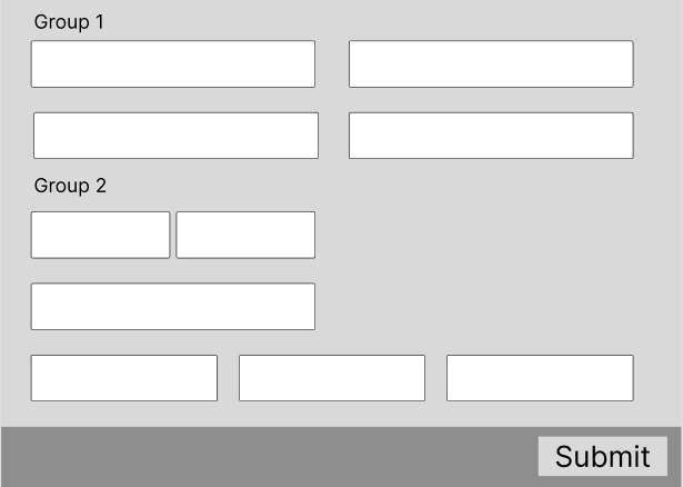
enter image description here

I considered adding headers to each group to easier categorize them, but I this will just take up more of the vertical space I am trying to preserve.

enter image description here

Is it ok to have a modal with lots of information available on scroll, even though the modal doesn't seem to have more items below it on first glance?

1
  • A couple of thoughts: At my current job we do not encourage folks to have heavy functions in modals because the modal isn't conducive of this sort of workflow. Secondly, scrolling isn't necessarily an issue when people think they are finished when they are not. It's like any other page. Do people not know when to scroll? Also wouldn't validation of the form help guide folks to continuing to fill out content?
    – UXerUIer
    Commented Apr 26 at 13:59

2 Answers 2

0

If you are worried about vertical space (because of mobile devices or other reasons), one common solution is to break up the form into sections and instead of scrolling through them you can step through different sections using 'next' and 'previous' buttons.

The reason why you want to show as much of the form as possible is so that the user has a good idea of how much input is required, and whether they are able to complete it all at once (especially if you can't save and come back to it later).

Regardless of how to decide to organize all the information, the principles to keep in mind are to ensure that the user is aware of what's happening, and that they feel in control of the situation. For example, if they don't know that there's more fields to fill in and click on the submit button, it will feel awkward for a lot of errors to pop up because there are empty fields that failed validation.

You might be trying to avoid one issue for the users by designing the form in a particular way, but it is important not to cause other issues that might make the user experience worse. So the best strategy is to go back to how much content you have to display, and work out the best way to let the user know how much content there is, and how easily they can get through it.

0

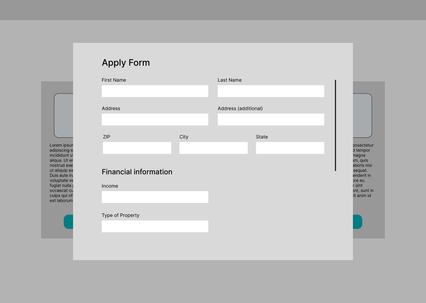
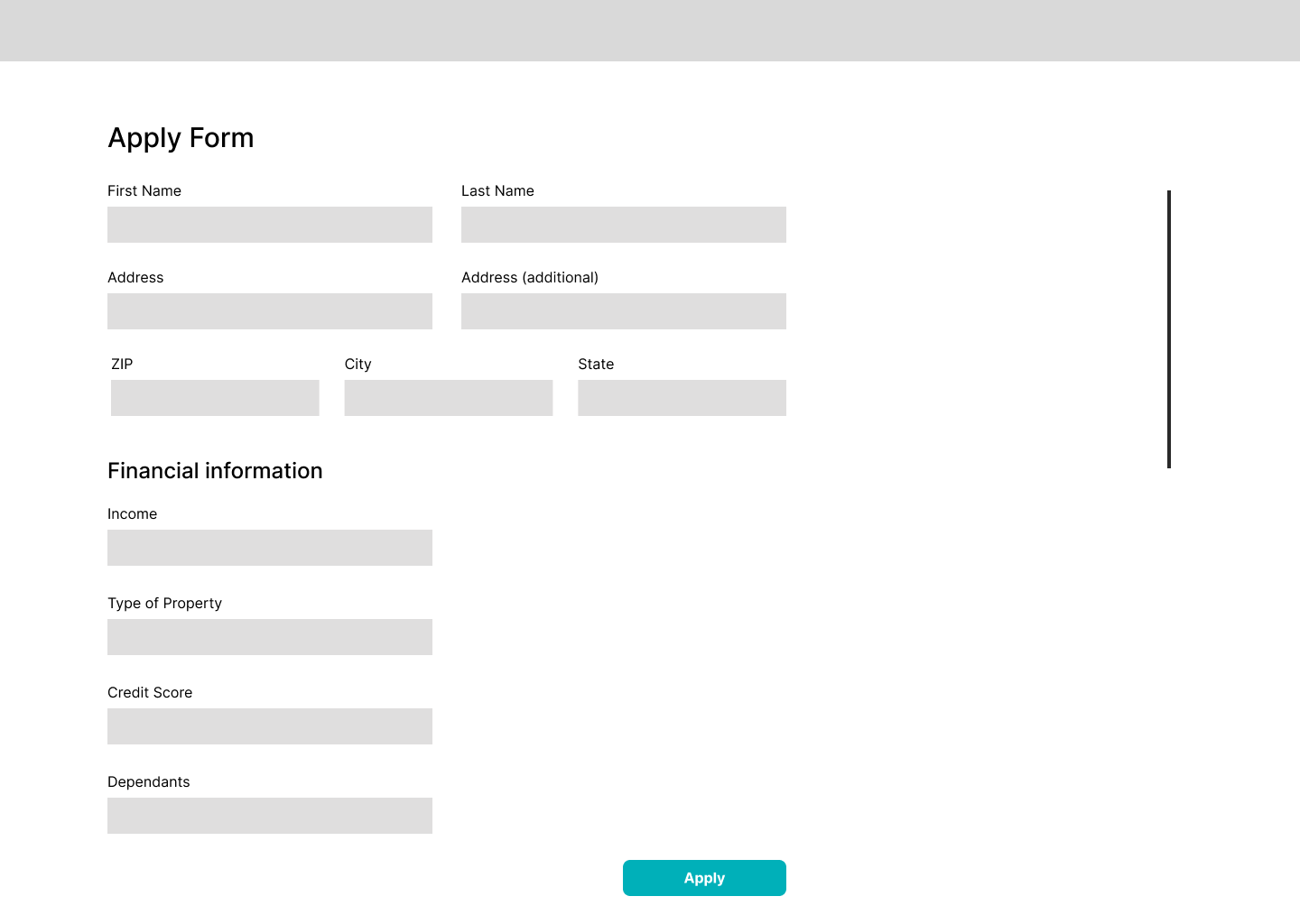
I once worked on a project for a banking client where the PO wanted to make the application process smoother. For him, that signified that you could feel that you didn't need to open a page to apply and fill out a form in a modal. In my personal opinion it was the worst decision due most of the new applicants didn't fill the whole form at the beginning, and didn't see a submit button. On a second round of enhancements to the app, I added a sticky footer to the modal and users didn't fill out the latest fields, they just clicked submit once they fill out the fields on their sight. Finally with all the data my team required to convinced the PO we finally added a page where the user was landed to fill out the whole form and hit Submit.

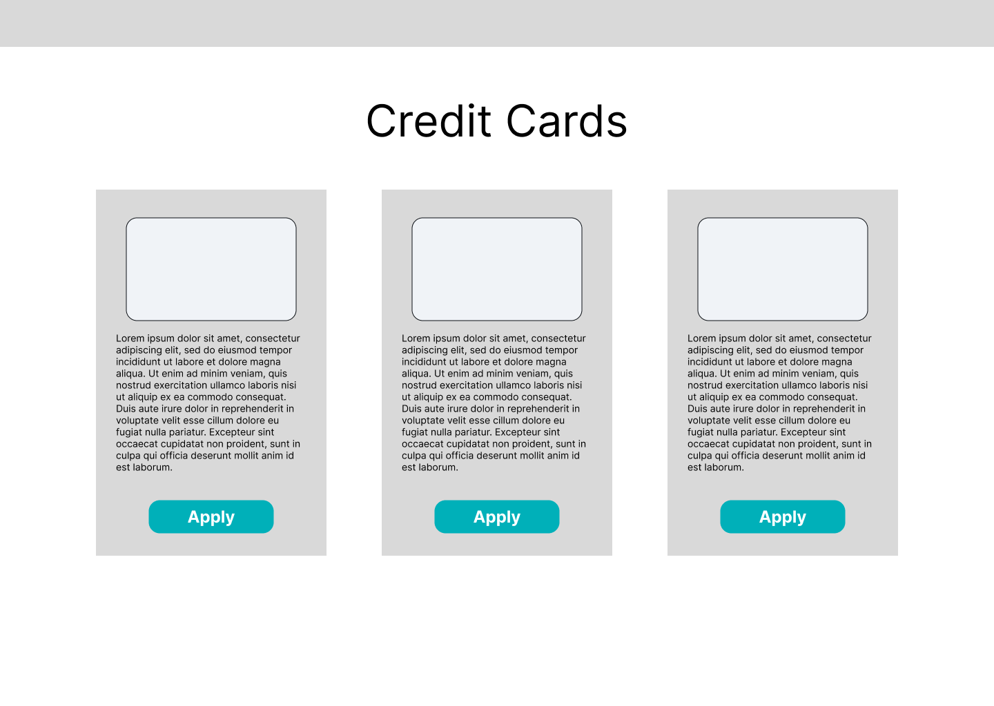
Credit Cards page

From the credit cards page the user could hit apply to fill out the form.

Form in a modal

Form in a page

The final solution was to create a page with the form. This solution was supported with the data from all the users that didn't complete the form and those that cancel the process. All those users increase since the first modification to the application process.

The only modal that we use was to show the user that the application was submitted successfully. 👌

Your Answer

By clicking “Post Your Answer”, you agree to our terms of service and acknowledge you have read our privacy policy.

Not the answer you're looking for? Browse other questions tagged or ask your own question.