1

I'm working on filters. I need help on filter grouping. We do have different filter groups that can be applied on given data. The problem here the page looks overwhelming with given options. I cannot hide these options. They need to be shown upfront. Can you suggest me some alternatives on how to reduce the visual noise. I tried with text format but the UI doesn't good.

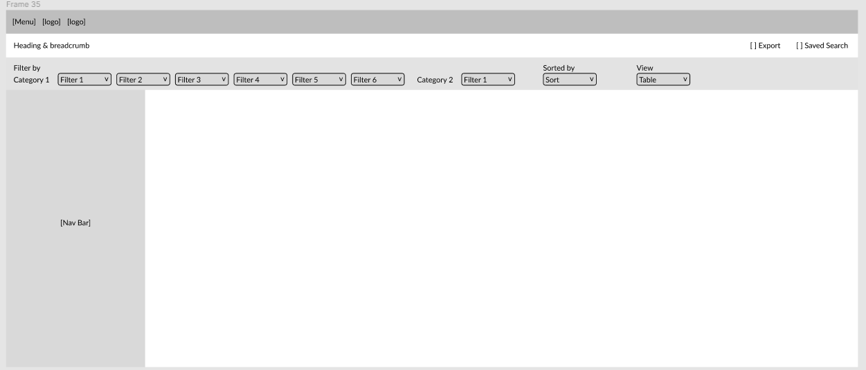
Below is the rough wireframe.

enter image description here

Note: Need to place quick filter design in horizontal format. As we have navigation on left side.

5
  • Could you provide more context- as to what data the user is seeing and why the filters needs to be upfront. Commented Dec 5, 2023 at 8:44
  • These are quick filters. So cannot hide them. I cannot reveal much about the filter options.
    – NB4
    Commented Dec 5, 2023 at 8:46
  • Where it says Filter [number] , is it supposed to be a category or a filter variable?
    – Devin
    Commented Dec 6, 2023 at 20:17
  • @Devin It is just a placeholder name for the filters.
    – NB4
    Commented Dec 12, 2023 at 6:01
  • @NB4 Your requirements aren't necessarily mutually-exclusive though. They don't have to be horizontal because navigation is on the left. The key point to consider is 'There's already navigation on the left that we can't move' but that doesn't necessarily mean you're restricted to horizontal filters. There's lots of options, provided they don't impact the left-hand navigation. I wouldn't restrict yourself to horizontal when that's not necessarily the only option.
    – JonW
    Commented Dec 18, 2023 at 11:43

4 Answers 4

1

The traditional way employed by many shops (like Amazon) and also some business applications would be to stack the filters vertically in a sidebar:

tmdn.org filters

This sidebar could be always visible or toggled by a "filters" button, it could be on the left or on the right, and if you want to keep some filter chips for commonly used filters you can do that, too.

2
  • We have navigation on left. Need the design in horizontal format
    – NB4
    Commented Dec 12, 2023 at 10:12
  • 1
    Why is that a problem? You can place the filters on the right, you can even have 2 sidebars right next to each other (Gmail even has double-sidebars on both sides). And you don't necessarily have to show both the navigation and the filter bar at the same time either. There's lots of options here to make it work. Commented Dec 12, 2023 at 11:14
0

To display 8 or more filters grouped by category while minimizing visual clutter, consider these steps:

  1. Separate filters from Sorting and List/Tile view actions. Position them on the right-hand side.
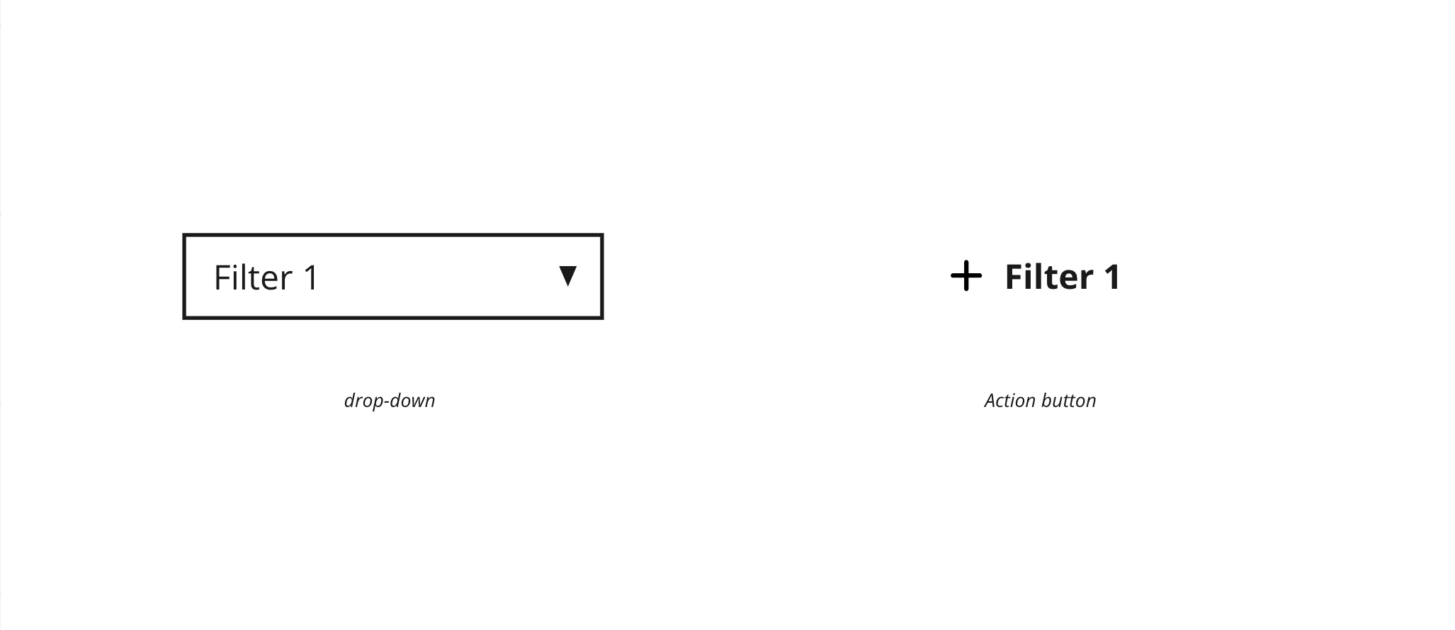
  2. Implement a distinct visual cue for an idle filter. For example, substitute the drop-down box with an action button, which can transform into a drop-down upon clicking. This approach aims to simplify visuals upon first opening the page.
  3. For additional filters, hide them under a "More Filters" button, which would move the content below.

enter image description here

2
  • I did try this option but somehow it is looking way to cluttered. But let me give it another try to this option
    – NB4
    Commented Dec 5, 2023 at 9:27
  • I bet! So much to show in one screen... try fiddling within your styleguide/components and see what option has better optics. Best of luck! Commented Dec 5, 2023 at 15:20
0

You mentioned in the comments on Leo's answer that you already have a left navigation so would prefer a horizontal format.

In that case, consider the LinkedIn job search interface:
LinkedIn top bar

  • The "most-used" filters are visible at the top
    • Without further context on the data and available filters, I wouldn't be able to say which filters you could show in that top bar; but I assume you know the data and which filters would be used more often, more on that below
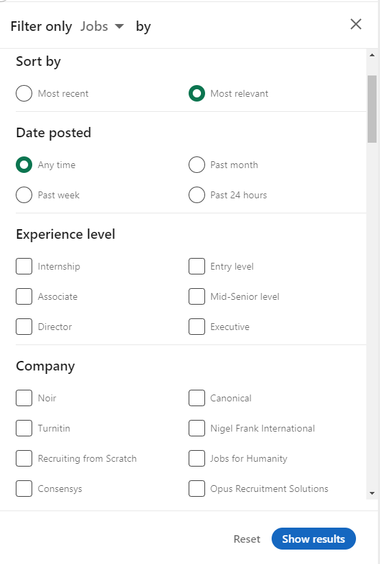
  • The full extent of filters can be accessed from the "All filters" button
    • I counted 18 filter categories (which surely would overwhelm any user if they weren't hidden at first!)

enter image description here

Finding out which filters are important

To find out which filters are most important to a user (if you don't already have an idea), you could:

  1. Simply ask them (not always possible)
  2. Log/analyse the API calls to see which filters are being used (only really possible if your interface calls an API when the filters are changed)
  3. Use some technology like Mouseflow to find out what actions users are performing most
0

I think you may go with the normal view which is currently. Make sure to give one bar background to the filter option so that you can easily differentiate between the filters and the main context.

Cause the main reason you are telling that these filter is necessary so keep them separated from the main context so that it will be there and it won't bother the user also.

Your Answer

By clicking “Post Your Answer”, you agree to our terms of service and acknowledge you have read our privacy policy.

Not the answer you're looking for? Browse other questions tagged or ask your own question.