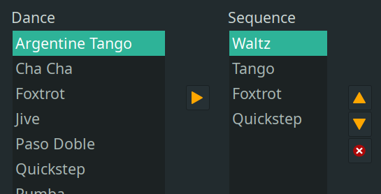
12

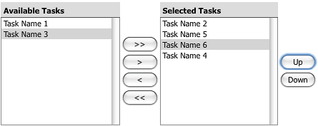
In my project, I have two lists of items: on the left, all the possible items for selection, and on the right, those that have been chosen.

Adjacent lists example

Unlike typical scenarios, in my case, the same item can be selected multiple times. Theoretically, this suggests that the item should not be removed from the left list after selection. However, through some testing, it appears that leaving the item in the left list might be misleading.

I am exploring the best UI/UX representation for this situation. Your insights on the optimal approach would be appreciated.

Update: It is a desktop application for managing and monitoring a testing machine.

11
  • --the same item can be selected multiple times-- Is there a limit?
    – Danielillo
    Commented Nov 24, 2023 at 14:15
  • 2
    Just because it is Friday afternoon: imgur.com/a/JDXdOmD :-)
    – koosvdkolk
    Commented Nov 24, 2023 at 16:48
  • 3
    I have never seen something like this. Furthermore, I think it defeats the purpose of using list boxes and it's probably an anti-pattern. Do you have an example where you have seen this so we can understand the rationale? Because it's very likely you need to use another pattern rather than this one
    – Devin
    Commented Nov 24, 2023 at 17:42
  • 3
    Is the order of the selection important? Otherwise it may make more sense to group identical items and add a quantity?
    – jcaron
    Commented Nov 25, 2023 at 13:19
  • 7
    Does the final sequence matter? e.g. if they add A,A,B,A,B do you want to maintain that or is A×3, B×2 preferred/acceptable
    – Chris H
    Commented Nov 25, 2023 at 16:00

4 Answers 4

41

The type of UI/UX you are using does not correspond to the functionality you need. In fact, if the items in the left list are to remain, the button to return them from the right list makes no sense.

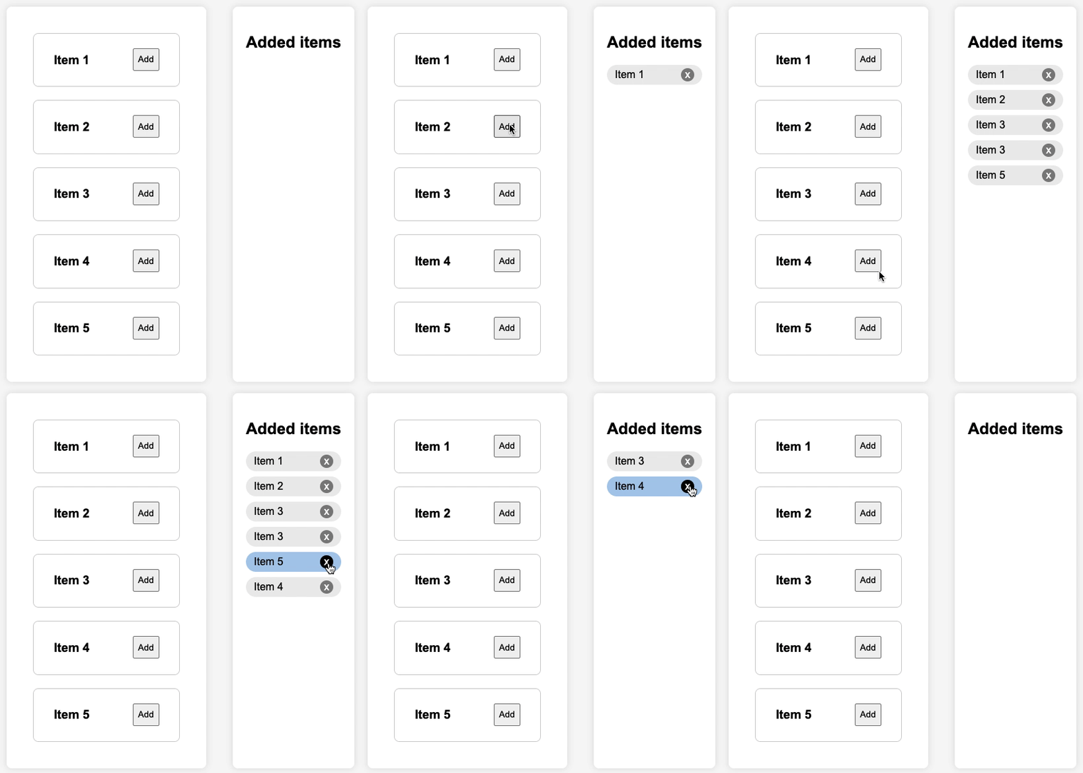
I think you should think about a functionality more in the e-commerce sense: adding items in quantity and independently and with the possibility of removing them once "purchased":

enter image description here

6
  • 12
    Is it a deliberate choice to display multiplicities (x1), but then not to merge the two subsequent executions of Item 3 into one execution with x2?
    – Polygnome
    Commented Nov 25, 2023 at 10:58
  • 1
    According to the comments after the question, the OP needs to select the added items independently to edit them
    – Danielillo
    Commented Nov 25, 2023 at 19:18
  • 3
    This, but also add drag-and-drop.
    – Vilx-
    Commented Nov 26, 2023 at 0:51
  • This is definitely one of the best options, thank you. I had thought of something similar with a '+' button instead of the 'add' button. The only doubt I have remaining is a UI-related question, specifically how to enhance it graphically to have a style similar to this project. That has a style similar to mine. However, I'll have to handle this on my own. Any suggestions are always welcome.
    – Alice
    Commented Nov 27, 2023 at 6:21
  • 1
    Instead of having all items visibile with it owns Add/+ button. you could just have a single Add/+/New button at top of the right list, which opens a dropdown where you can select which item you want to add.
    – Yalla T.
    Commented Nov 27, 2023 at 9:25
14

If the order of the selection is not relevant, only which items are selected and how many of each, then it may make more sense to keep only one line for each distinct item, and a quantity.

The obvious example is the archetypal shopping basket on nearly all e-commerce sites:

  • If you add an item the first time, it is added to the basket with quantity 1
  • If you add an item which is already in the basket, you increase the quantity
  • You have options to change the quantity for each item in the shopping basket (- / + and/or input field)
  • You have an option to remove an item from the basket (usually a trashcan icon or a cross)
  • Option: you can add multiple items at once from the product page by adding a quantity field there

In your case you have a list of items on the left rather than many different product pages, but the logic remains.

On some sites (like grocery shopping) it is common that the full list of items also shows if the item is already in the basket, and how many are in the basket (usually the "add to basket" will convert to a - | 1 | + composite button). You could use the same system on your list.

Here's an example:
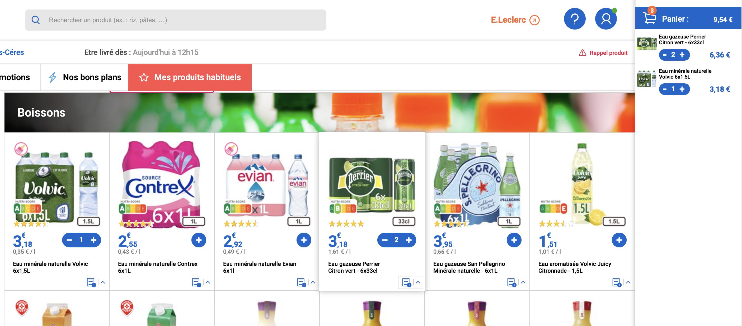
enter image description here

You'll notice that on the left side you have the full list. When you add one to your selection, it does not get removed from the list, but the small + becomes a larger - | 1 | +, so visually you can instantly see which products you have already added, along with the quantity, and the option to add more or remove some.

On the right hand side you have standard shopping basket with only the products selected, each with their own - | 1 | +. This implementation does not have an option to remove an item from the basket with one click if the quantity is more than 1, or to change the quantity directly at this point (by manual input of the new quantity), but others may have it.

Of course in your case you may have only text and no images, so the layout of the "from" list may be very different, but I believe it's important to keep the visual difference between items already added and those which haven't been.

A small variation on this other site:
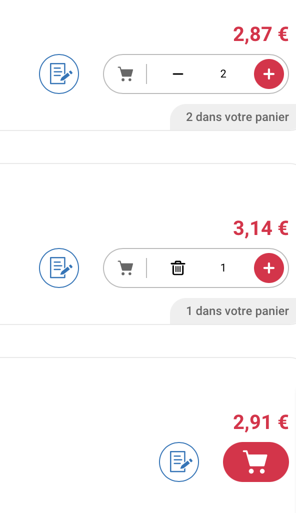
Here when quantity is 1 the - button is replaced with a trashcan (and the quantity is actually an editable input), but it's otherwise similar. The important point is that there is an obvious visual difference between items already added and those that haven't been (though it's probably slightly less obvious here).

1
  • This suggestion is definitely helpful, thank you. I hadn't thought about it because the application I'm working on has nothing to do with e-commerce, and I've never seen it as a reference. Later today, I'll look into some examples to gather additional ideas. If you have any specific suggestions, they are always welcome
    – Alice
    Commented Nov 27, 2023 at 6:25
1

What about removing the right column and the buttons, replacing them with just "Add" and "Remove"? Then add a counter to the items in the left column:

"Add" will increment the counter of the selected item, while "Remove" will decrement it.

If ordering of items is important, keep the "Up" and "Down" buttons to re-arrange items.

0

I have an identical UI, and after reading this thread, I simply moved the left arrow button to the right side and made it display as a remove button.

This particular API with the dual columns is used both for select and remove from the left column and for select multiple without removal and the button is displayed as a left arrow or the remove button depending on the task.

Your Answer

By clicking “Post Your Answer”, you agree to our terms of service and acknowledge you have read our privacy policy.

Not the answer you're looking for? Browse other questions tagged or ask your own question.