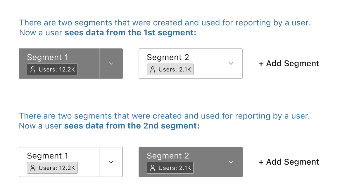
My team and I are currently working on developing an analytical system that employs a segment-based filtering mechanism. In essence, this system shares similarities with Google Analytics, where rectangular segments are used to represent different sets of data:

Initially, we experimented with using drop-downs for segment selection and employed tabs and a content switcher for changing the view between segments. However, this approach proved to be really unfriendly to our users (and for us, as well) due to a kind of duplication of elements (but we had to start from something, yeah):

Consequently, we embarked on a journey to create a solution that could seamlessly combine the two fundamental functionalities – (1) selecting a segment to construct a report using its data and (2) choosing a segment to view the data contained within it. For now, our design allows users to select and work with up to five segments simultaneously.
Our primary source of inspiration for this design was Google Analytics. However, since Google Analytics lacked a segment choice option, we decided to enhance the concept, making it akin to a split-button. We've coined this element as the "segment card" or "segment button."
So there is a current version below. By clicking the chevron down, users can:
- Preview data from the segments in a relatively small pop-up.
- Choose from options like editing (leading to a scenario for creating a new segment) or removing (which resets a segment and excludes it from reporting).

However, we've identified an issue through user session recordings: the clickability of the "segment button" is not intuitive. Users do not easily recognize that clicking the "button" serves as a content switcher.
To address this concern, we are considering implementing a tab-based approach similar to web browsers. However, we have some doubts about this potential approach (it appears to me that there is an opportunity to enhance the concept associated with the 'segment button'). So, I'd personally appreciate your input on the matter.
We welcome any ideas or expert opinions from the community. If anyone is aware of relevant references or solutions that have effectively tackled a similar challenge, we would greatly value your feedback and advice.
Overall, a user should be able to:
- Switch between chosen segments.
- Independently view data for each segment..
- Select an "View All" to see a data table that consolidates information from all segments simultaneously.
Thank you for your assistance and insights!

