3

I have been looking for guidelines on visual hierarchy with precise and substantiated recommendations, yet I have found only generic tips, such as "you can use contrast and font size" to add visual weight to an item. How much contrast and how big font size, and what leverage between the two, remains unaddressed. Solely at the discretion of the designer, I guess.

I am asking for suggestions about serious guidelines, explaining what, how and why to use. E.g. a guideline explaining whether bigger font is better than font of the size but in weaker colour (or whether both are equal), with references to research or least references to DIY user research protocols, would count as "serious".

2
  • 1
    I think it is too broad a question, in fact, there are treatises on the psychology of perception that deal with the topic without giving strict guidelines regarding its use. Maybe you should focus on a specific case.
    – Danielillo
    Commented Oct 5, 2023 at 11:44
  • @ Danielillo - I am looking exactly for specific and strict guidelines, substantiated by some evidence, I am not referring to a specific case.
    – drabsv
    Commented Nov 14, 2023 at 13:13

2 Answers 2

5

There is academic research on the foundations of UX and visual design, and there's (typically: unpublished) corporate research on the UX of completed prototypes and launched products. The middle area is necessarily devoid of concrete science, as the number of variables increases exponentially for each component you add to the study.

The research question you give as an example, comparing font size and color, runs into massive issues if you were to try to generalize it and attempt to apply it to a different situation. It's easy enough to get Times New Roman in sizes 12pt and 16pt and make the 16pt font more and more grey until it finally has equal prominence to the 12pt font.

But is the same ratio true for 16pt vs 20pt font? Is the same true for the bold versions? What about other fonts, keeping in mind that point size and perceived visual size vary drastically? All-caps vs lowercase, keeping in mind that this also changes drastically depending on the font choice? Colors other than grey, keeping in mind that the RGB color model is not perceptually uniform? Backgrounds other than white? And what if this text is near another object, like an image?

Until we create a mathematical solution to art and design (which probably requires defunding all other science for a few decades), you have to take the vague guidelines that fall out of other designer's experience and design yourself. You can find out if you did a good job afterwards using the usual user metrics like retention, running surveys, and conducting other usability evaluation. And that research of "is my website/service/product better than before the changes?" is something that can be conducted as "seriously" as needed.

1
  • An answer exactly to the point, thanks. Only thing I could possibly argue about, is that the needed scientific research would probably require defunding all other science for a few decades :) Most breakthroughs in science happen on the basis of transfer of discoveries from one field to another, so we may find the answer long before dedicated research has covered even small percentage of its set agenda.
    – drabsv
    Commented Nov 14, 2023 at 13:19
2

As @Danielillo commented and Leo Wattenberg answered, this question is too broad to answer (and yet too limited).

I'll try to answer it based on the big picture. Font size and color (or contrast) are just the tip of the iceberg, and also an impossibility, for the same reasons other people commented.

However, when we talk about visual hierarchy, there are countless methods and techniques we can use, and many of them have guidelines. Now, here's the thing: while guidelines do exist, they don't exist as a "one size fits all" solution since they combine in almost infinite ways.

Consider the following image:
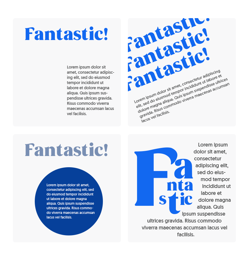
enter image description here

I made it really quick, so I'm not aiming for great design, but just to provide you with examples.

Basically, I have used what you said (font size and color + contrast)... plus a couple of other techniques. Which one would you say has more hierarchy?

The first one drives attention by breaking patterns; the second one uses two Gestalt Laws; the third provides more hierarchy to the title because of size, yet what you'll want to see is the text in the circle; the fourth breaks patterns for the title but uses a visual hierarchy technique called grouping for the whole group. And each of these is just a couple of techniques among many different methods used in typographic design, let alone multi-element designs that may use images, shapes, motion, interaction, etc.

So, back to my point: there are very precise guidelines if you check on a technique or method basis. For example, if you mention contrast and size, you'll probably want to check accessibility guidelines. If you want to drive attention, you may want to check attention-driven design techniques; if you aim to affect users' psychology, you may want to check Gestalt Law principles, you could even use the HTML default sizes for headings and paragraphs as well as the default colors for text and links in their different states, and so on. However, as I showed in the image above, all of them can be combined in multiple, almost infinite ways.

In short: you won't find a guideline for everything, for the simple reason that it's impossible.

2
  • 1
    Thanks Devin for the detailed answer. I do not agree with the "for the simple reason that it's impossible" statement. "Impossible" is not the same as "undiscovered". Just because we have not (yet) discovered universal principles for building visual hierarchy, does not mean that such do not exist and that such are impossible to discover in the future.
    – drabsv
    Commented Nov 14, 2023 at 13:23
  • You might be correct here, but my point is that the almost infinite combination possibilities make it quite difficult, to say the least. And that's without considering new emerging technologies and cultural changes.
    – Devin
    Commented Nov 14, 2023 at 16:04

Your Answer

By clicking “Post Your Answer”, you agree to our terms of service and acknowledge you have read our privacy policy.

Not the answer you're looking for? Browse other questions tagged or ask your own question.