1

I'm working on a customer portal, aiming to enable clients to access product information and apply for products. There might be only one more product card but its inclusion isn't confirmed yet. I have provided images for both option 1 and 2. enter image description here
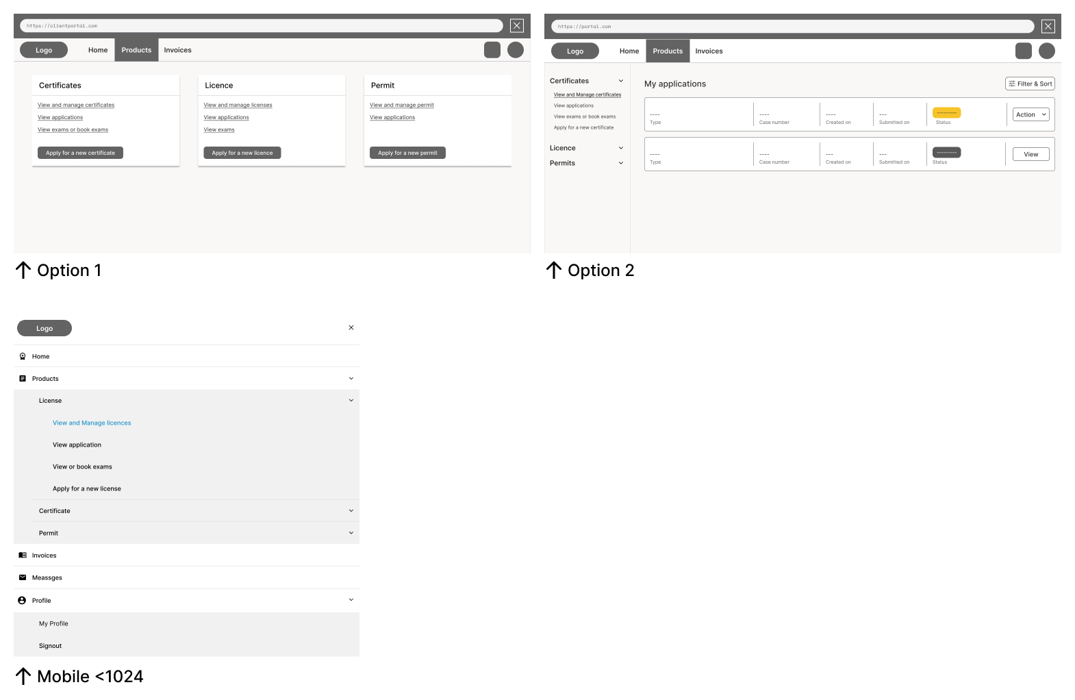
Option 1 involves clicking 'Products' on the top navigation, displaying products in cards with clickable categories. Option 2 entails clicking 'Products' and revealing a sidebar with expandable sub-categories.

My intention in asking about the better navigation option stems from my concern regarding user engagement and ease of task completion.

In the case of the second option, I'm apprehensive that user's attention might be diverted from the primary content or call-to-action required to complete tasks efficiently. The sidebar layout, while structured and organized, could potentially draw attention away from the main task areas. I'm aiming for a design that prominently guides users toward the core actions and content they need to engage with.

To address this, I've been considering the first option – the card-based layout – as it has the potential to keep users focused on the essential tasks without distractions. However, I'm also aware that my own perspective might be biased, and I'd like to gather insights from others to make an informed decision. In essence, I'm seeking a solution that optimizes user engagement and task accomplishment while ensuring a visually appealing and intuitive interface. Your insights and observations will greatly contribute to refining the design to better address these concerns.

2
  • 1
    It is not enough to ask which design is better because "better" means something else in different contexts and for different people. You must have a reason to ask this. What is it, what are your concerns or doubts with the designs and what did you already do yourself to get it answered, what do you already know? Describe the problem you try to solve.
    – jazZRo
    Commented Aug 30, 2023 at 8:21
  • You're absolutely right, and I appreciate your thoughtful approach to design assessment. My intention in asking about the better navigation option stems from my concern regarding user engagement and ease of task completion. I have now added more information on what I am trying to achieve. Thanks.
    – Meekfern
    Commented Aug 30, 2023 at 20:21

2 Answers 2

1

I've seen both implementations in portals.

  • Option 1 works best for an occasional visitor, as it has less content on the page;
  • Option 2 is optimal for someone who uses this portal daily as you have less back and forth. Also this layout allows to collapse the navigation into menu icon, should you have a need to introduce a breaking point.

Not much but hope this helps!

2
  • Thanks! Yes, the users only login if they need to apply or have any updates to the related products.
    – Meekfern
    Commented Aug 30, 2023 at 20:22
  • @Meekfern I would keep it more straightforward then. Best of luck! Commented Aug 31, 2023 at 7:41
1

I would recommend to go with option 2 but to avoid clutter content as you mentioned you can add Overview page. So when the user clicks on the product the Overvie page will be selected following the vertical menus that you have.In the Overview page, you can list the recent activities and you can include main CTA buttons to make it ease, something like dashboard where you can make it little interesting.

Your Answer

By clicking “Post Your Answer”, you agree to our terms of service and acknowledge you have read our privacy policy.

Not the answer you're looking for? Browse other questions tagged or ask your own question.