I have a webapp LMS in which there's a page that allows teachers to monitor the progress on ongoing exams. The page displays a table with data about all students that are participating in the exam and their progres, e.g. how many questions they've answered.
In this page, the teacher can select some of the students from the table and apply actions to them, such as: if a student has turned in, undo the submission; close the exam prematurely for some students; reopen the exam for some students for whom it was closed. The teacher can also close the exam for everyone (so it's not technically a bulk action, as it doesn't depend on the selected student set).
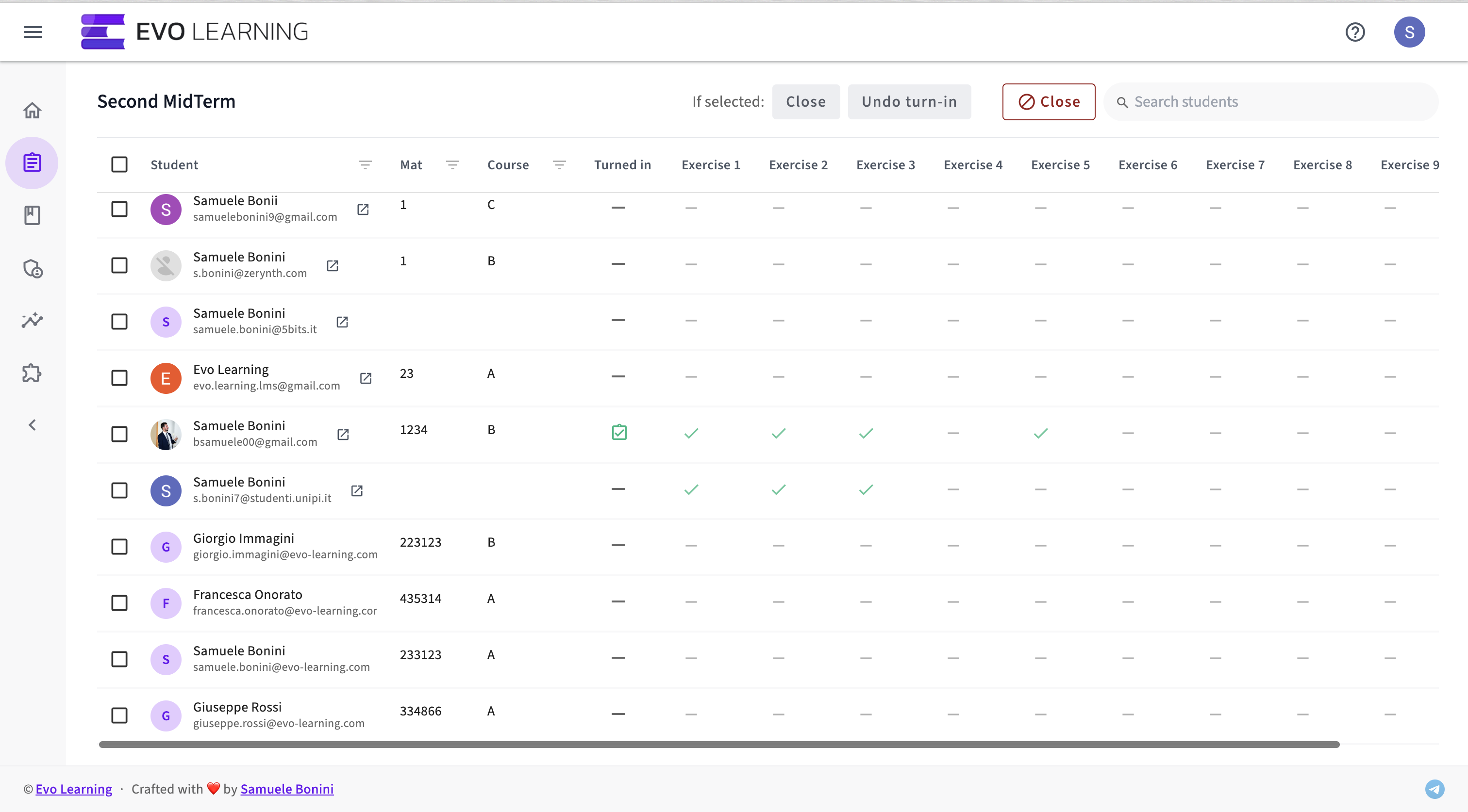
The page currently looks like this:
As you can see, there's a button for each one of the actions. The issue is that, depending on screen width, not all actions will fit on the same line. Additionally, if I ever have to add more actions, I might have a problem. (The "reopen" button to reopen the exam for the selected students is missing in this screenshot, but you get the idea.)
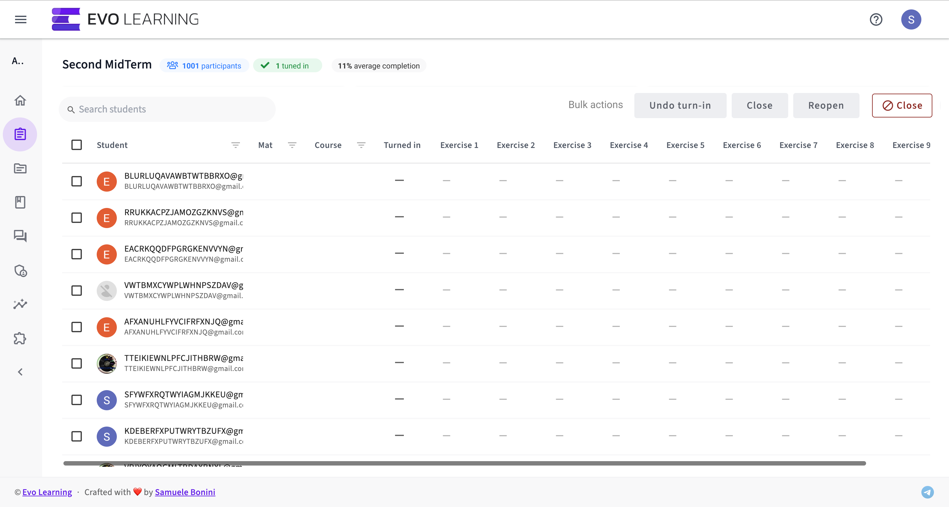
What would be the best way to feature these "bulk" actions in a way that bears low cognitive load to the user and clearly communicates to them what the options are?
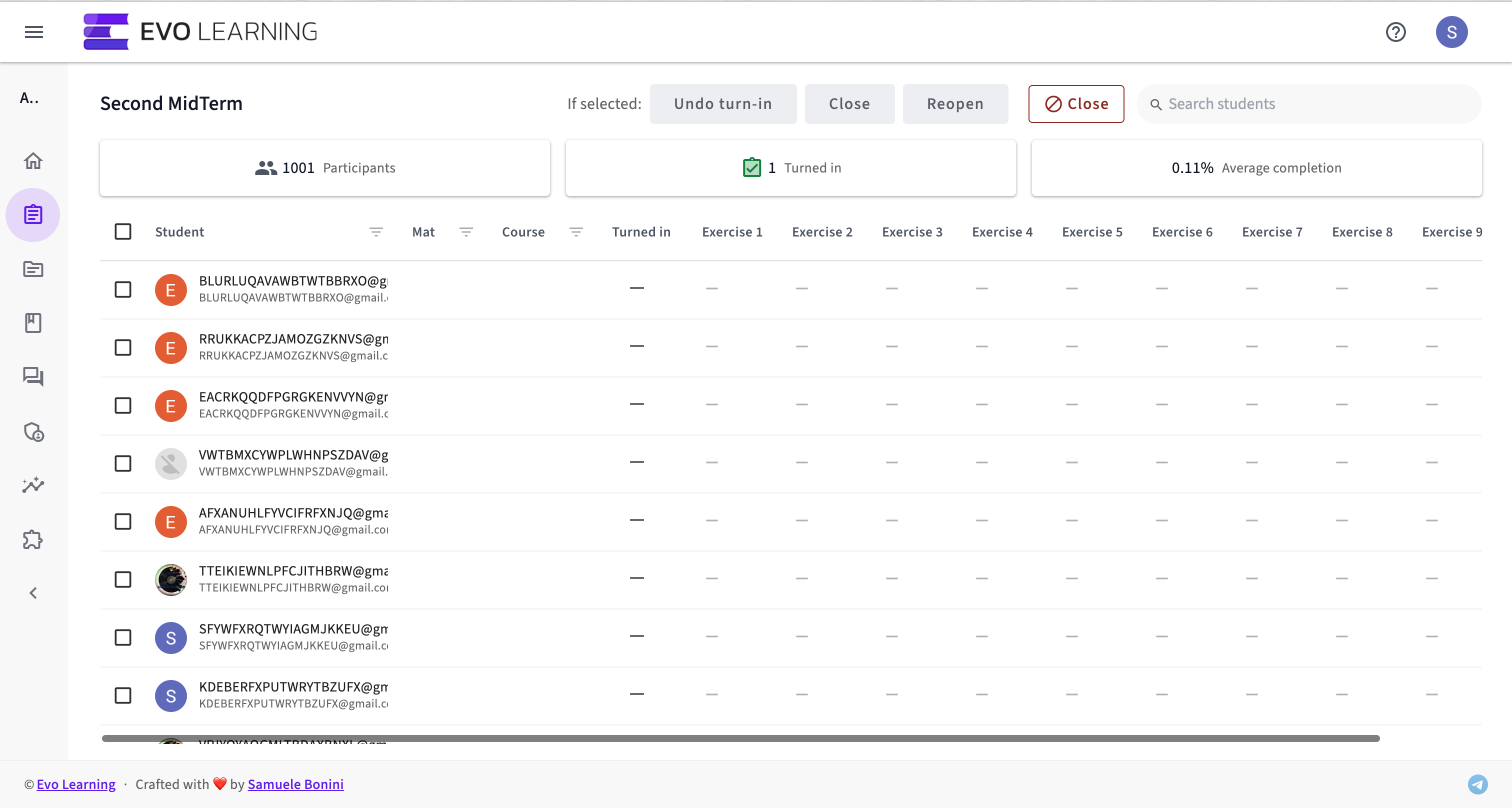
As an aside, I would also like to somehow fit a few stats in the top row, such as these:
The thing I'm concerned with is that adding these cards in a row just below the one at the top with the action buttons would show less rows in the table, hiding possibly useful information for the user. But maybe the user doesn't need to have access to all that information at once?
This is what it'd look like adding these stats cards on a row below the action buttons:


