3

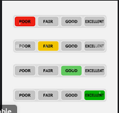
I am currently trying to design an app and part of the app is being able to monitor data and set alerts when the data reaches a certain point. There are 6 different metrics that are being tracked and these metrics are converted into 3 generic values: good, poor and dangerous. I want to design a UI that allows for the user to see the current value as well as set an alert for when a metric goes past a certain point. (example: currently metric 1 is "good", I want to set an alert for when this reaches "dangerous") Ideally, I'd have both current value and the alert threshold value on the same card/visual. Here is an example of what the alarm setting could look like, with toggle buttons to choose when you'd like to receive an alert.

enter image description here

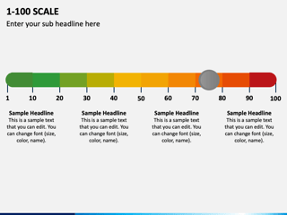
Additionally, here is what a "current value" scale could look like:

enter image description here

How do I combine these two ideas into one? The reason I want to do this is to reduce cognitive load on the page I am working on, since it already has lots of information on the page.

Edit: It would be air quality measurements, so things like microdust levels, CO (carbon monoxide) levels, and VOC (harmful gases). The other metrics fall under the same category of air quality, but those are the main ones I am concerned about. Please consider that I have to have 6 of these, so the simpler/less overwhelming idea the better. Here is an example of what I've been thinking so far:

enter image description here

2
  • what are the metrics? Can you share?
    – Mike M
    Commented Mar 10, 2023 at 17:28
  • 1
    @MikeM I guess its not that important to keep secret. It would be air quality measurements, so things like microdust levels, CO (carbon monoxide) levels, and VOC (harmful gases). The other metrics fall under the same category of air quality, but those are the main ones I am concerned about
    – Gene
    Commented Mar 10, 2023 at 17:32

1 Answer 1

3

I most likely don't have all the details covered here, but here's a first attempt.

Try reducing the color density to a small meaningful area, and use icons plus color for vision impaired users.

What you're trying to do is get the most info for the least ink.

The Data to Ink ratio

The data-ink ratio is a concept created by Edward Tufte, famous author in the field of data visualization. Clearly speaking, the data-ink ratio encourages chart creators to examine if all elements in the chart are relevant to the chart’s message.

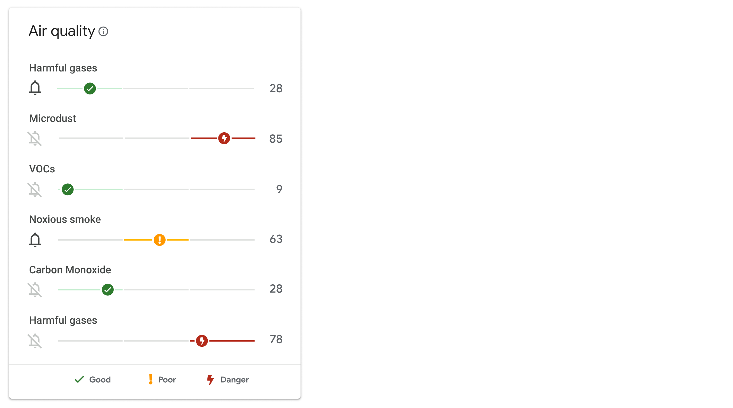
Rather than repeat the scale 6 times, break up the segments, and only use color for the current area measurement where it falls on the scale.

You can also pop the current indicator to the right, so they can just glance along the right side and see the exact number. You've got a legend below (common for data viz), and the 'info' icon in the title could even pop up the full scale if they need reminding.

enter image description here

This way you have small popping areas of meaningful colors (with an icon to support), and can see which segment of the scale it's engaged with.

1
  • 1
    Honestly, I worked on this problem since the time I posted this and came up with a solution with my coworker that is basically exactly what you did with a different UI design. I'm glad to get some confirmation that the idea we came up with is a solid idea. Thank you for your input!
    – Gene
    Commented Mar 11, 2023 at 0:25

Your Answer

By clicking “Post Your Answer”, you agree to our terms of service and acknowledge you have read our privacy policy.

Not the answer you're looking for? Browse other questions tagged or ask your own question.