When a client clicks the Generate receipt to get a receipt, what would be better UX? Hide the button after the receipt becomes available or continue to show the button after the receipt becomes available?
1 Answer
I think it depends if it's possible to generate a receipt twice. If the user would like to generate a receipt more than once, I'd make the button have a "loading" animation to the right and then a "complete" to let the user know that a receipt was generated. Than the user can decide whether they want to generate another receipt or not.
If this is a ONE TIME action, then I'd say grey out the button after it is clicked and add some text next to it saying "Receipt generated" so the user knows that they already did that action.
The main thing is to let the user know what is happening when they click receipt so they don't end up clicking it 100 times wondering why nothing s happening.
If you make the button disappear, the user may forget that they clicked it earlier and then may look for a button that no longer exists
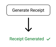
Edit: Based on Mattynabib's comment, if it is a one time action then I would design it like this:
That way, no extra text is added, the user understands that a receipt was generated, and the removal of the button design lets the user know that it can't be clicked again
-
1Perhaps if it is a one-time action, rather that graying it out and adding text (space consuming) you could replace the button with just a checkmark (maybe with some text if needed). The basic contention of "let the user know what's happening" is key, of course. Commented Mar 3, 2023 at 22:41
-
1@Mattynabib Yeah I agree, that could help save space and a checkmark shows the user that the receipt was generated. Going off this idea, I would change the text to "receipt generated" with a checkmark and remove the "button" design. I edited my original comment with an image to represent what I'm talking about– GeneCommented Mar 3, 2023 at 22:55


