I would be thinking not just about showing a simple history of changes as a flat list, for the sake of ticking a box on the clients requirements, but also wanting to delve a bit deeper as to what the client actually wants to get out of seeing the history, and displaying that information in a format that makes the analysis of the data easier.
For example, does the client want to see the number of changes, rate of change, change compared to last week, last month, last year? Does the client want to export that data into another application to process it further or is it purely for getting a general overview. Would it help to display the information graphically on a timeline, or to provide an export (eg to csv, pdf, etc)?
We know what the client wants (or thinks they want) but what do they need? Chances are they have something in mind and they've asked for the history as a first step to ease that process, but they haven't given you the full picture?
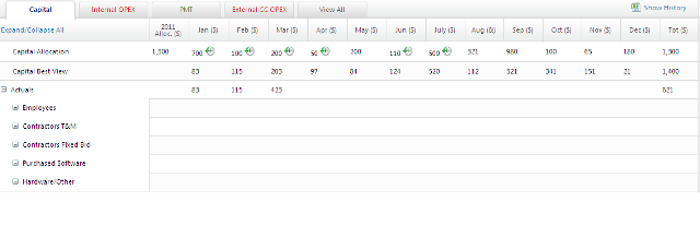
So that aside, and moving on to the interaction, it strikes me that the view history toggle doesn't actually show and hide the history, it shows and hides buttons which give you access to the history, which is slightly confusing to a user.
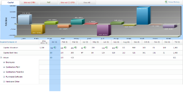
Perhaps you could consider a panel which opens and closes above the data, which displays a timeline or graph of changes over the most appropriate time period, colour coded by positive or negative changes, or by user, or by whatever other criteria is deemed to be useful. Perhaps make it interactive if necessary.
The content of the timeline could change according to which column you click in the grid, and the selected column be highlighted accordingly.
As a very quick mock-up example, cobbled together from your image and a graph I found on google images.

But once again, I can't stress the importance of knowing how the history of changes fits into the bigger picture, rather than supplying it as a totally standalone feature which once implemented may lead to further frustration rather than being a smart and useful time-saving tool.


