0

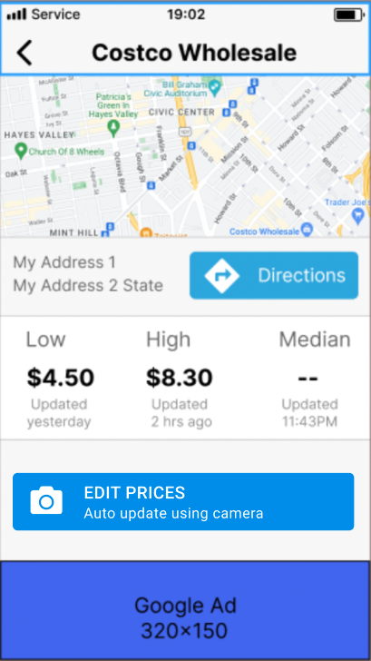
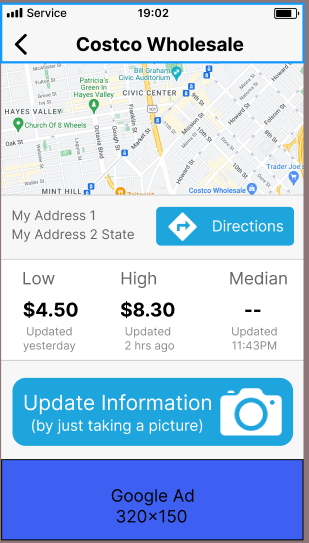
We have a mobile app where the information is updated when the user takes a picture. I'm attaching the screen.

As you can see there's a huge button that says "Update Information (by just taking a picture)". The only thing the user needs to do is click on the button to take the picture.

When user taps on the button, the camera will pop up, user takes picture, and either "accepts" or retakes pic. That's all the user has to do.

The problem is that the users that have tested the app don't relate the button to updating the information.

Question: Once the user reaches this screen, how can I let the user know that they can update the prices by taking a picture?

I was thinking of maybe having a link that displays a popup? Or maybe changing the text in the button?

enter image description here

3
  • so the function of taking a pic is that they get to enter new prices? How does this work?
    – Mike M
    Commented Aug 1, 2022 at 17:22
  • From the users' perspective, by taking the picture they're automatically updating prices. In other words, instead of entering the prices manually, they take the picture.
    – rbhat
    Commented Aug 1, 2022 at 18:06
  • 1
    Basically, because it looks like a banner. It's even the same size as the banner, so it's very hard to recognize it as a button (I didn't until I read your description). Your camera icon, for example, is huge, and the only thing users need to know is that it's a button and what it does, with no "embellishment" needed. So, as Mike M. said, "Label the action" or as Danielillo said, "Make it look like a button".
    – Devin
    Commented Aug 1, 2022 at 22:01

2 Answers 2

2

Maybe try labeling the button with the action itself.

In this case 'information' is really prices, so it's a little more specific.

The benefit

And the benefit is having it done automatically by camera. I added the phrase 'auto update' with the idea that it's a lot easier, and implies the opposite of 'manual'

enter image description here

2

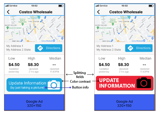
Well, actually I wouldn't have clicked that button either. I don't know what the rest of the application is like, but this screen has serious contrast problems, precisely because it doesn't exist. I would try:

  • Color contrast
  • Avoid dividing fields. It's already split for the Google ad, it makes it look like another ad while it's an important app info.
  • Avoid text inside a button. If a button needs an explanatory text, it's because that button doesn't work. Also, a lot of text inside the button makes it look like another ad.
  • Size contrast, the larger the text of the button, the better it will be noticed.
  • Button shadow. I already know that the application is designed based on flat design, but beyond aesthetics, there are certain details that directly affect the user's perception, and one of them is the shadow behind a shape, it indirectly invites them to place it on the right place, and this by clicking on it.

enter image description here

Your Answer

By clicking “Post Your Answer”, you agree to our terms of service and acknowledge you have read our privacy policy.

Not the answer you're looking for? Browse other questions tagged or ask your own question.