We are designing an e-commerce website where our client is a marketplace for merchants to offer discounts or great prices on services/products to end users.
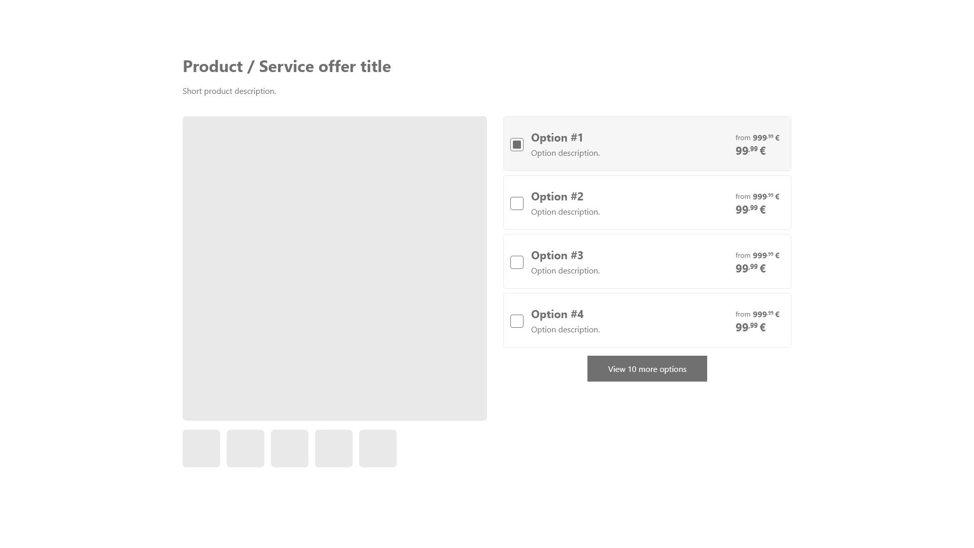
Some merchants may give multiple options for a single offer, for example, a Theater may give tickets for a play and have multiple options for the available dates.
In order to not clutter the product details page, we show the users the most relevant options up-front and hide less relevant ones. To see the rest of the options we added a "View more options" button that opens a side-panel with all options.

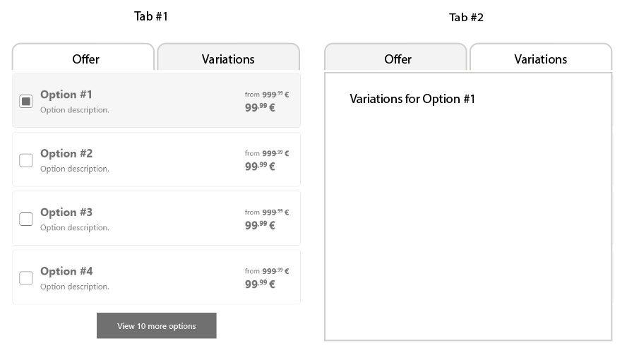
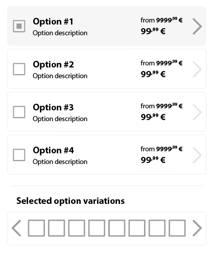
This worked fine in most situations, but some offers require a second step to complete. For example, in a Cinema the merchant may have options for the date, but then require to select a particular seat.
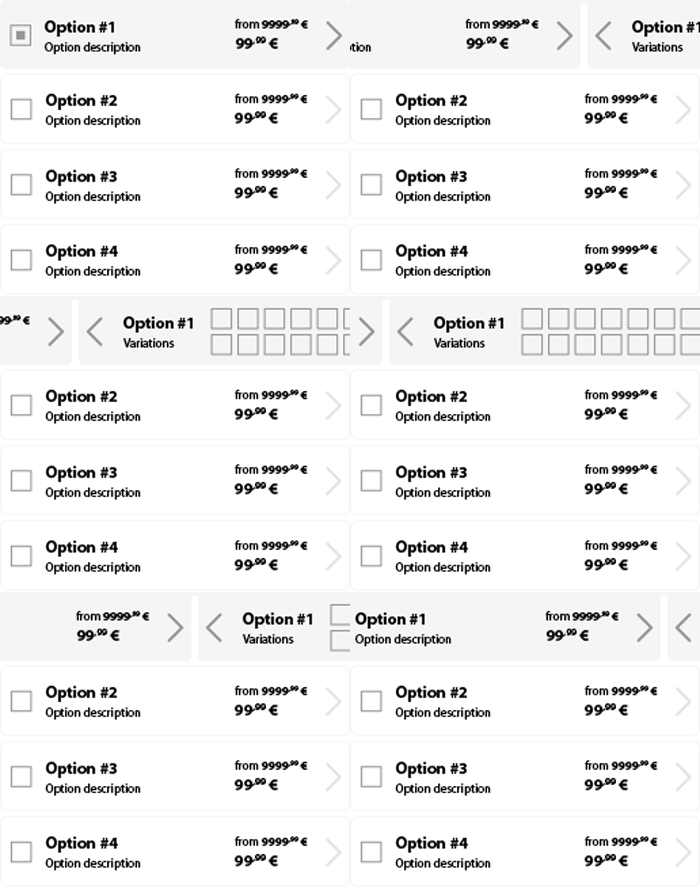
Would it be a bad user experience to have a second step process in the side-panel? Would it be better to move the seat selection step within the first panel? Or the whole side-panel route needs to be rethought?


