2

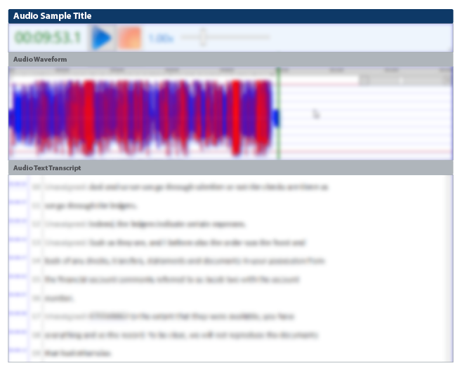
My application has a window that shows the waveform of an audio sample and the text transcript of that audio:

enter image description here

(Sorry for the extreme blur, but this is proprietary software and I'm advised not to reveal too much. I think the main context is still clear.)

Sometimes you want to navigate within the audio and sometimes you want to work on the text.

My intent is to allow focus in either of these panels, because each one has keyboard shortcuts that make sense in context. For instance, if you are in the audio panel and hit CTRL+Right, it moves the audio playhead forward 10 seconds, but if you are in the text panel and hit CTRL+Right, it moves the caret one word to the right.

If you look closely at the screenshot, you'll see that the audio panel has focus, indicated by a blue border. But my users are not looking closely, because I get reports that the app is "frozen".

It turns out that they think they are in the text panel and they are typing, say "A", and nothing happens, when in fact they are in the audio panel and "A" simply doesn't do anything in that panel. There are hotkeys to easily jump between the panels, but they don't realize that they need to use them to jump to the other panel.

So the question is: how can I have two complementary panels like this and show which one has the focus, in a way that's better than my (too subtle) border color?

2 Answers 2

3

I think the focus in each area is a secondary problem in this application.

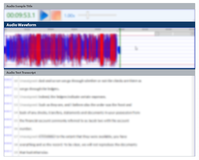
In fact, the beginning of the question explains what each area is about when the simple thing would be for it to remain implicit when opening the application. The new user needs to read an instruction manual prior to understanding what the complete panel is about. In my opinion, the absence of titles is the main problem.

enter image description here

Once each area has its corresponding title, it is much easier to differentiate the focus in each one with color, font size, etc.

enter image description here In any case, it needs a general color revision, the waves are perceptually too strident.

1
  • 1
    Thanks. I think this is exactly the way to go here. Commented Nov 30, 2021 at 15:58
1

I'm going to propose an alternative solution: remap your hotkeys so that the user can control either the waveform or the transcript without having to change focus between panels. Control-right might move the waveform position, shift-right (or maybe just the right arrow itself) might jump ahead in the transcript. Perhaps all waveform hotkeys use control, while all transcript hotkeys use shift.

If you have a Magic Mouse or a mouse wheel, think about how modern systems don't force you to have focus in a window (or panel) to engage scrolling in it - just the location of the mouse over the section is enough information for the system to know what the user wants to do. Systems are moving in that direction.

1
  • I thought of this, but then there's a lot of crowding in hotkey-space, trying to find enough combinations of modifier keys to express all the things you can do in both windows. I think this would cause a lot of things like Ctrl+Shift+Alt+Right combos, which would be hard on the brain and fingers. Commented Nov 30, 2021 at 16:16

Your Answer

By clicking “Post Your Answer”, you agree to our terms of service and acknowledge you have read our privacy policy.

Not the answer you're looking for? Browse other questions tagged or ask your own question.