2

For a plafform for build mobile apps, I'm working in a concept about how to propose a flexible personalization of navigation bars (bottom and top). The technical solution proposed by developers is having a navigation bar as a drag and droppable component, that can be personalized (colors, entries, icons) on each screen (page editor) of the app (something like Adalo platform propose). Evaluating the example, I raised an alert about this proposition :

  • Repetitive Drag and drop or Copy/task action and configuration task
  • Increase risk of human error making x times a manual configuration of the bottom bar

The possibility to customize the bottom bar is considered as a good asset/feature, but allow to customize it differently on each screen gives users a sense of instability and the app lost in consistency.

The developers team insist in run in production their option. I would like to have more UX advices about this.

I proposed to explore two concepts:

  • parent/child component in order to set a global parameters of the component or

  • component navigation bar templates that will be configured once, and the displaying of each screen is set by default.

2 Answers 2

1

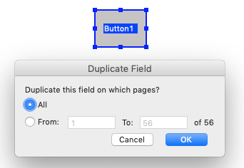
Adobe Acrobat uses the repetition of interactive elements once created under the action of Duplicate Field.

Once the object is created, you can select duplicate. The options window allows to choose the page where the object must be repeated, which can later be edited independently.

duplicate

2
  • Good option ! Thanks. For the moment, I have no a clear idea about how integrate the action duplicate field after the first drag and drop of navigation component. I will drill down to the concept. Commented Nov 17, 2021 at 11:36
  • Acrobat has not a Duplicate menu option, it's in the “Context Menu” actionable from the right mouse button
    – Danielillo
    Commented Nov 17, 2021 at 11:44
1

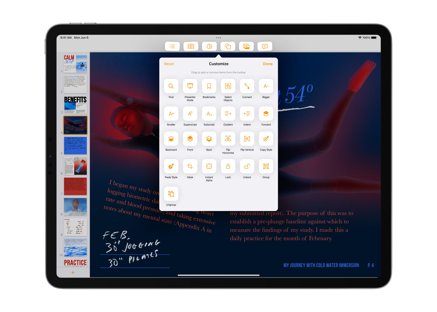
I am a big fan of what iPadOS and macOS did for customizable toolbars.

Essentially, one enters the "Customize mode" and then drag-and-drops the items to a toolbar. Or takes them out the same way.

enter image description here

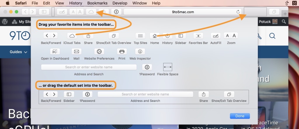
And, as a way to make it easier for the user to return to default layouts, there's an options to drag-and-drop the whole set at once (this could be a "global preset" in your case).

enter image description here

Now, to address your concerns: consistency is very important, so be careful about how much the users should be able to customize, especially if they want different configurations for different pages. This probably should be a feature for the more tech-savvy users, so don't make everybody use it, let the default toolbars work for most categories of users and if they want something changed - let them.

It's also usually a good idea to leave only the extra options to be configurable by the user, but the most important ones (like 'menu', 'home') should stay where they are to avoid users ultimately confusing themselves.

I would probably opt into always leaving an overflow button visible (or easily accessible) that would contain all the navigation options and let users configure other options if they want, leaving the most popular options as the default.

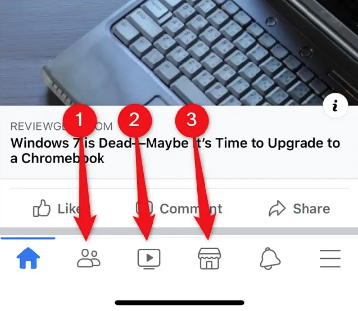
I think, facebook recently did something like that with their app: there's "menu" from which one can navigate anywhere, the "home" and "notifications" that are fixed and cannot be hidden and the rest are configurable for every user (more on that see here): enter image description here

Your Answer

By clicking “Post Your Answer”, you agree to our terms of service and acknowledge you have read our privacy policy.

Not the answer you're looking for? Browse other questions tagged or ask your own question.