1

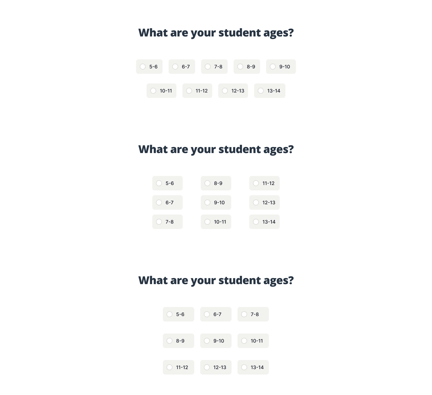
We are in the process of creating a survey style onboarding flow and was curious if it is ok to break the rules here? I understand that once the number of choices gets over 6 or 7, it is best to use a dropdown menu, however, for this instance it is the only question on screen and seems like exposing all the options would be quicker and easier to complete.

The second part of this question would be the layout of the options (on desktop). Which layout would to recommend for quickest scan-ability?

  1. Left to right list - Similar to a tag group style selection and uses less viewport height. Also feels less organized.
  2. Three column, Top to bottom
  3. Three column, Phone style layout

Layouts

9
  • 2
    A. Guidelines are not laws. Do what you think works best for your specific situation. B. Option 2.
    – musefan
    Commented Sep 29, 2021 at 14:53
  • If the expected input is a number, let them write a number in an input field of type number. Also, "How old are your students?" is a better grammar form.
    – Adriano
    Commented Sep 29, 2021 at 22:27
  • Thanks @musefan. What makes you lean towards option 2?
    – Rohrski
    Commented Sep 30, 2021 at 13:47
  • 1
    @Rohrski: My mistake... I actually meant option 3! The alignment is better than option 1, and the readability is better than option 2. People read from left-to-right (at least the English language anyway)
    – musefan
    Commented Sep 30, 2021 at 13:58
  • 1
    Go for option 3
    – Adriano
    Commented Oct 4, 2021 at 21:33

2 Answers 2

0

HTML5 allows for a number input, which has a + or - spinner and as someone mentioned you can set a min/max value. This will do your server side validation (prevent anything but whole numbers from 5-14 as you wanted. Your devs will need to do serverside validation (samething with the radio buttons they have to be serverside validated as well).

Typing in a number is pretty easy and takes less space than all those radio buttons. The radio buttons are honestly the wrong thing to use in my opinion, where there is a simpler solution.

1
  • As I understand the question the answers are labels ("5-6") and not numbers. So I don't think a number spinner would work here.
    – Nash
    Commented Nov 20, 2021 at 12:33
0

When it comes to usability, there are a few things to consider:

  • clicking vs typing = clicking is easier and preferred, especially on mobile
  • number of necessary clicks = preferably just one click to complete the question
  • distance between options = if user needs to change the answer, shorter distances make it easier
  • size of options = bigger elements are easier to click
  • product changes = the options might change in the future, so the layout should be easy to adapt
  • reading direction = people usually read left-to-right, top-to-bottom, and numbers go left-to-right, so positioning options left-to-right in ascending order makes them easier to understand than columns

Based on that, my preferred version from your mockup is actually the first one, without columns, since it accommodates most of those factors, even though it might look less organized.

Overall, I don't think it makes that much of a difference. Your ideas are good enough for most users, so unless you want to optimize the form completion speed, it doesn't really matter which version you choose.

Your Answer

By clicking “Post Your Answer”, you agree to our terms of service and acknowledge you have read our privacy policy.

Not the answer you're looking for? Browse other questions tagged or ask your own question.