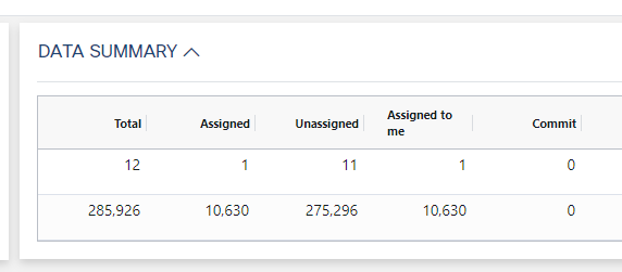
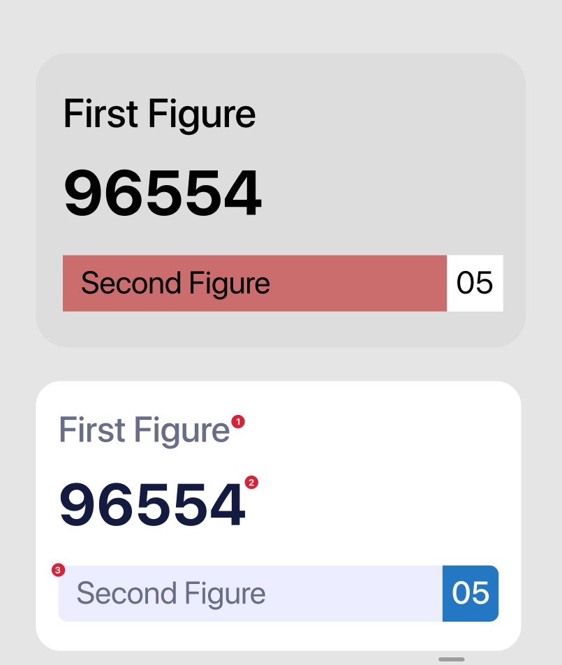
There is a total section on my dashboard and below that, a grid with all the list of data. As a total number of items and their total values need to show on top of the grid distributed among categories, I designed something as per the below screenshot, but want to validate that UX-wise it's ok, or is there a better pattern?
Screenshot of total section:
So in the above design, each box contains below details:
- Total Profit/Order.
- Total Record/Order count.
- Title of that box.
I also tried another way to show data in a grid as shown in the below screenshot.
Grid Data screenshot:
How can I improve this so users can get the idea that 1st one is for what value and 2nd one is for what?


