3

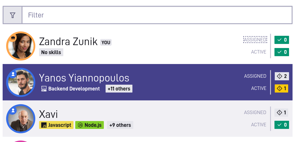
I have a UI like this.

Screenshot enter image description here

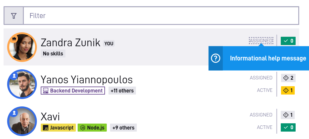
The user navigates through a list of people. To the right, there are two labels: Assigned and Active. A mouse user can click on the label to see some help text, as shown on the second screenshot.

Each one of the labels comes with a tab index, so a keyboard user can also navigate to them and do the same action by pressing "enter".

However, when this is all put together, it creates kind of a clunky UX for the keyboard user. Each label will show basically the same information. Having them all clickable is not a problem for the mouse user, but the keyboard user has to tab through each one before they can get to more relevant parts of the UI (the select box itself).

Is there something I can do to make this better experience for the keyboard user?

2
  • Do "Assigned" and "Active" pair with the colored numbers to the right of them?
    – Izquierdo
    Commented Jul 9, 2021 at 21:46
  • Yes, there is also a variant where they are combined. But the same issue remains.
    – panta82
    Commented Jul 10, 2021 at 15:06

3 Answers 3

1

Two approaches come to mind.

  1. The approach you have now, or a variation on it, where each interactive element is a tab stop.
  2. A grid-based UI with two columns and n rows.

The first approach has a major accessibility flaw if the list of developers ever grows large -- it will create a large number of tab stops, with each developer (row) producing three tab stops.

In the second approach, the entire list of developers would be a single tab stop, and you'd arrow directionally from row to row. The basic information about the developer (name, skills, etc.) would be the first column. The information about assignments would be the second column. With keyboard focus on a cell in the second column, pressing Spacebar or Enter could raise a variation of the popup that shows information for all the relevant states (e.g. Assigned and Active together).

I'm assuming this is on the web, and assuming you want to make this accessible to screen reader users as well. A combination of some focus-handling code and ARIA (role="grid", etc.) would likely make the second approach work. It'd need a bit of experimentation / prototyping to get it right.

0

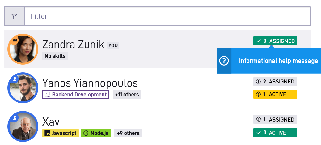
See if you can combine the label and status:

User directory with Assigned and Active status chips

The help text on "Assigned" and "Active" might be more useful when combined with the status it's describing.

10
  • Thats a neat improvement. But doesn't resolve the issue with repeated info messages. I'd still want to add info what "assigned" and "active" mean. But if I activated that info on keyboard focus, user would still need to tab through the same help text target over and over again, as they are going down the list.
    – panta82
    Commented Jul 10, 2021 at 15:08
  • Do "Active" and "Assigned" need explanations that are more than a few words? And once the user understands what they mean, would they need that help again?
    – Izquierdo
    Commented Jul 11, 2021 at 18:57
  • The actual help message will be something like "Assigned developers are those who are given a task, but their task hasn't yet activated. You can assign developers from... blah blah". It can also be shorter, I haven't decided yet. I am trying to do a contextual help system across the app, but I am open to doing something different if there is a better pattern.
    – panta82
    Commented Jul 12, 2021 at 11:00
  • 1
    So I guess an experienced user probably won't need to see these messages all the time. But I still want them to have an option to click and see, without going to documentation site or contacting support. There could be users who are not using this UI all the time, but just occasionally. So quick access to help is important IMO.
    – panta82
    Commented Jul 12, 2021 at 11:09
  • Thanks for the additional info. It seems like moving developers from Assigned to Active is important, and you might want help text on the UI element that does that. Is that available in this screen?
    – Izquierdo
    Commented Jul 12, 2021 at 14:30
0

The most elegant solution would be to do entirely without the help messages. I see two possibilities for this:

  1. put an info box at the top or bottom of the page, briefly explaining the exact meaning of "ASSIGNED" and "ACTIVE", or

  2. use a short description instead of one-word-terms. Instead of "ASSIGNED", for example, "WAITING FOR 3 TASKS" or "3 TASKS IN BACKLOG", and for "ACTIVE" something like "2 TASKS IN PROGRESS" or "WORKING ON 2 TASKS".

However, I do understand your concern about inexperienced users. Is it a common scenario that an inexperienced user who sees the list for the first time has to make changes in it, not having been introduced to the system and not having someone nearby who they could ask? If so, this might be a recipe for desaster further down the line. But maybe I'm just looking too much on the dark side of things.

Your Answer

By clicking “Post Your Answer”, you agree to our terms of service and acknowledge you have read our privacy policy.

Not the answer you're looking for? Browse other questions tagged or ask your own question.