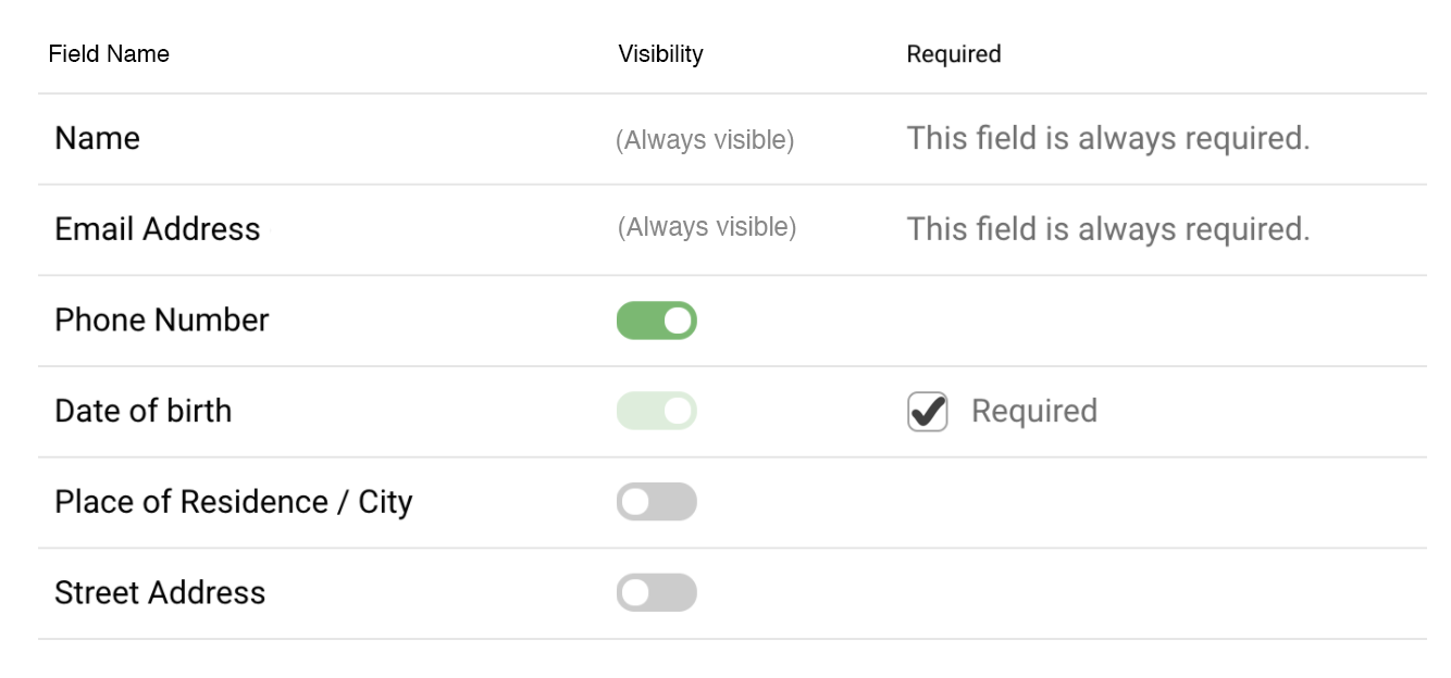
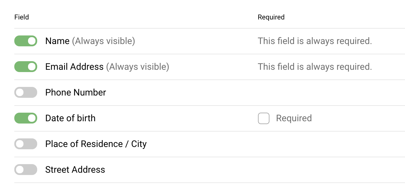
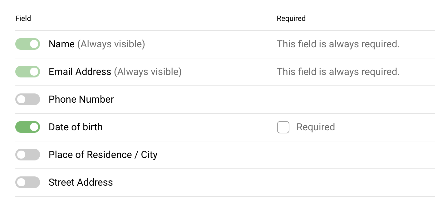
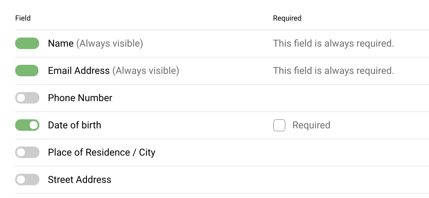
Consider removing UI elements that have no function, and add labels to emphasize the options the user does have.
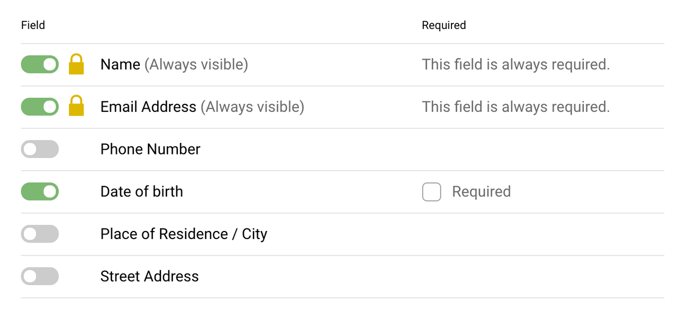
For a simple form, there's a lot going on in this interface. Not only are you letting the user tell the system what fields are visible and/or required, but you're also trying to communicate to the user the situations where they aren't allowed to make that choice. Plus, it looks like there might be circumstances where the user could make an invisible field required, and you probably don't want that to happen.
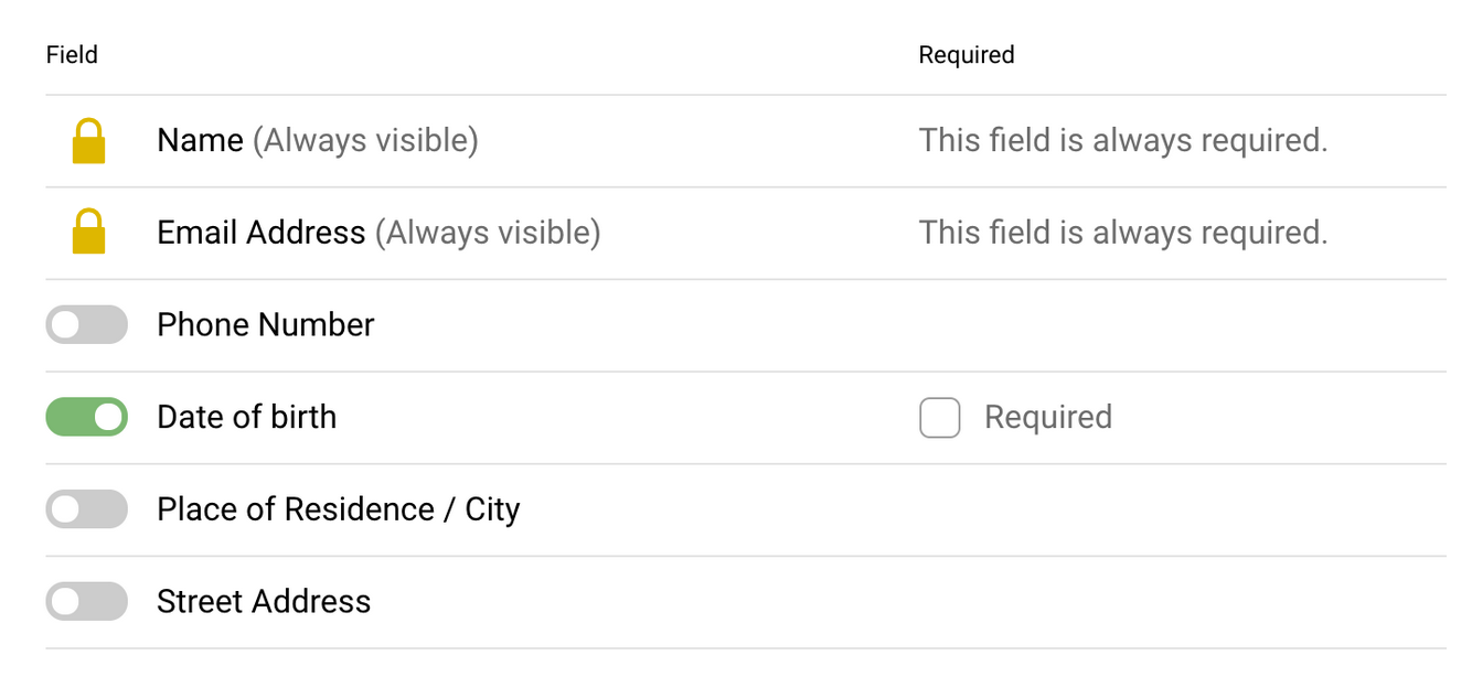
I would suggest moving the visibility toggles into their own labeled column for clarity, and removing the toggles from the two rows where they don't make sense. Having them there, no matter the visual style, will only confuse users who assume there must be some (hidden) way to interact with them. Disabling a control should only be done when the user has some way to enable it nearby.
That also allows you to use the disabled style for when the user checks the optional Required box for a field. You can lock it to "on" when it is required not only to convey why the toggle is no longer available, but to also sidestep the issue of required invisible fields.
