15

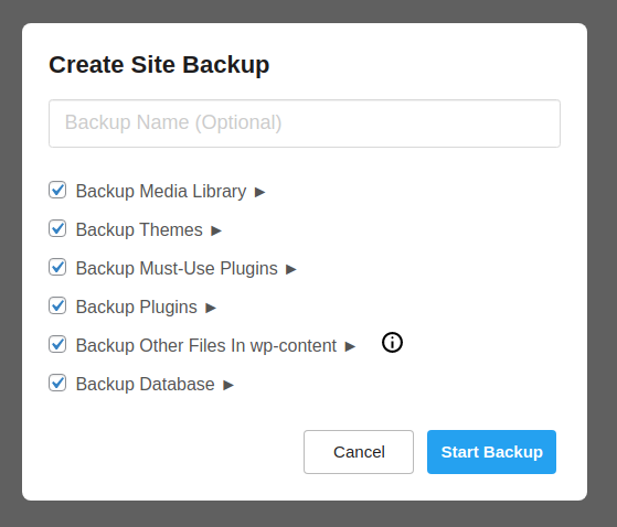
We have a feature where the user can select some checkboxes. They are all selected by default.

We are planning some UI/UX changes that will allow the user to cherry-pick, between these selections, a more detailed list of files/folders from each.

Once the user clicks the chevron, the idea is that a list of files/folders will appear beneath it, where the user can de-select specific files/folders.

This is what the UI mock-up looks like:

dropdown in select

It raises a couple of concerns:

  • When clicking "Backup Media Library", should it select/unselect, or expand/collapse?
  • If the expand/collapse behavior is tied to the chevron alone (my preference), is it too small for the user to click? Should I replace it with something bigger, like [Show/Hide]?
  • In this specific application, desktop users is a vast majority, but is this friendly enough for mobile users?

Bonus question: When expanding multiple sections, should I collapse the other sections, keeping only one expanded at a time?

1
  • 1
    Move the chevrons to the left of the checkbox, and you will end up with a treeview as suggested in the answers, which is the de-facto standard UI language for this type of thing. Commented Jun 6, 2021 at 15:49

3 Answers 3

35

My initial thought is that I'd personally avoid attaching a chevron to the checkbox like you've got in your screenshot because it's an atypical design pattern and therefore pretty safe to assume that a (possibly significant) percentage of your user base won't be familiar with it and they'll have to work to figure it out, which means increased cognitive load, and many may not recognize that the functionality to expand is even present and miss it entirely.

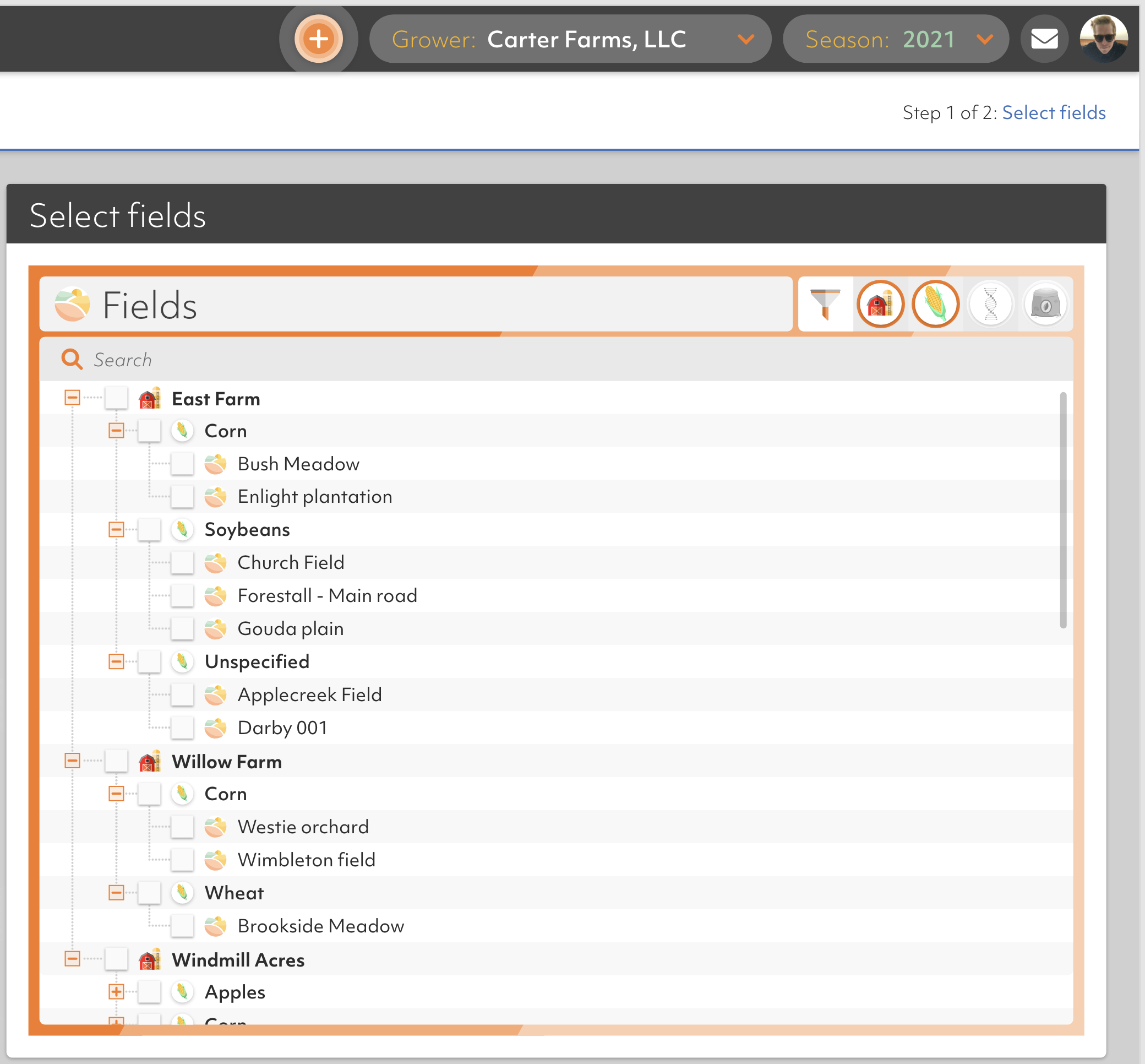
An alternative solution that is a more common design pattern would be what we call a treeview component. Here's a screenshot of one that I designed in our app.

Treeview component

It offers all of the same functionality that you're after i believe, and also brings scalability and as many levels of hierarchy as you want. Collapsed sections have a '+' beside them, which when clicked expands the section and displays the children. Children can also be expandable, etc. I think this might work better for you because most people have a basic understanding and level of familiarity with this functionality compliments of early Windows UIs. Of course it can be dressed up and polished better, but in the end I would opt for utilizing a design pattern that is more commonly recognized versus inventing something new that your users will have to learn.

6
  • 1
    Great suggestion, I'd also force submenus open when parent is checked(selected), and collapse them when parent is unchecked(deselected).
    – TCooper
    Commented Jun 3, 2021 at 21:49
  • 1
    @ke11en we've considered this structure, but those selections don't necessarily match a filesystem structure, the filesystem can look like something completely different, and I didn't want to confuse the user by showing a filesystem-like tree that does not represent a filesystem Commented Jun 4, 2021 at 1:34
  • 1
    @TCooper It is a requirement that all checkboxes start checked, I think it would get too confusing if I showed all options on the screen at once Commented Jun 4, 2021 at 1:35
  • @LucasBustamante Just make sure to open it with the structure fully collapsed, rather than fully expanded. This and the answer below is the best solution for your problem I am sure.
    – niemiro
    Commented Jun 4, 2021 at 8:50
  • 6
    FWIW, I wouldn't incoporate TCooper's suggestion
    – Strawberry
    Commented Jun 4, 2021 at 12:38
28

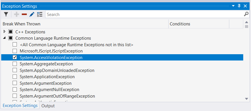
There is a similar UI for managing exceptions in Visual Studio, which is fairly intuitive: enter image description here

The key differences to the UI you have shown are:

  • Chevrons/arrows appear to the left of the top level checkboxes, making the control more like a familiar tree control.
  • The top level checkboxes are tri-state checkboxes so you can see if only all/some/none of the child items are selected even when they are collapsed.

Following this design the answers to your questions would be:

When clicking "Backup Media Library", should it select/unselect, or expand/collapse?

It should select (if not fully selected) or unselect, but not expand/collapse.

If the expand/collapse behavior is tied to the chevron alone (my preference), is it too small for the user to click? Should I replace it with something bigger, like [Show/Hide]?

It's no smaller than other UI controls, and seems to work fine for a desktop app, but probably would not be great in a touch UI, and I expect it would need to be larger.

In this specific application, desktop users is a vast majority, but is this friendly enough for mobile users?

It would probably need to be larger in a touch UI.

Bonus question: When expanding multiple sections, should I collapse the other sections, keeping only one expanded at a time?
No. The user may want to be able to see all the details, and scrolling would be better than expanding/collapsing.

6
  • 1
    Too small a comment for a complete answer - but worth noting that the user will expect to be able to click on the text of the control, as well as on the chevron, to select/expand it. Commented Jun 4, 2021 at 12:33
  • I can't speak for Linux/Unix systems, but as a multi-decade user (and developer) of Windows software, this is exactly what I would expect and I would be able to use this design completely instinctively. If this matches the UI/UX on *nix systems, then this would appear to be a pretty much perfect answer (with the touch-interface caveat from@simonalexander2005 [nice catch], of course).
    – Spratty
    Commented Jun 4, 2021 at 15:42
  • I would make clicking on the text activate the expand/collapse verb, not the select/deselect verb. Expand/collapse is non-destructive, it only changes the presentation of the same information. In contrast select/deselect is destructive, if there are N descendants then there are 2**N combinations before doing select/unselect on the ancestor, and only 2 after -- clicking a second time will not undo the information loss.
    – Ben Voigt
    Commented Jun 4, 2021 at 22:44
  • @BenVoigt Except that runs counter to how checkboxes have worked in Windows user interfaces for 25+ years. If I clicked on the text attached to the checkbox, it would be completely unexpected behavior for it to do anything other than toggle the state of the checkbox.
    – 17 of 26
    Commented Jun 9, 2021 at 14:52
  • @17of26: And your preferred behavior runs counter to how trees have worked in user interfaces for 2 decades. Either behavior is going to surprise someone. The difference is that surprising expand can be undone, and surprising check cannot.
    – Ben Voigt
    Commented Jun 9, 2021 at 15:00
7
  • When clicking "Backup Media Library", should it select/unselect, or expand/collapse?

It should select/unselect. This is the default behavior and makes the checkbox more accessible.

  • If the expand/collapse behavior is tied to the chevron alone (my preference), is it too small for the user to click? Should I replace it with something bigger, like [Show/Hide]?

Use indeed links or buttons with a descriptive label: "Show files and folders" and after expanding "Hide files and folders".

  • In this specific application, desktop users is a vast majority, but is this friendly enough for mobile users?

Making it responsive should not be a problem. You can let text wrap like this (or keep it always this way):

enter image description here

Bonus question: When expanding multiple sections, should I collapse the other sections, keeping only one expanded at a time?
Keep it expanded. Change the "Show files & folders" button to "Hide files & folders" when expanded and let the user be in control.

Your Answer

By clicking “Post Your Answer”, you agree to our terms of service and acknowledge you have read our privacy policy.

Not the answer you're looking for? Browse other questions tagged or ask your own question.