1

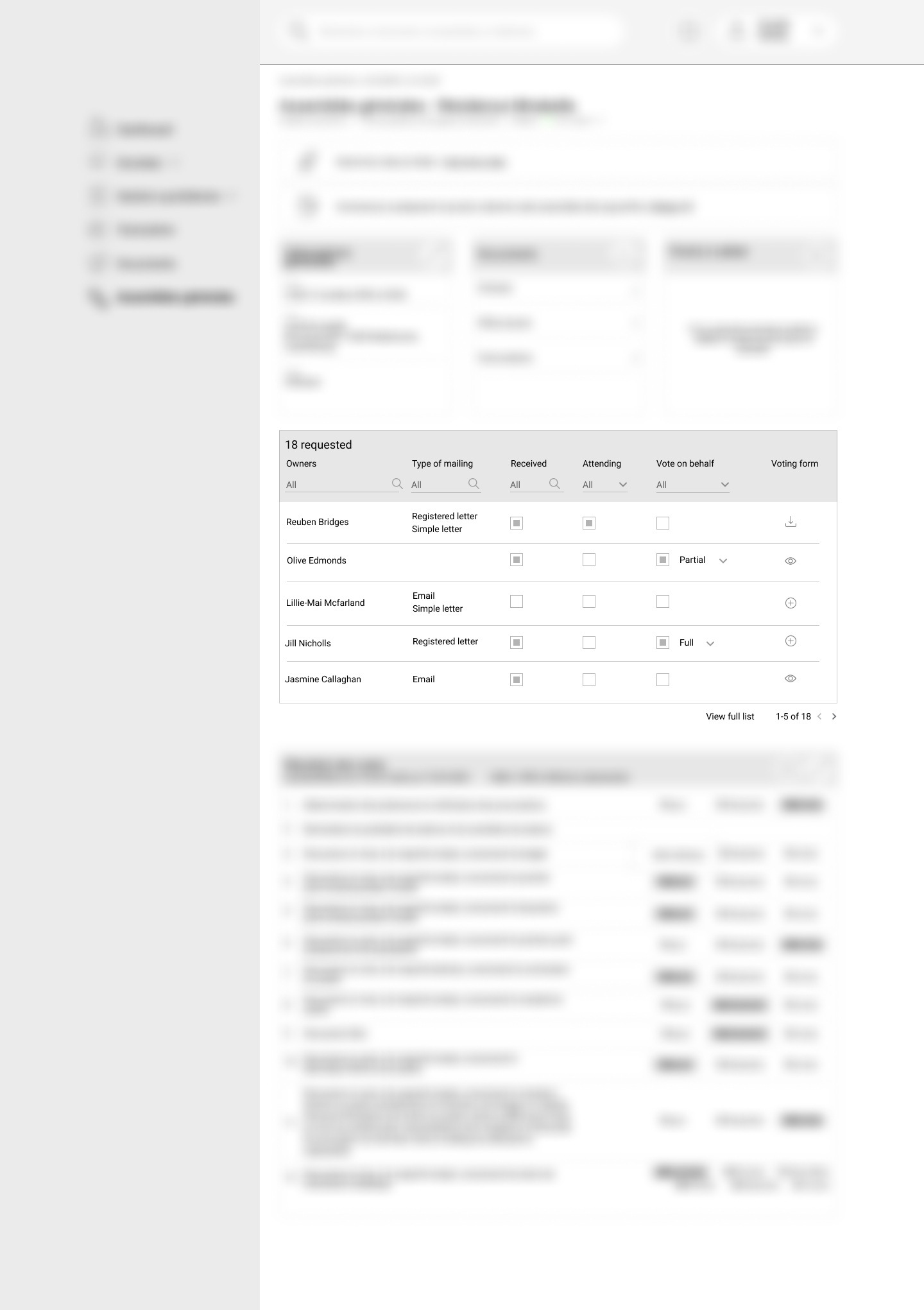
In this project, invitations are sent to users in different ways to invite them to vote. They can accept to come or not. And give a mandate to someone else to vote in their name.

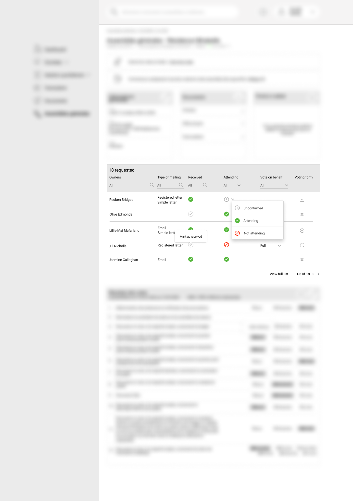
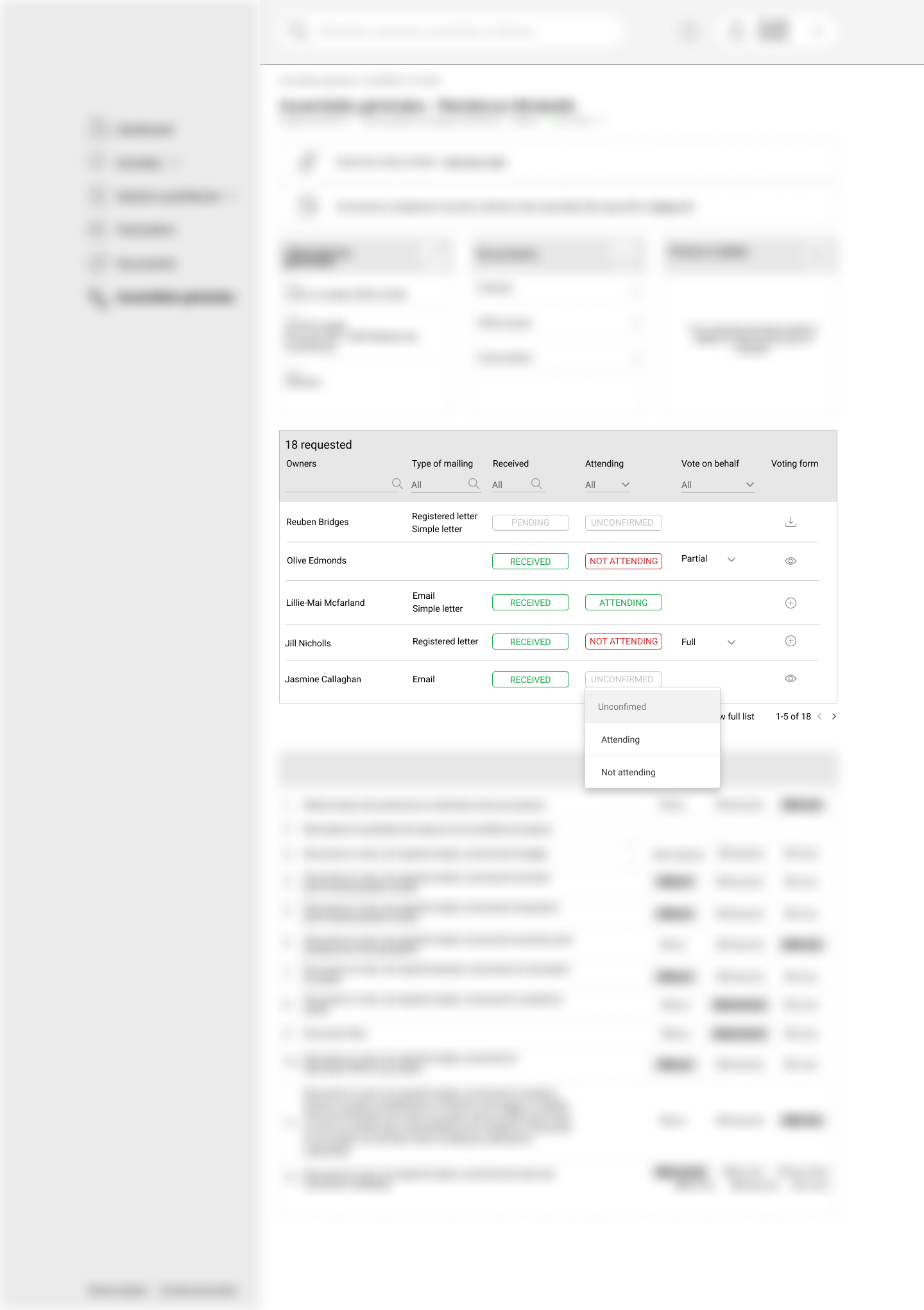
This list should give a snapshot of who received the invitation and who will come. But the admins should also be able to act and change the status manually.

The stakeholders imagined checkboxes in their description. This did not seem to us as the best approach: risk of error, lack of status, not clear if action is saved or not...

We propose alternatives.

  • Simple clickable icons - easily recognizable - behaviour could be yes/no or on hover could reveal an option to show a drop-down menu, immediate update
  • Simple status markup - all same size clickable to change the status. Same advantage. Using text instead of graphic item.

Have you experienced any more relevant approaches? Or are the checkboxes finally a more straight to the point solution?

What could be a could a good alternative to checkbox in such cases?

A usual thank you very much for your feedback, very appreciated :)

enter image description here enter image description here enter image description here

4
  • Please accept that your first attempt to post this question was closed for a reason. We don't do "site reviews" here. You can't just post your work and ask us to give you opinions on it. Please read help center and see if you can edit your question to fit with the posting rules.
    – musefan
    Commented May 11, 2021 at 8:02
  • I thought the problem was a phrasing issue. The question seems generic to me. The goal was not to choose among the A/B/C version but to think about features that help in a general way to manage this type of problem I've already faced in the past, illustrated with a specific use case I'm facing these days (we are encouraged to put illustrations for the understanding). I was able to find some examples in some interfaces, I wished to collect the experience from others and I think that it would have been useful not only for me. I do not want to create a controversy, I will withdraw the question.
    – Nicolas
    Commented May 11, 2021 at 8:17
  • Well, you are welcome to leave the question up. I am only one person and it take multiple people voting to close a question, so other people may not agree with me and leave it open. You may even get the answer you are looking for. But in my opinion this post is just a dump of your site and you are asking people to give their opinions on what you have done. I don't really see any specific question here that a potential answer can focus on. Again, that's just my opinion. What you should have done is tried to modify your original question to be more accepted, not just copy and paste it.
    – musefan
    Commented May 11, 2021 at 8:22
  • You are really attributing to me intentions that are not mine. The context has not changed, I have not rephrased it, that's true, but I have explained the thinking process, with only one generic question remaining at the end, what is the best alternative to a checkbox? In search of a better solution, I haven't think about. Sorry if I didn't do it right, it was not intentional, But finally, enough debate, I close the subject...
    – Nicolas
    Commented May 11, 2021 at 8:50

1 Answer 1

0

A checkbox would be fine if there were only two states: Confirmed Attending or not. This may be functionally true in some cases. For many applications, No Response is treated as the same as Confirmed Not Attending, especially if it’s after a certain deadline. However it sounds like you need to distinguish between Not Attending and No Response. Maybe your users need to know who to make follow-up phone calls to. I'd guess your stakeholders simply didn’t think of that when they gave you their description, but that’s why you’re the designer, and they are the stakeholders.

In any case, you have a three-state attribute to track: Attending, Not Attending, and No Response (or, more generically, Unknown). Don’t make it complicated or unfamiliar for your users. Use one of the standard controls for more-than-binary attributes:

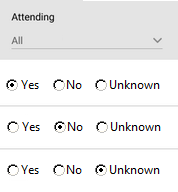
  • Radio Buttons. These are best when typically a user must manually edit the attribute. Just one click changes Unknown to Attending or Not.

Radio button for Yes, No, and Unknown

  • Dropdown Menu. This best when the user only occasionally needs to edit the attribute, since it takes two clicks to change it. On the upside, it takes less space and makes it easier for the user to identify the value for given row (only one place to look to). If invitees typically send a response, then this is your solution.

Combo box with Yes, No, and Unknown options

If space is particularly tight, you may be able shorten “Unknown” to “Unk.” Test that your users can understand it.

Graphic coding of the attribute values, such as using color coding and check boxes, is great to help the users scan for certain values, so these can be used in addition to simple words. However, this can be distracting, so only do it if you’re doing it to a lot of attributes, or the importance justifies it.

Combo box with green Yes with checkmarkl, and red No with prohibit symbol

Saving may be automatic when the user changes an attribute, or you can have a Save button.

1
  • Thank you for this interesting feedback. I must admit that I never thought of radio buttons which is obvious but indeed problematic in terms of space. The idea of the drop-down list is finally the one I wanted to achieve, but without daring to display it as such. Hence the idea of an informative pictogram that gives the status information without cognitive effort but that on click allows switching the value. However, your remark is a simple and valid alternative that pushes me to reconsider my copy. Thank you for this input.
    – Nicolas
    Commented May 11, 2021 at 14:58

Your Answer

By clicking “Post Your Answer”, you agree to our terms of service and acknowledge you have read our privacy policy.

Not the answer you're looking for? Browse other questions tagged or ask your own question.