29

Earlier I asked when it the right time to prompt the visitor to opt in for web push notifications (they work on both PC and Android devices).

I was just loading the default prompt and every day maybe just 5% or less than visitors have clicked "allow".

It was suggested I should wait for some user interaction, and show them some info for why they should opt in, so I decide to use a slide box pop up which shows right after user start to scroll down

I have attached my design.

I tested it for a whole day, and 0% have visitors have clicked "Activate Now".

What can I improve? Design, Copy, CTA?

I don't want to display the prompt only after a certain user action or time, since many users view the website just for information and that's fine. it doesn't mean they aren't interested, they just might not have the money to buy the item right now. So with notifications, I can send them an alert a week later for example. that's why it's important to collect permission from as many as possible, or I'll lost those leads for good.

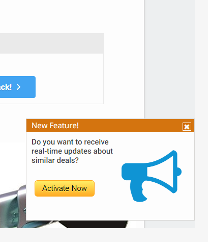
My SlideBox

11
  • 144
    The obvious null hypothesis is that they don't want whatever it is you are trying to sell. No matter what they taught you in business school, no amount of usability engineering can bridge that gap.
    – tripleee
    Commented Apr 26, 2021 at 10:07
  • 80
    The reality is, most people don't want inboxes full of spam, and you can't change that. Any half-intelligent shopper will look for deals as and when they need to actually buy something. My point is, don't expect to get much interest from things like this.
    – musefan
    Commented Apr 26, 2021 at 14:08
  • 72
    You show this right after the user starts to scroll down? So if I'm interested in your product, and I start reading to learn more about it, you immediately block me from reading what I'm trying to read, and ask me whether I'm interested in something else? I'd say that's a question which I can't possibly answer at that time. And if you're preventing me from reading about the thing that I'm actually trying to learn about, then sorry, but I'm leaving your site and never coming back. Commented Apr 26, 2021 at 19:37
  • 13
    Users have been conditioned that pop-ups = "crap they are so uninterested in that the website has to force them to interact with it".
    – JS.
    Commented Apr 28, 2021 at 0:16
  • 15
    Yes, this popup can absolutely be improved. By ceasing to exist.
    – Jivan
    Commented Apr 28, 2021 at 18:17

8 Answers 8

177

Pop-up windows are a pestilence on the web. Users are fed up with them.

People visited your web site because they wanted to view information about some product. But as soon as they started scrolling down, an annoying pop-up window appeared in the middle of the screen, blocking what they were trying to read.

Their response was simple - get rid of that window by the quickest way possible, by clicking on the "X" button. This allowed them to carry on with what they were reading.

What can I improve? Design, Copy, CTA?

Get rid of it entirely. Provide an option somewhere on the page that they can click on if they want to sign up for updates. But be aware that most people wont click on a "please send me lots of spam on products that you want to sell to me" link.

13
  • 111
    @Nash My point is that improving the popup won't help. You can make the text more informative, or the graphics prettier. You can change the precise moment that it pops up. None of this will help. Users will close that popup as quickly as they can, regardless. The only solution is to stop using annoying popup windows, and find another way to do it.
    – Simon B
    Commented Apr 26, 2021 at 19:26
  • 85
    Your explanation might be too optimistic. The quickest way to get rid of unwanted popups on a site is to close the main window, not the popup, and never visit that site again.
    – alephzero
    Commented Apr 26, 2021 at 21:27
  • 19
    OP asked literally "can [the popup] be improved?" and this answer explains why no one is clicking. The only improvement to this answer would be to start with with a large boldfaced "No. The popup cannot be improved in such a way as to make more people click on it." leading into the current first sentence "Pop-up windows are a pestilence..."
    – shoover
    Commented Apr 26, 2021 at 21:46
  • 19
    @ScottCameron This is called a "frame challenge", and is generally accepted in the Stack Exchange network: meta.stackexchange.com/questions/263661/… In essence, sometimes the querent is expected to have more success with a different strategy; based on vote counts, this appears to be such a case. Commented Apr 27, 2021 at 13:20
  • 20
    It's an X/Y problem. OP has basically said 'I need Y to happen. I have tried X but it isn't working, so how can I fix X?'. There's no point trying to fix 'X' if it's not actually going to solve 'Y'. It's like saying 'My car is out of fuel so I hit it on the wheel with a hammer but that didn't work, so where else should i hit it with the hammer?'.
    – JonW
    Commented Apr 28, 2021 at 12:40
39

As other have said, most visitors have developed a banner blindness and will either ignore or close your pop-up without reading its content. Improving the content of the banner will have minimal effect on this behavior.

A better alternative would be to advertise your feature inside the page content and not as a generic overlay. Depending on what value your feature provides, you should place an access to this feature in strategic locations:

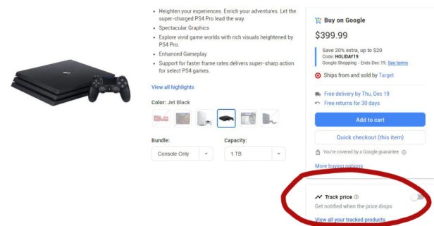
  • If your feature provides a way to track price change: put a button next to the price labelled "Track". Here is an example of this that used to be implemented in Google Shopping*: enter image description here
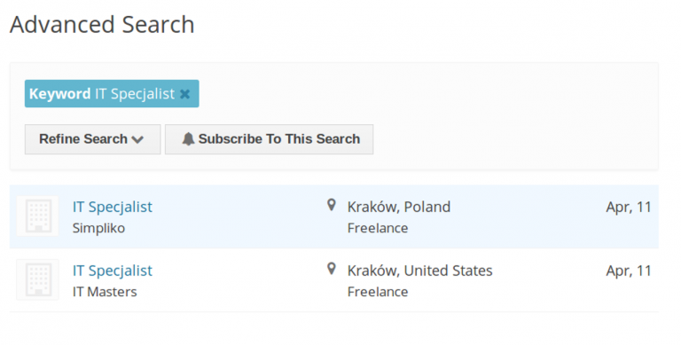
  • If your feature provides a way to subscribe to new offers without having to repeatedly make the same research: put an action button on the search page labelled "Subscribe...". Here is an exemple of this implemented in the Job Board Wordpress Plugin*:enter image description here
  • etc.

If all of the above is covered by the same feature (browser notifications), once a user click one of those buttons you can explain in a modal window the benefits of this feature (e.g. "Activate notifications to get price tracking & much more...") with an action button to activate it.

Users will be much more attentive to the content of the modal that opened while looking for the feature than a pop-up that opened automatically out of context.

*: I have no affiliation with either of those websites, they're just the first results I found in Google image. Those screenshots are used for educational purpose only under the fair use policy. If anyone wants to replace them with wireframes, feel free to do so.

1
  • 6
    This is the difference between asking the user to use a feature and simply making it available should the user wish to use it. The former is viewed as the annoying digital equivalent to a telemarketer. The latter is much better UX because the user is in control at all times.
    – bta
    Commented Apr 28, 2021 at 22:49
25

There are a few issues that spring to mind here.

For example:

  • The title of your Popup is 'New Feature!', but you don't explain clearly what that feature is OR why it's of value to the user.
  • If the current 'deal' the user is viewing isn't interesting, why would they want updates of a similar type?
  • The button text says 'Activate Now'. Again, the user may not fully understand what you are asking them to activate OR how this 'feature' benefits them.

Employ some meaningful UX copywriting to grab the attention of the user. The title could read something like: 'Get notified about new deals!' or 'Find out when new deals launch!'. This will introduce the benefit before the ask for a commitment.

Make the body copy more informative; tell the user what benefit they can expect to receive for choosing to activate notifications and why it's a great idea. Generalize this so it doesn't sound specific to whatever they're currently viewing.

Lastly, change the button copy to something more human: 'Yes, please' or 'Sure, notify me'. Adding a secondary CTA to allow users to say 'No, thanks' could be beneficial for tracking your Yes vs No % rate over time.

3
  • Nice suggestions. to answer "why 'deal' the user is viewing isn't interesting", it's a bit tricky - some users would buy if the price was lower. but I don't want to explicitly tell them to subscribe and wait for a better price alert, because then other users might not buy at the existing price, after seeing such message, and they will think I admit that if they wait they might get a better price. any way how to take on that? Commented Apr 26, 2021 at 14:00
  • 32
    I doubt that the users are even reading the popup before they click the X. They just see an annoying interfering popup over the text they were trying to read and, as Simon B says, they click the X as fast as they can so they can get back to the task at hand as soon as possible.
    – shoover
    Commented Apr 26, 2021 at 21:49
  • 11
    @thenondeveloper Please internalize shoover's comment. People really don't read popups and decide whether they want to engage with the CTA. They look for the x to close the popup, or they just leave the site.
    – Tashus
    Commented Apr 27, 2021 at 19:26
18

TL;DR You don't, and can't, get high response rates because nobody wants the notifications.

Nobody, and I mean NOBODY, actually wants to "opt in for web push notifications".

That is the core problem.

One of the absolute top things I do on a customer's computer the first time I work on it is to remove existing browser push notifications and turn off the ability of web sites to ask to add new notifications (the action that presumably is attempted if someone clicks "Activate Now"). I have never had anyone say "oh, I want to keep those notifications. Never. The vast majority of the time they don't even say anything because they don't realize how easy it is (in Firefox, Chrome and many other browsers) to stop the notifications. Until I say "should I get rid of these notifications" and they typically tell me "Yes, please!"

Nobody wants these things. NOBODY.

Email is a different story. There are many people who are OK with periodic (weekly or even daily) emails from many different vendors or other organizations. There is a big difference between email and web push notifications: Control. The end user can delete the email as easily as they can close the push notification. But they also only see those emails when they want to look at email. If they are doing something else, they don't get bothered with notifications. In addition, power users can setup filters to automatically file the emails so that they are even less intrusive.

5
  • 5
    I don't agree that the feature is entirely unwanted. I have occasionally deliberately signed up to get notified when a particular live stream starts. I also believe there some people want notifications from web apps like gmail. It's just that nobody wants them used as advertisements instead of being actual notifications.
    – Džuris
    Commented Apr 28, 2021 at 6:55
  • I would take those same notifications (as I do with appointment reminders, Google Doc updates, etc.) via email. Not guaranteed timing, but by and large unless your internet connection is down (in which case a live stream isn't going to work either) pretty fast and "good enough" - and still retain control over when/where I see the notifications, etc. Commented Apr 28, 2021 at 14:10
  • That's if you're not relying on a web email client which can only notify you via this very mechanism.
    – Džuris
    Commented Apr 28, 2021 at 14:22
  • The people I know relying on a web email client (even myself if I am at a customer site, under some limited circumstances) just pop over to that browser tab every so often. Plus if you're using a borrowed computer (friend/family, library, etc.) then you often couldn't (or at least shouldn't) turn on notifications anyway. Commented Apr 28, 2021 at 14:53
  • 1
    I think the only cases most users actually want to click a "notify me" button is when it's for something very very specific. Typically a "let me know when this product is available" situation. Or alternately, when they're job-hunting or similar and need to be notified of jobs meeting their criteria. "Give us your email so we can send you stuff we think you might be interested in" might as well read "We want to spam you, click here to let us" as far as most users are concerned. Likewise with push-notifications or allowing the site to know your location. It's just not in the client's interest. Commented Apr 29, 2021 at 9:55
14

I think the biggest issue here is that it's not clear what will happen once I click that CTA (as Scott mentioned).

Where and how will I be notified? "Activate" sounds like I will be installing a new program or browser extension. The best thing to do is just make it more clear what you actually mean.


Another issue could be, that it visually looks like an ad and people have developed a banner blindness.
Though I am not a visual designer and don't know what exactly would have to be improved in that regard.

Maybe the icon could already show more?

9
  • 3
    @thenondeveloper I understand, but I'm not saying explain in 100% detail what will happen etc. Just a bit more context to what "activate now" will do. For example something like "Not sure yet? Set up notifications when this or similar products go on sale!".
    – Big_Chair
    Commented Apr 26, 2021 at 15:16
  • 1
    @thenondeveloper Look eg at idealo.co.uk - they have price history and price alert sections, absolutely nonintrusive, even I almost clicked on price alert few times :)
    – Arvo
    Commented Apr 27, 2021 at 17:22
  • 1
    @thenondeveloper This site was just an example of good ux, they do not sell anything themselves, they just aggregate price info - thereby no bad business there :)
    – Arvo
    Commented Apr 28, 2021 at 7:45
  • 1
    @thenondeveloper If it's bad for your business for people to know what your historical prices are, why do you change your prices like that? You're in the business of selling things that people want for a fair price, not deceiving people into buying things for an unfair price. (Aren't you?)
    – wizzwizz4
    Commented Apr 28, 2021 at 14:10
  • 1
    @thenondeveloper Hmm. In which case, wouldn't it be strictly better for you to make the market more efficient? Having people checking back for a better price later can't be bad; it's more people checking your site more often while considering a purchase.
    – wizzwizz4
    Commented Apr 28, 2021 at 14:52
11

Drop the popup, make it an option in the main page. And make it look better integrated with the rest of the page (e.g include it in a list of options with "buy now" and "add to wishlist")

At the moment, that look like an advert, spam, or clickbait, trying to trick users into going to a different (potentially malicious) website. It hits almost every red flag and alarm bell in my head, bar two: it's not trying to say that I've won anything, and it's not showing or implying people in various states of undress.

If you insist on having a popup of sorts, then there are 3 ways to make it look less like a phishing expedition, and more like it actually belongs on the website. First, try to improve the text slightly. "Activate Now" does not make sense in that context, try something like "Add Alert" (and, include a "manage alerts" button beneath it, so that people can check what types of products/deals they are currently subscribed to), and probably get rid of the "New Feature!" title.

The other two options would be to have it as a narrow bar along the bottom of the screen, or to have it appear in what would normally be whitespace (e.g. the StackOverflow "Manage Cookies" popup, which appears under the menu on the left of the screen) — notably, both of these ensure that you don't block the user's attempt to view the actual content.

10

It's possible that 95% of your visitors don't want push notifications.

My humble suggestion: Put two more buttons on the pop-up. One that says, "Close this popup" and a second that says, "Close this popup and never show me another pop-up on this site again."

Tally your responses. That will point you in the right direction.

3

I believe I can answer this question. Couple of years back I faced similar issue of users not clicking the pop-up as I desired. So, as you have mentioned that users would mostly leave the page after they get the desired information. In order to increase the conversion rate what I did was, instead of using the pop-ups I used to place the same content of pop-up box into a placeholder so subtly that it would blend-in with the rest of the content and at the same time it wouldn't stand-out as a pop-up, still would hold it's relevance and convey the desired message.

For e.g., Let's say the article was on optimising the memory(space complexity) of a search algorithm. So I would place one or two subtle placeholders saying 'Get weekly article on optimising algorithms in your email' and similar with the CTA containing similar accent colour. And at the end of the article I'd place another message placeholder saying:

'Get more algorithm optimisation guides delivered directly into your inbox! Send me the weekly news letter'

I hope it gives you some kind of rough idea to begin with.

Your Answer

By clicking “Post Your Answer”, you agree to our terms of service and acknowledge you have read our privacy policy.

Not the answer you're looking for? Browse other questions tagged or ask your own question.