While others jump into solution too quickly, I'm going to bother you with some other questions and suggestions.
- Are you on a responsive situation? (mobile, tablet, desktop, at least)
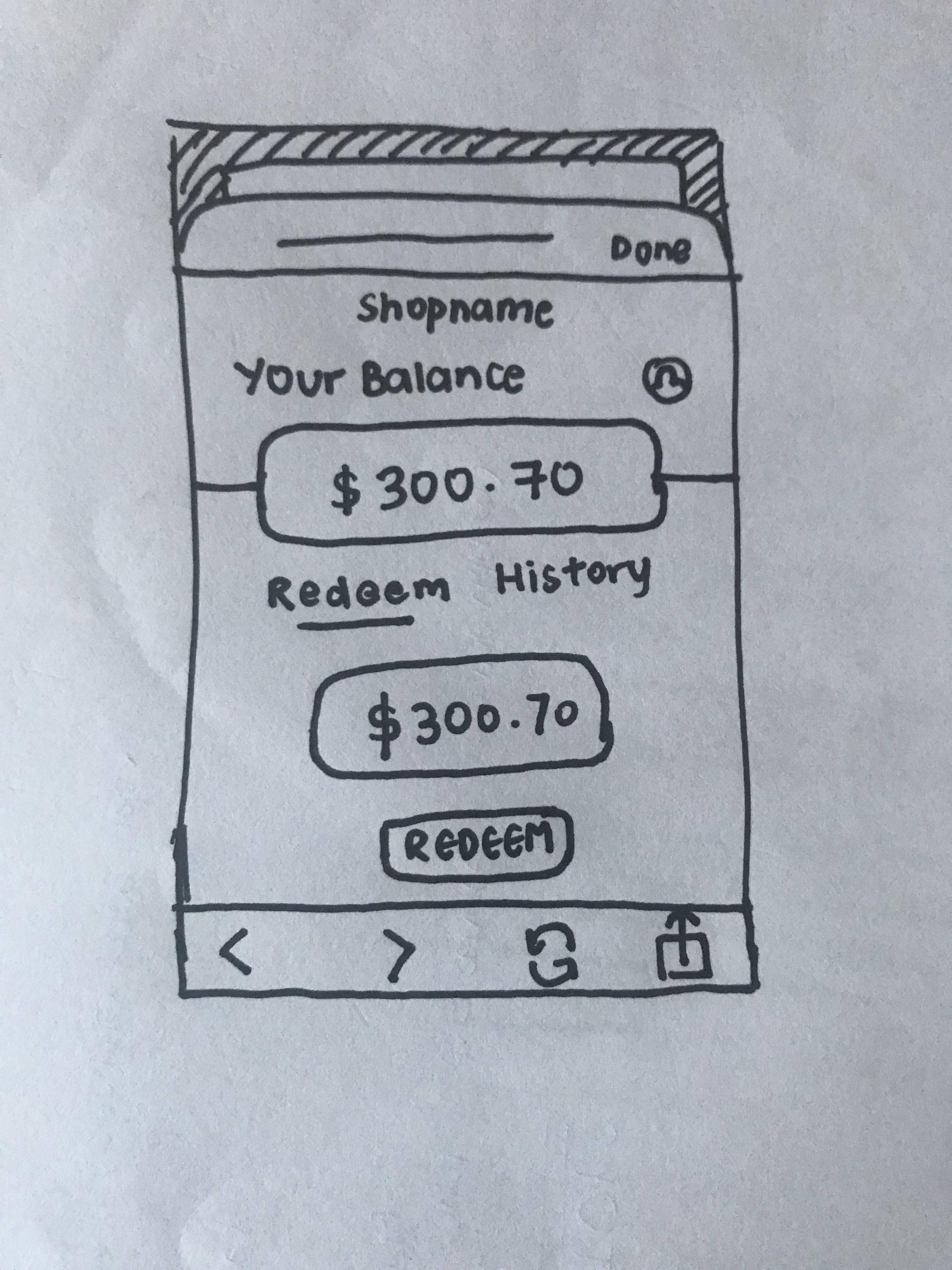
- What are the previous steps? (I don't know why you already have an amount in your field)
My thoughts:
Mobile devices
Having a editable field with a cursor into that field (like autofocus or other technique) will activate the keyboard for obvious indicator that the field is editable. If this behaviour seems good for you, I'm sure that the user will find it visible enough.
That's only for the case where the completion of the field is mandatory, or at least you can be sure that's is supposed to be the next step when you land on this page/view.
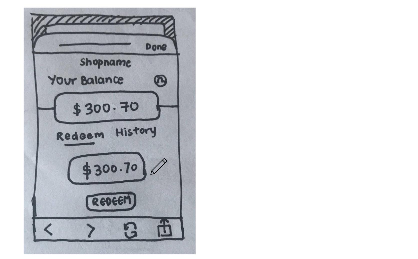
If the content of the field if pre-filled but the user can edit it, I would personally go for a "field appearance" (depending on your existing UI for this component) and a little "Pen" icon next to it to indicate it's editable.
If you have a bit of room for it, I would add the text below the field saying that's an editable field, but it depends of the type of users you are focusing on. Being explicit can be good for inclusivity when things around are not explicit enough.
Desktop devices
As the autofocus on a field doesn't make your keyboard pop (that would be fun to imagine though :D), you need some indicators mentioned above on the mobile section.
The best way I found on a web page that requested a One Time Code (those code you need to use for double authentication), is to have a slow focus effect on the field, for instance: a border or bow-shadow that grows from 1px to 3px with a color change, in 700ms.
This is not an obvious way to show something is editable, but it shows that the cursor just land into this editable field.
Don't hesitate to multiply indicators, finding a balance between overwhelming and explicitation :D
Good luck 😊
PS. that's my thoughts with no knowledge of your target.


