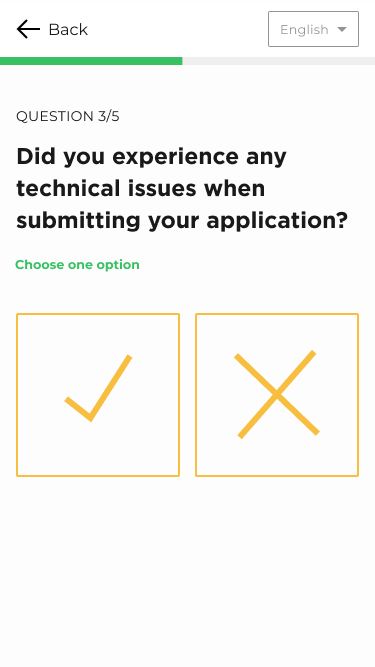
I'm concerned about your opinion - what do you think about the graphical description for yes and no questions? Do you believe that they are not neutral enough? 
-
12They just look unnecessarily big, it makes it hard to recognize the options in one glance. If they were smaller and a bit further apart, it would already be much more familiar for the eye (because we know it from other software). Then a quick decision is possible.– Big_ChairCommented Apr 8, 2021 at 9:33
-
3Also, icons only are sometimes a bit confusing. Maybe writing out Yes and No would be beneficial. In terms of neutrality they literally look the same, which might even be a hinderance because I can't tell what's yes and what's no on first glance and have to think first.– Big_ChairCommented Apr 8, 2021 at 9:35
-
20The tick means the application passed the test without any issues yeah? That's the issue with those icons, they can mean pass/fail more so than yes/no.– musefanCommented Apr 8, 2021 at 9:40
-
9There’s also a localization issue here: In some countries, such as Sweden or Finland, a tick/check mark (✓) can mean “incorrect”/“wrong”, which is of course completely different from the common meaning of “yes“/“correct” in other countries.– SocobCommented Apr 8, 2021 at 18:15
-
3Adding to @Socob's comment, refer to the PS5 Button Controversy– istrasciCommented Apr 8, 2021 at 19:30
4 Answers
The problem with icons is that they can mean different things to different users. In this instance they could be confused with "pass" and "fail" as that is essentially what the question is asking. Which would result in the opposite of what you want them to mean.
At the very least, you should include some text with those buttons. That way you don't rely on the user having to guess what the icons are supposed to mean.
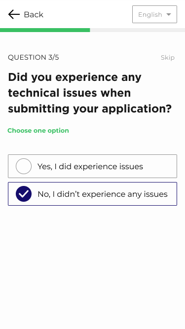
However, my suggestion would be to remove the icons completely. Just stick with what people are familiar with when they do a survey. Have a simple list of text options to choose from. Something like this:
You are not limited to a simple style, you can make them look like nice buttons with a more attractive radio button/checkbox graphic, but the overall aim is to have clear, descriptive text alongside a selectable button.
There is a good reason why most survey UI designs use this simple approach, and I can assure you it isn't because nobody was ever creative enough to make some nice looking icon buttons.
-
12I agree that the buttons are the wrong way around — but for me, your text options are too! How about: “Was the application submitted OK? ( ) Yes, everything worked as expected ( ) No, there were technical issues”– giddsCommented Apr 8, 2021 at 20:32
-
3@gidds: Well, that is a debate for another post. I was simply matching the question that they are associated with. If OP wants to change the question then that is up to them. Personally I think your suggestion is a bit vague and could imply it is asking about non-technical problems too. This part of the survey may need to be explicitly about technical issues only, so I think the question works ok.– musefanCommented Apr 9, 2021 at 9:33
Thank you for your answers and valuable feedback. In the end, I moved on with radio buttons and regular text as suggested above.
-
5This is better than the accepted answer because it avoids confusing negations– user67467Commented Apr 9, 2021 at 10:35
-
3@theonlygusti. I don't think there was anything wrong with the wording in my answer. Although I do like the wording in the answer too, if not more. It's kind of a distraction from the intended question/answer though which is more about that importance of having text rather than just an icon. But hey, I have nothing against your opinion and you can vote however you see fit :D– musefanCommented Apr 9, 2021 at 16:38
-
1@musefan Oh whoops, I totally misread your answer earlier, I see now the options are actually the same. I guess only difference is active/passive voice. For some reason I misread your answer as "Yes, I did not experience technical issues" (I have no idea how I got so confused) the first time I saw it.– user67467Commented Apr 9, 2021 at 17:56
-
7the words "Yes," and "No," are wholly pointless and confusing! Just leave them out! The buttons should be labelled I experienced technical issues" and "There were no technical issues."– FattieCommented Apr 9, 2021 at 18:16
-
@Fattie, while I agree with you, isn't also the question text technically redundant, since the answers indicate what they are answering? Some redundancy may be good!– LSpiceCommented Apr 9, 2021 at 20:39
They are ambiguous, different cultures use them differently.
https://en.wikipedia.org/wiki/Check_mark
Perhaps use something unsrestood by all cultures, like smiling and frowning emojis instead. But even then include words for those few individuals who do not understand facial expressions.
In primary school, I had half of the teachers using the checkmark to mean that answer was wrong. (V as on 'Väärin' / Wrong in Finnish). And the other half using it to mark the right answers. I'm still confused.


