3

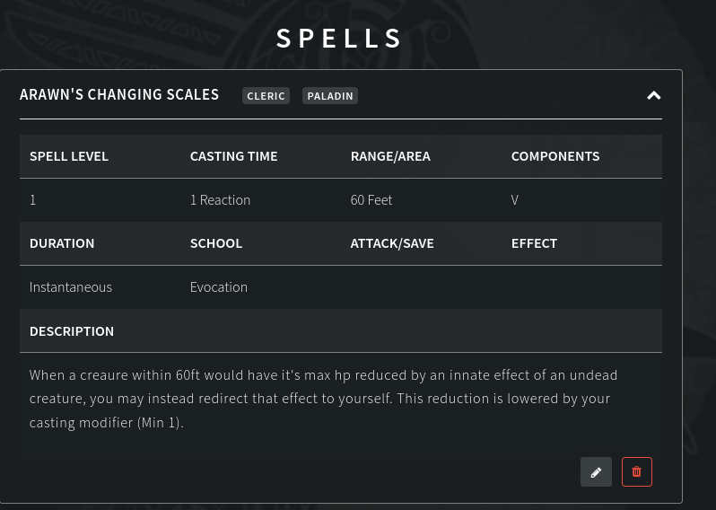
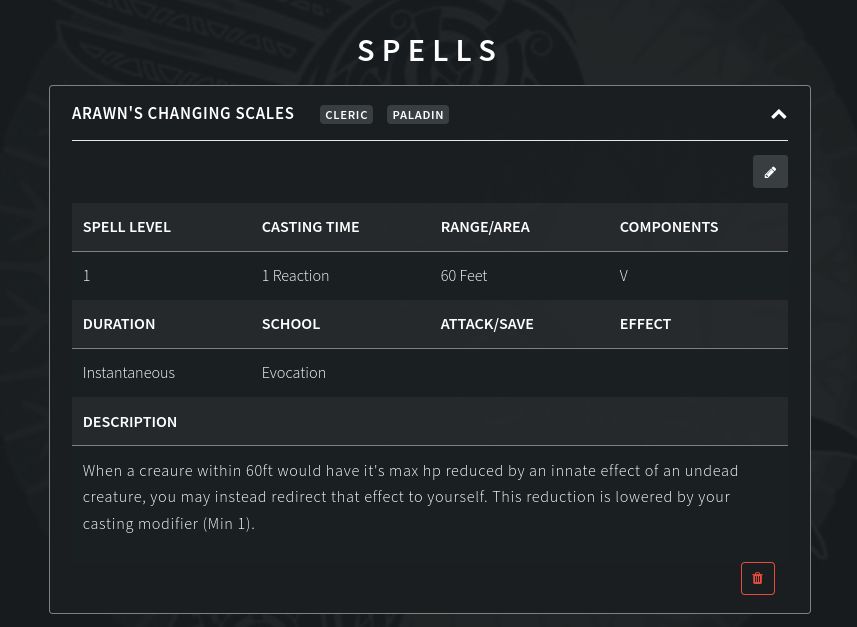
I am a webdeveloper and am looking for a better solution in a private project of mine, which is a wiki-like webpage for a Dungeon's and Dragons campaign. I have a list collapsible panels, each containing information about a specific item (explicitly: Spells). You can click on edit and delete buttons inside the collapsible panel to edit the item's dataset, or delete it entirely. Below a screenshot of my current prototype.

I find the current placement of the buttons somewhat jarring. What would be a better way to do this?

So far I had ideas for the following other approaches that seemed to not quite fit:

  • Put the delete and edit button to the right of the table as opposed to above and below it (I am using bootstrap's-grid, so essentially a single grid column). That has the disadvantage that I'm loosing the screen real estate between these two buttons which shortens the table
  • Put the edit button into the panel-heading. I tried this before with just adding an icon as opposed to a button and found that it's placement besides the chevron seemed... off. It also opens a different question, should I only show the edit button if the card is expanded? If yes, isn't it a bit odd to have a button appear spontaneously like that in a previously visible space?
  • Repeat the card-heading as larger heading in the collapsed card-body. That fills the space to the left of the edit-button, what's a bit odd though is just the repetition.

During an overview over the collapsible panel questions I found this similar question, but found none of the answers quite applicable. As I am by no means a great designer, I welcome all feedback should there be other grave detriments that I threw into the UX and am not aware of.

enter image description here

8
  • 1
    Does this answer your question? collapsible panel and delete button in a web application
    – Nash
    Commented Mar 23, 2021 at 16:29
  • Why is your current solution and are the solutions in the other question not applicable? Is it just aesthetically, or is there some other problem you didn't mention?
    – jazZRo
    Commented Mar 23, 2021 at 16:31
  • @jazZRo It is purely aesthetically. Functionally this does the trick, it just seems aesthetically off. The answers didn't seem applicable in order: Alvaro's suggestions (he made multiple) 1) Put the buttons inside the panel. That's what I did here, it's about their exact placements that my question is about 2) Add checkbox to individual elements and then add a "do in bulk" action-drop-down. In this case you typically do not want to delete or edit in bulk. Your typical usecase is that a new item is created and you add it to the list, or a new ruling comes around changing one of them. Commented Mar 23, 2021 at 17:19
  • As for Gianluca Ghettini's solution (Add a "footer" line to the collapsible panel and add the buttons to that), it seemed unintuitive to place an edit button at the bottom of a dataset, and keeping the edit button in the upper right corner while creating a footer for the delete button seemed unintuitive. The current solution is what I defaulted to as I used the rule "Edit Button in upper right corner, delete button in lower right corner" throughout the project for several pages (there are e.g. pages for individual items/locations/characters that you can edit, all following this rule). Commented Mar 23, 2021 at 17:24
  • 1
    @PhilippDoerner Here's a good discussion on some patterns. Library websites also tend to have good metaphors for the kind of information you're listing here. ux.stackexchange.com/questions/98167/…
    – Izquierdo
    Commented Mar 23, 2021 at 17:46

4 Answers 4

1

The buttons in each case want to be in a group, right next to each other. Whether they should be on top or at the bottom becomes kinda irrelevant, they look quite good pretty much anywhere as long as they stay together.

two buttons below the content

But there's another option still - who are you designing these things for? It looks to me like they're designed for players primarily, but happen to be editable from the front end.

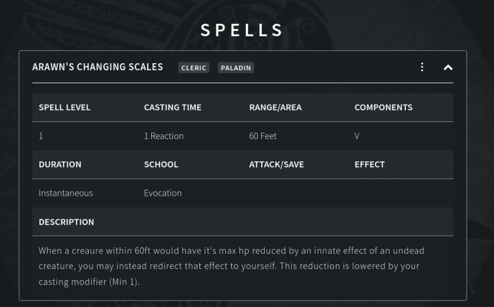
If that's the case, even in the expanded case, the average user doesn't need to see the edit options at first glance. So what you could do is put all of them into an overflow menu which can be placed pretty much anywhere - it doesn't even look out of place in the header!

3-dot overflow menu next to chevron

3
  • They are designed primarily for participants in a given game which as such have the capacity to edit and those not participating in the game and that thus do only get the ability to read. Therefore I hide edit elements from them. I am somewhat terrified of grouping an edit and a delete button next to each other simply because I have the fear it might increase accidental delete-button presses. That is not that much of an issue since I (of course) have a "confirm delete" dialog, but still fear that you could accidentally click the button and on autopilot click the dialogue away by confirming. Commented Jul 25, 2023 at 18:38
  • That is of course highly subjective. On the other hand, your overflow menu I think hits it spot on. It seems intuitive to me and while the closeness issue of the 2 actions is still there, to me it "feels" like (still speaking as a UX beginner) that clicking on an overflow menu and selecting an option is a much more conscious choice than simply clicking on a delete button. Thus the "felt" chance of accidental deletion seems lower. It also looks pretty clean. I think this is the answer. Commented Jul 25, 2023 at 18:40
  • FWIW: Offering an undo option can alleviate the fear of deletes. The standard procedure nowadays is to have a snackbar saying "<item name> deleted. [undo]" which stays for just long enough for you to realize you accidentally deleted the thing, notice the snackbar, read what's on it and click on undo - something around 10s usually works. Commented Jul 25, 2023 at 23:53
0

I don’t have the full context here, so i could be wrong. But something worth considering would be if you really need a collapsible panel at all. Why not just show the content upfront and you could have the edit and delete buttons in place of the chevron. People don’t mind scrolling if you provide a quick way to get back to the top.

1
  • Fair suggestion! But a question for my understanding since I'm still a UX beginner: Given that the horizontal size of every item is as large as what I posted (larger on mobile since that's a smaller screen), that would only be true up to certain amount of items, wouldn't it? E.g. if I have so many items that the user needs to press repeatedly PageDown. What's a good ballpark estimate for when it's too much? As for context, this is where I took the design from: dndbeyond.com/spells . My list of is shorter (~10 items) due to it only having campaign-specific custom spells. Commented Mar 28, 2021 at 9:54
0

Top Left for actions: Edit and Delete. Right for drop down to view, and collapse.

Minimal chance for error, Edit and Delete button never need move, and can be accessed in both states (opened and closed).

-1

Can a collapse / expand icon do double duty with a built-in menu?

enter image description here

2
  • Having things do double duty doubles the likelihood off frustration or error. Commented Mar 24, 2021 at 15:49
  • I like the prototype, but as Nicholas mentioned I have the fear that I might have to "educate" my userbase to expect this kind of behaviour of the icon. I think an approach where the buttons are visible from the get go is needed here. Commented Mar 24, 2021 at 17:00

Your Answer

By clicking “Post Your Answer”, you agree to our terms of service and acknowledge you have read our privacy policy.

Not the answer you're looking for? Browse other questions tagged or ask your own question.