10

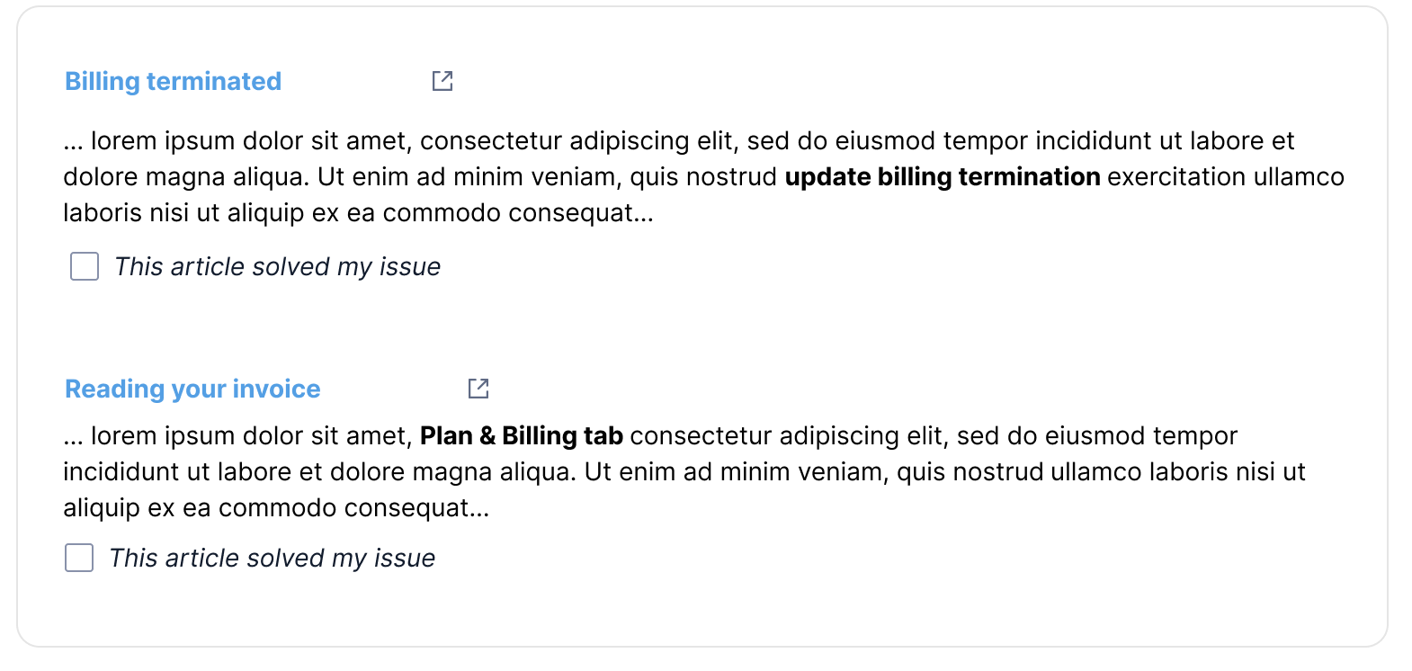
I'm working on a component (see image) that shows the results of a keyword search.

Each result displays:

  • the title/link to an article,
  • a snippet from the article,
  • a checkbox reading "This article solved my issue" that the user can select if the article actually did solve their issue.

A majority of users I asked feedback from said they glanced over or didn't notice the checkbox because it visually blended in with the text above it; they weren't compelled enough to select it.

Is there a way I can visually improve the checkbox, such as a design pattern that may help fix this? I want it to be noticeable, visually pleasant, but not outshine the article title and snippet.

image

4
  • 3
    Is there really a reason you use checkboxes? Is it possible to check several? Is there then a button to submit the whole form? If just clicking on the checkbox is enough, then a button may be more appropriate (though this is usually in the article, not in the list)
    – jcaron
    Commented Mar 15, 2021 at 8:35
  • 1
    I'll tell you how NOT To do checkboxes: twitter.com/settings/your_twitter_data/twitter_interests . Each and every checkbox must be individually clicked to make a change, and each and every click sends a JSON list of what you've unselected. If you try to automate the clicking, or even if you click manually too fast, you end up with 503 errors. Madness. Commented Mar 15, 2021 at 17:00
  • Does the little "square with arrow" icon to the right of the title indicate that the link takes you to an entirely different site?
    – MrWhite
    Commented Mar 17, 2021 at 10:13
  • @MrWhite yes it does
    – darz123
    Commented Mar 17, 2021 at 13:28

4 Answers 4

29

Note: This answer is a frame challenge.

The checkbox should not be there at all.

According to your screenshot, your users use your search engine to find a solution to their billing problem.

You write that your users "weren't compelled enough to select [the checkbox]". And why should they be? They have a billing problem, and so, their number one priority is to solve their billing problem. Informing you about the usefulness of the search results is, at best, at the very bottom of their list of priorities. They have a much more important problem right now than to give feedback to a random stranger on the Internet.

So, when would be the right time to ask them for feedback? After you have helped them solve their problem. Currently, you show them a snippet of a page that could help them. They don't know yet whether this page will help them or not, they need to read it first. And no, they won't make a mental note to return to the search result page afterwards to click your check box. As I said, they have much more important things to worry about right now.

So, where is the right place to ask for feedback? Right after they found the solution. This is what your "Reading your invoice" help page could look like:

Lorem ipsum dolor sit amet, consectetur adipiscing elit, sed do eiusmod tempor incididunt ut labore et dolore magna aliqua. Ut enim ad minim veniam, quis nostrud exercitation ullamco laboris nisi ut aliquip ex ea commodo consequat. Here is how to download your invoice:

  1. Lorem ipsum dolor sit amet,
  2. consectetur adipiscing elit,
  3. click on the "Download" button.

[ This solved my issue ] <-- should be a button, not a checkbox

9
  • 3
    @ljrk: About mistakes: That depends on how "serious" such a mistake is. If the button closes a support request, sure, then there must be an option to reopen it. If the button just gathers statistical information, this kind of "noise" probably cancels itself out in the long run.
    – Heinzi
    Commented Mar 15, 2021 at 13:31
  • 1
    @ljrk: About further feedback: That's a problem of the original checkbox proposal as well. If further feedback is required, I'd use two buttons, as suggested in Mike M's answer.
    – Heinzi
    Commented Mar 15, 2021 at 13:33
  • 4
    For an inspiration, look at any random Microsoft help page, like this one: support.microsoft.com/en-us/office/… You will see a sticky bottom bar with an easy "Was this helpful?: Yes/No" question. Even then, expect the majority of users to not give feedback. They simply don't care. Commented Mar 15, 2021 at 14:37
  • 2
    To a large extent, it can be determined from the user's actions, without explicit feedback, as to what solved their problem. In the significant majority of cases, the last help page article the user looked at (actually looked at, not necessarily the last tab they opened) prior to completing the action they were inquiring about is what solved their problem for them, or they just gave up and tried something. It should be relatively easy to just record the help page the user was most recently viewing prior to completing the action, rather than ask for explicit feedback for one individual thing.
    – Makyen
    Commented Mar 15, 2021 at 18:08
  • 2
    There should also be a thumbs down option if it didn't solve the issue, to the (most of the time) more valuable feedback that the page wasn't helpful Commented Mar 15, 2021 at 18:27
9

Try using actions that represent a clear choice between two outcomes. Phrase in the form of a question or a command to address them directly.

Your question is about graphic emphasis, but I'm suggesting rethinking the checkbox and the writing you have.

A checkbox is associated with a setting or configuration. Here, you're asking the viewer to leave an assessment about the quality of your support, not to configure, add, or other interactions we associate with a checkbox.

Try using opposing controls

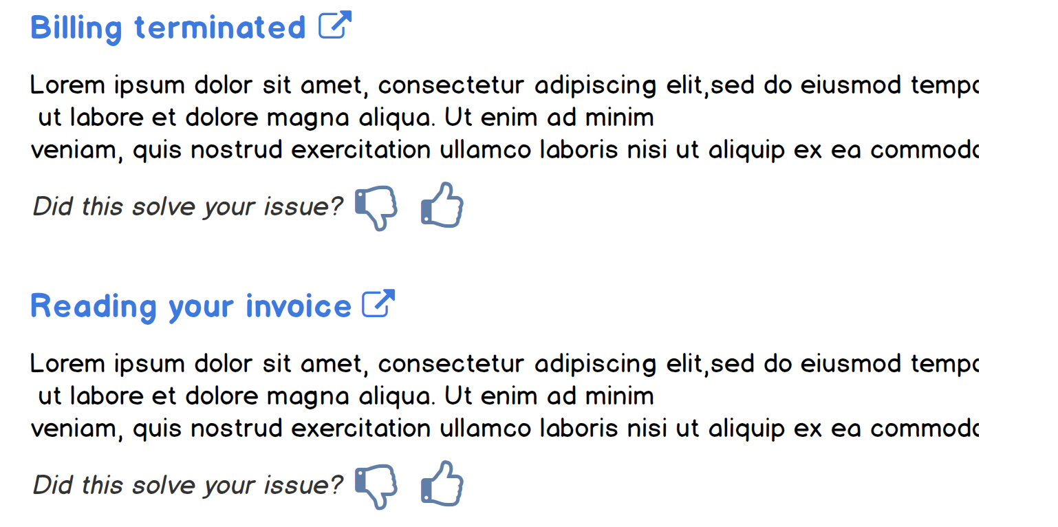
Using thumbs up / thumbs down (Twitter uses smile / frown emojis), you're leveraging a fairly common interaction. Once selected, you can make the icon selected solid, indicating a change of state. This allows them to unselect if they would like to revoke their answer.

enter image description here

You can trying various type treatments, such as italics, which distinguishes it from the rest of the text.

You'll see this in doc sites; here's from Google Cloud, in which they call 'Rate and review':

enter image description here

3

There really isn't a design pattern that would address this, since design patterns are more abstract concepts for solving problems that still require some implementation and testing to see if it is effective.

So while this is primarily a visual design issues, and therefore falls into the domain of Graphics Design StackExchange, the principles used in the presentation of information and the experience of the uses does fall into the types of things discussed in UXSE.

And given this particular perspective or angle into the question, the principles that are applied in visual design which stem from psychological principles are the Gestalt Principles of Design. Without going into too much detail, which would make it a graphic design topic, here is a summary of a process to consider which will improve visibility without disrupting hierarchy:

  1. Look for the most obvious thing that reduces the amount of contrast between the checkbox and the other content, whether it is the colour, size, other visual embellishments or position of the UI element and increase it in the direction of more contrast (e.g. increase intensity of colour or size)

  2. Establish the types of visual design elements used in the component and identify any others that can be used (e.g. icons, text styling, animation, micro-interaction, etc.)

  3. Establish the hierarchy of visual design elements used in the component and sort from the most prominent to least prominent, and work out how you want the checkbox element to sit in that hierarchy

  4. Apply the combination of visual elements to the checkbox and reassess the effect of the change

Now you have a process to experiment with the combinations of visual elements that can be used to manipulate the contrast/visibility of the checkbox element until you achieve the desired level which you can apply iteratively

-2

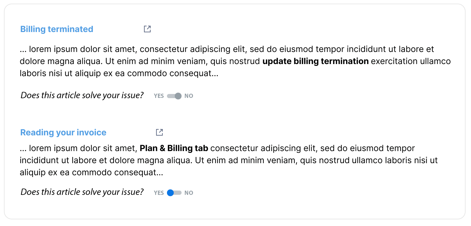
I think the problem is not so much that the checkbox is mixed with the text, but that it is not clear that the user needs to do an action. In fact, the current checkbox looks like a bullet that accompanies the statement of "This article solve my issue".

I would try to make clear the possibility of interacting by showing an active / inactive element accompanied by a question.

enter image description here

1
  • 10
    This is a pretty bad implementation of the switch component. The default state should be "neutral" (with the selector in the middle), and only with a user interaction it should move to the side of either "yes" or "no". The switch component is best used when there are binary options, when the two are the opposite of each other, and when the default selection is one of these two.
    – Adriano
    Commented Mar 15, 2021 at 4:47

Your Answer

By clicking “Post Your Answer”, you agree to our terms of service and acknowledge you have read our privacy policy.

Not the answer you're looking for? Browse other questions tagged or ask your own question.