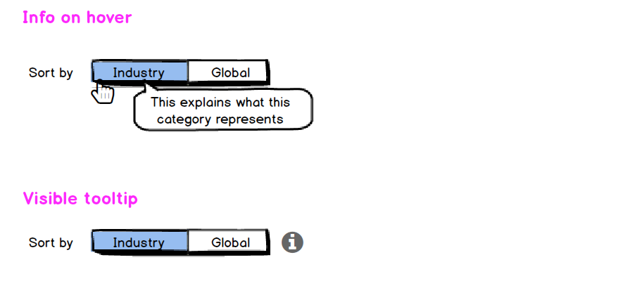
I'm wondering if using a toggle button to enable different views of the data indicated on the platforms is the right solution, especially if the toggle button needs a description so the user is able to understand it. Does anyone have some opinion regarding it?
Toggle buttons - what do you think of using them in SaaS platform if description is still necessary?
-
What do you regard the description? 'sort by' ?– MartynCommented Feb 19, 2021 at 7:41
1 Answer
The core issue is clarity, regardless of the control.
We're discussing toggle buttons at the moment, but this is about user understanding. This can apply to any control, which either shifts a view, filters data, or changes a configuration.
Is switching this toggle a potentially destructive action?
If this is a UI which is part of a complex configuration, where a choice has some consequences once it's applied, having a visible info tip could tell them what each choice represents.
Or is this just a view preference?
If this is the case, just having a hover tip when the cursor appears can be enough to tell them what this choice means.
-
it's just a view preference. The tooltip of course would be applied :) Commented Feb 18, 2021 at 7:37

