3

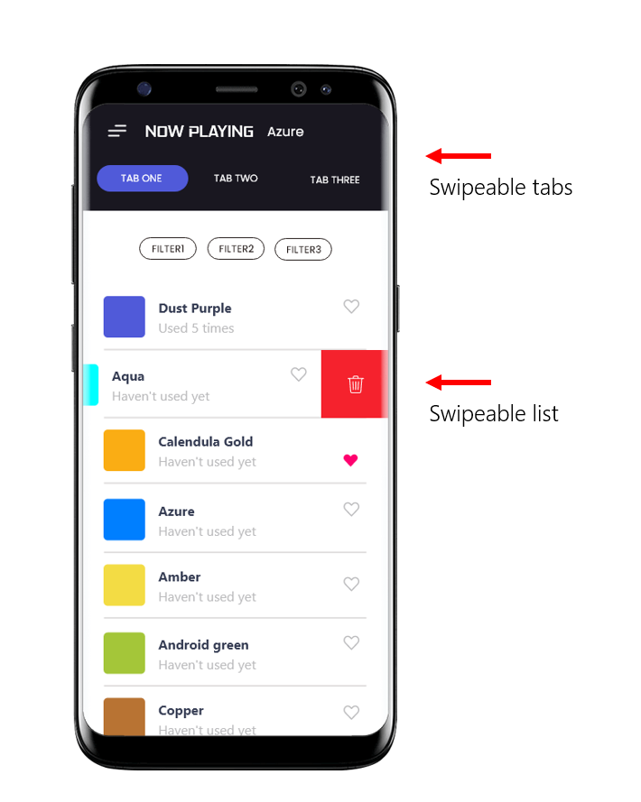
I have a screen where users can switch between tabs via swiping back and forth. In each tab, it has a list of items. Recently I implemented a gesture handler for that list (so list can have more optons, but hidden initailly) and now it's a lack in user experience since both, top navigation (tabs) and the list has the same gesture behaviours. Please refer to the image for more info.

So I am stuck in this and seeking help from you guys. If you have any advices, let me know.

enter image description here

2
  • I just see one problem, that the user does not know that they can swipe on the tabs. Is that the problem you're describing? Or is it something else? Commented Feb 2, 2021 at 6:03
  • @NielsBrinch basically they can switch between tabs via swiping the whole screen. The problem is I recently added a swipe feature to the list, So now if the user does a swipe on a list item it will now show more options instead of moving from one tab to another. Commented Feb 2, 2021 at 6:18

1 Answer 1

4

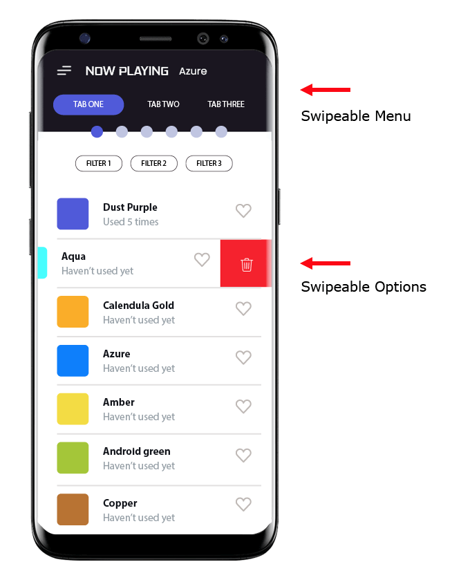
I think the solution is to understand that although the gesture is the same, the functionality is different. The first is a Swipeable Menu with hidden tabs and the second is a Swipeable List with hidden options.

In other words, the first one is a Carousel and the second a list with a swipe functionality.

While in the list it's easily deductible for the user that the number of options is minimal, in the menu the number of items is unpredictable, it can be 3 or n-items.

Adding a dot indicator at the menu can solve several of these problems:

  • Knowing the total number of items
  • Knowing the position of the selected item
  • Understand that it's a menu with a swipe interaction

enter image description here

Your Answer

By clicking “Post Your Answer”, you agree to our terms of service and acknowledge you have read our privacy policy.

Not the answer you're looking for? Browse other questions tagged or ask your own question.