5

I'm currently working on a story where users can make a custom report. The list has around 40 items. At this moment, I'm working on a multi-select box where users can select all items at once or separately.

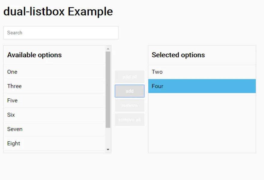
I notice that I found it hard to make it visual when I use a multi-select checkbox. I'm looking for different patterns, and I found a dual list box. It's directly visible for what you are selecting.

What do I have to keep in mind when choosing a dual list box over a multi-select box? It's giving me headaches on a Friday afternoon. Thanks in advance. If I have to clarify stuff, let me know! enter image description here enter image description here
6
  • I feel like this depends on how critical or important the report is. If it some high risk / security scenario, then the dual-box is most probably better, because it is very "static" and makes double-checking easier. The multi-select would probably be more suited when it's a casual scenario, as it seems like it's easier to forget, miss or unselect an item accidentally. If it's just filters on a product list for example, it's no big deal, but if the info is important then it makes it harder to review the choices.
    – Big_Chair
    Jan 29, 2021 at 16:07
  • Will this be used on mobile at all?
    – Izquierdo
    Jan 29, 2021 at 18:14
  • @Big_Chair: A check list box could be a middle ground that is still sufficiently "static" for the serious scenarios. Jan 29, 2021 at 21:22
  • @Big_Chair, thanks for your reply. Users can export the data as a CSV/Excel. So, users can modify the data as they wish later on.
    – YengarIV
    Feb 1, 2021 at 8:11
  • @Izquierdo For the MVP, it's not necessary. Suppose you have any suggestions for mobile. Please let me know. I think it will be something added in the future.
    – YengarIV
    Feb 1, 2021 at 8:12

2 Answers 2

4

A dual list builder can seem bulky in terms of persistent space, but it's clearer for comparison purposes.

The clarity of a list builder or dual list box, is that it's clear not just about what's included / selected, but what's being excluded. This is useful when you have a fairly robust set to choose from, and there's a high price for errors. It's a scaleable approach.

A list builder can feel like more clicks (and take up more space), but the tradeoff is clarity. List builders are sometimes derided as 'dated', but it can be a reliable control depending on your use case.

1

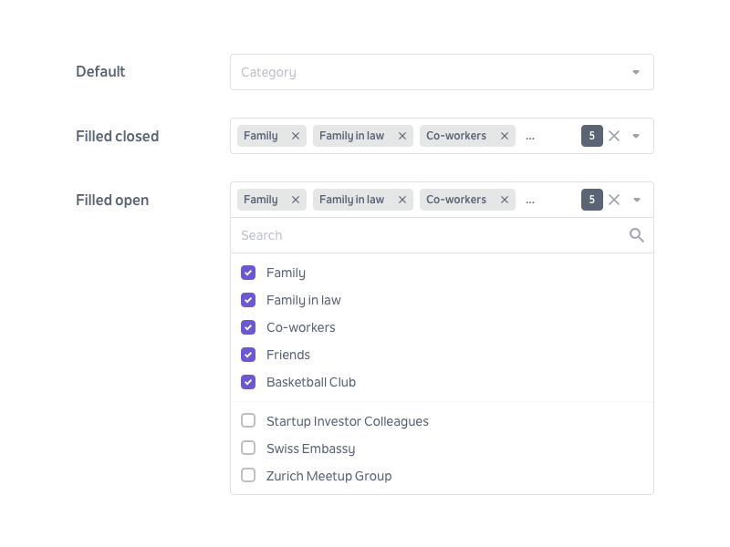
For a collection of about 40 items, clustered checkboxes with category labels could be a good option. They would expose all possible items (like a dropdown) while showing which ones are in the selected state. An example from Zina Szőgyényi:

Clustered checkboxes

This is a fairly standard pattern for report setup interfaces, and allows more options to be added over time. The category labels help the user find the options they want quickly.

If it's important to save space, you could roll this up into an accordion.

Your Answer

By clicking “Post Your Answer”, you agree to our terms of service and acknowledge that you have read and understand our privacy policy and code of conduct.

Not the answer you're looking for? Browse other questions tagged or ask your own question.