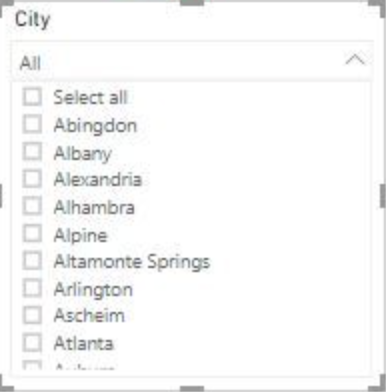
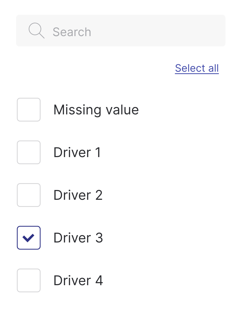
While researching I found two main ways of placing the "Select all" option. One usually appears in the top right corner and another one (used i.e. by Microsoft it seems) is adding a Select all option on top of all filtering options. What's the difference from the user perspective and which one is the best practice?
1 Answer
Select all checkbox
- More common, more modern IMO
- Also gives the user the information if only some checkboxes are checked or all (indeterminate state vs checked state)
- My choice usually
Just make sure it stands out more from the other checkboxes (e.g. line below, different background)


