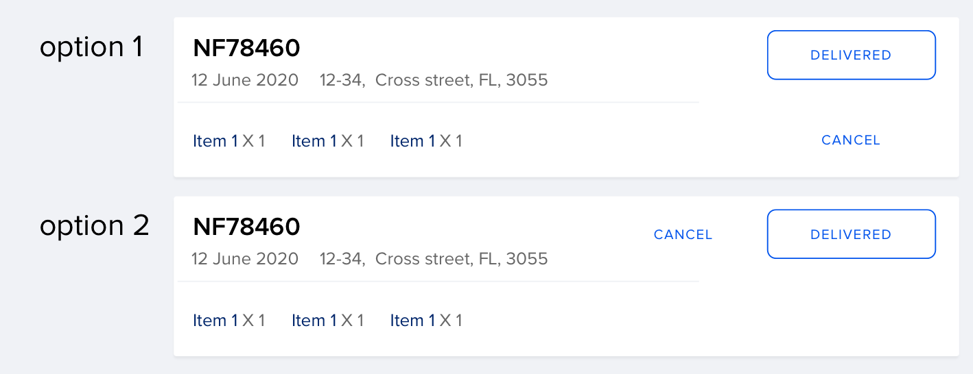
In Option 1: It feels like delivered button is associated with the content on its left & cancel with its respectively. This is because the extended spacing. They dont feel grouped together. You can refer Gestalt Principles to understand grouping similar items better
In Option 2: The problems that could arise are when the content is too long, lets say the title is more than 50 character, then you will have to double row titles. It is not scalable. Also you are placing the important action on the right end & cancel to its left. But when you read from left - cancel comes first. There is a conflict of intent.
I would suggest you bring both delivered & cancel below the whole content i.e., below "1 x item, 1 x item". With delivered on the left & cancel on the right. This way the whole content reads left to right. And you dont have to worry about scalability.

