2

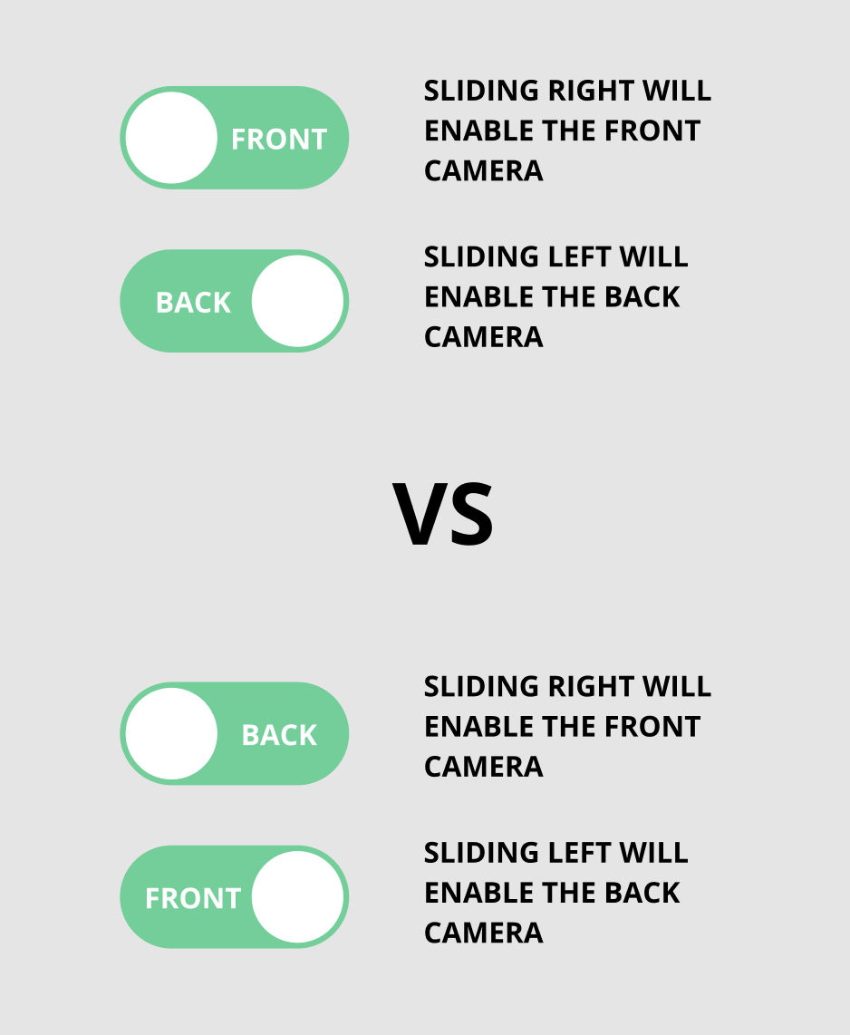
I'm working on a camera switching feature. I'm thinking about the arrangement of the label of the button. To me, we can prompt the user to slide right to enable the front camera and in order to enable the back camera, the user will slide left.

The reason for my opinion is: We should show the instruction in the button rather than showing the current status.

Is there any user research or different thought?

Thanks in advance.

enter image description here

0

3 Answers 3

2

Just use a single, stateless button

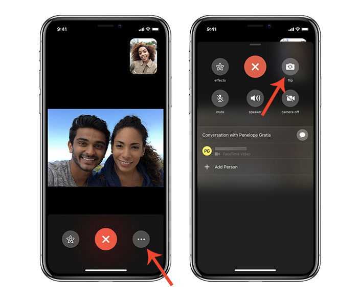
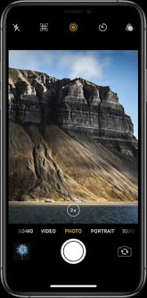
Normally, it's important to differentiate the difference between the current state, and what it will be after clicking. However, with a camera, that's very obvious—can the user see themselves? If so, it's the front camera. If not, it's the back. This will also provide familiarity to the user, as this pattern is fairly common in existing applications:

iOS FaceTime Flip iOS Camera Flip Android Camera Flip

If you're implementing a feature for taking a picture later, such as a time-lapse feature, and don't currently have a preview, you should add one. Aside from showing the current camera in use, it will allow the user to position the device correctly and see lighting.

2

I agree with @locationunknown that you may find your question has already been answered, however, I think there's another problem with this design.

According to Apple's Human Interface Guidelines on switches, this element is supposed to be used in a different way.

A switch is a visual toggle between two mutually exclusive states — on and off.
...
Avoid adding labels to describe the values of a switch. Switches are either on or off.

The established pattern is that these controls represent "this on or this off." Instead, your image shows a choice between "this or that"—a choice between two different options rather than a single feature that's either on or off.

For this reason, I'd suggest you use a different input method, probably either radio buttons, a segmented button, or a stateless button (as @lights0123 suggests) would be more appropriate here.

0

In your specific example it is best to show the current status, because the style of the control already looks like a status indicator. It isn't clear that the text represent the action of pressing the control.

If you are concerned about general understanding of what the text represents then you would probably be better to move away from a toggle control, and instead use 2 radio buttons (or styled buttons that have the same functionality as radio buttons). That way it is very clear which option is selected, and it is very clear what action will be performed when clicking the other item.

Not the answer you're looking for? Browse other questions tagged or ask your own question.