As a business application, the data table must provide:
Actionable data including opening the property, delete, export, send email.....etc, and usually viewing the property is the most important action item among these.
Therefore, I came out with these below solutions to let the user manipulate the data table as efficient as possible:
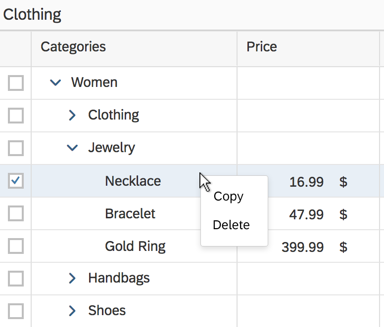
<1> Place all the actions in the context menu opened by right-clicking
 Advantage
- All actions can be present in the same place (context menu)
- Right-clicking on the row provides a whole-row-space that allows users clicking on
Disadvantage
- Clicking on any of the actions at least takes two steps
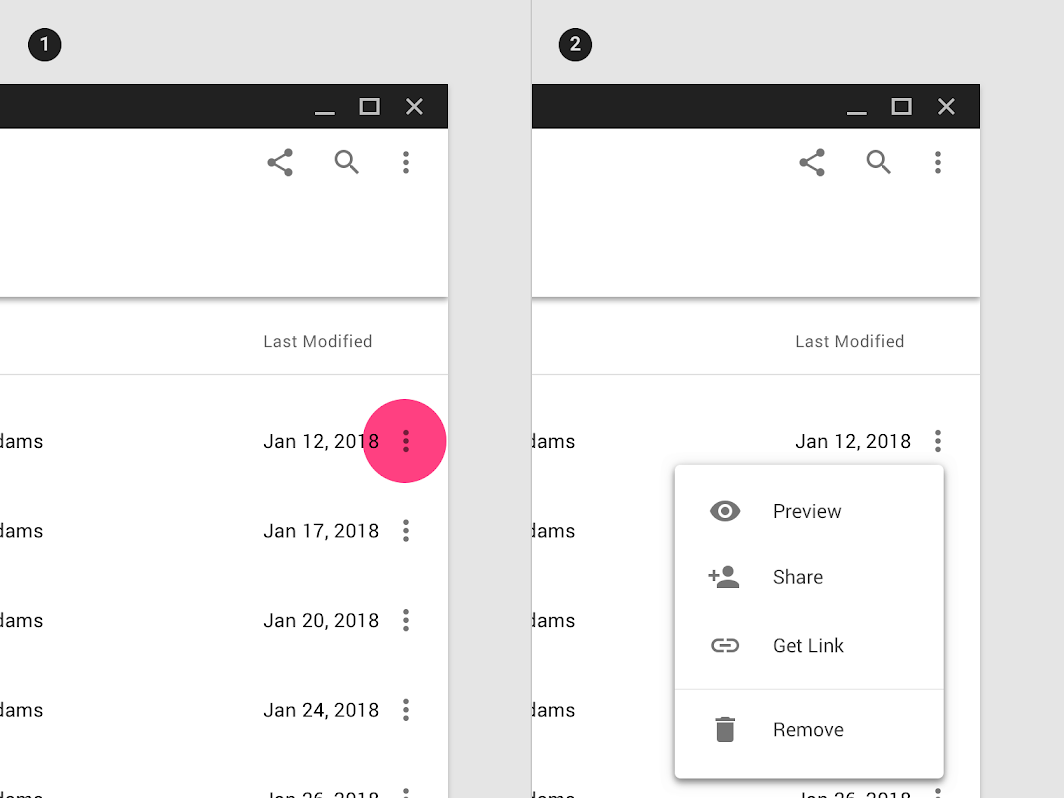
<2> Place all the actions in the overflow menu opened by left-clicking on "more button"
 Advantage
- All actions can be present in the same place (overflow menu)
- A more Button provides a much clearer hint or guide that tells users it's clickable
Disadvantage
- Clicking on any of the actions at least takes two steps
- Clickable area is smaller than the first one
<3> Make one of the cells become an anchor, place the secondary remaining actions in the context menu
 Advantage
- Link appearance always provides the most clarity of the clickable hint
- The most important action item could be accessed only by one step by left-clicking
Disadvantage
- There will not always be a specific column (like ID) that could be the identity for the whole row
- Clickable area is smaller than the first one
<4> Make the row become a left-clickable area, place the secondary remaining actions in the context menu
Advantage
- The most important action item could be accessed only by one step by left-clicking
- Left-clicking on the row provides a whole-row-space that allows users clicking on
Disadvantage
- A table row is not a clear, obvious hint that tells users it's clickable
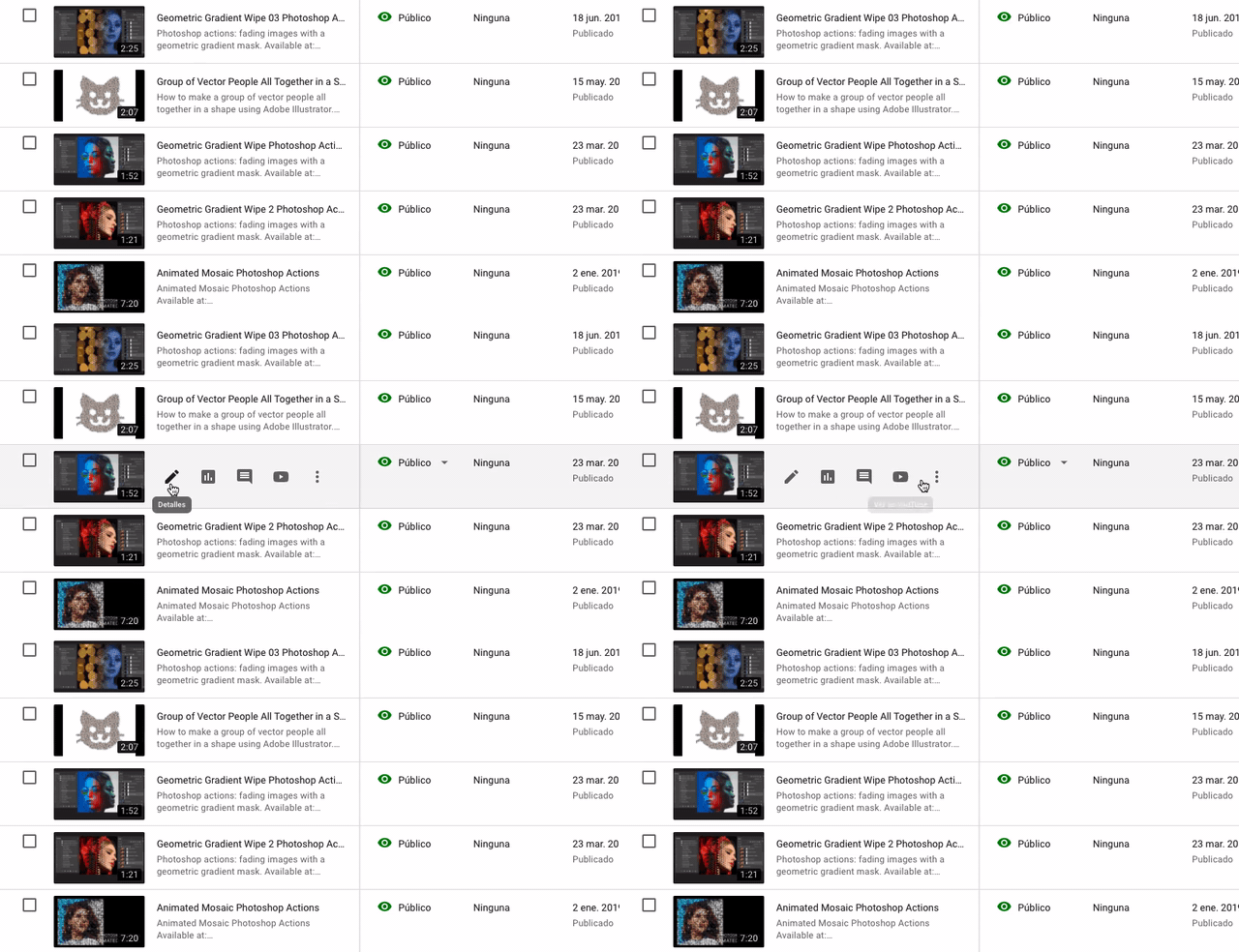
*Clickable area will be really small if going with approach <2> or <3>. Because in order to make the data be viewed as much as possible in a limited container, each of the row is really squeezed
I couldn't decide which approach I should go with...please anyone kindly give me any suggestions or a new idea !!! Thank you so much.

