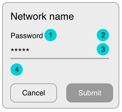
writing “show password” versus using an eye icon.
Both options are widely used.
Better still, use an eye icon with a label that says ''Show/Hide Password" so it's clear what the icon means.
Or If you want to save real estate for the input field, you can shift the action below the field so you can either have an icon or a checkbox to clearly mention the action.

showing the password only when pressed versus toggling visibility
on/off with each press.
This is an accessibility concern. Users with dexterity/motor issues will find difficulty in 'touch and hold' the button, also users with cognitive related issues will have a hard time remembering what they just saw.
Also from a usability perspective, studies have shown that it is better to keep the password unmasked on mobile screens by default.
According to Luke Wroblewski:
there’s a visible touch keyboard directly below the input field that
highlights each key as you press it. These bits of feedback show the
characters in a password at a larger size than most input fields. So
in reality, the •••• characters aren’t really hiding a password from
prying eyes anyway
Related Articles:
https://www.nngroup.com/articles/stop-password-masking/
https://cxl.com/blog/password-ux/


