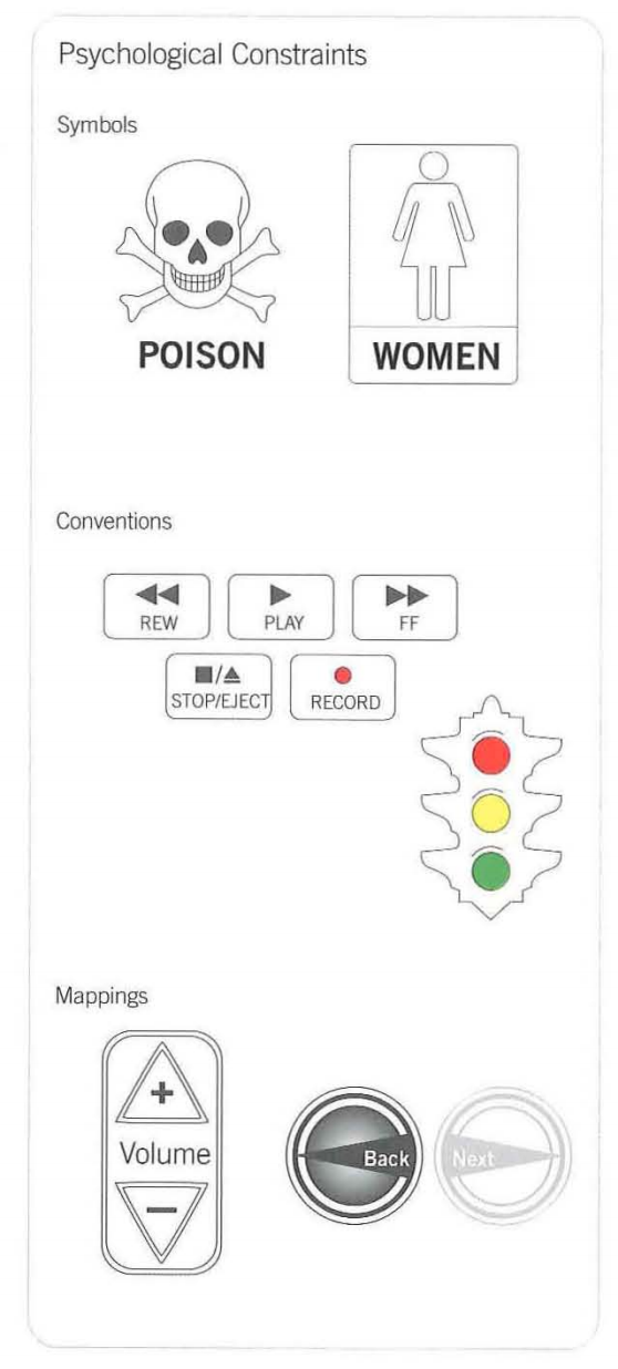
According to the Universal Principles of Design book, this falls under the Constraint principle, more specifically, this is a combination of a symbol and convention constraint:
Psychological constraints limit the range of possible actions by
leveraging the way people perceive and think about the world. The
three kinds of psychological constraints are symbols, conventions, and
mappings. Symbols innuence behavior by communicating meaning through
language, such as the text and icon on a warning sign. Conventions
innuence behavior based on learned traditions and practices, such as
~red means stop, green means go." Mappings influence behavior based on
the perceived relationships between elements. For example, light
switches that are close to a set of lights are perceivec to be more
relatec than switches that are far away. Symbols are useful for
labeling, explaining, and warning using visual, aural, and tactile
representation---all three if the message is critical. Conventions
indicate common methods of understanding and interacting, and are
useful for making systems consistent and easy to use. Mappings are
useful for implying what actions are possible based on the visibility,
location, and appearance of controls.

What essentially this sink does, is take a variation of a convention(On and off, lack off and presence) and apply this using a Mapping:
Turn a wheel, flip a switch, or push a button, and you expect some
kind of effect. When the effect corresponds to expectation, the
mapping is considered to be good or natural
Good mapping is primarily a function of similarity of layout,
behavior, or meaning. When the layout of stovetop controls corresponds
to the layout of burners, this is similarity of layout; when turning a
steering wheel left turns the car left, this is similarity of
behavior; when an emergency shut-off button is colored red, this is
similarity of meaning (e.g., most people associate red with stop). In
each case, similarity makes the control-effect relationship
predictable, and therefore easy to use.


