16

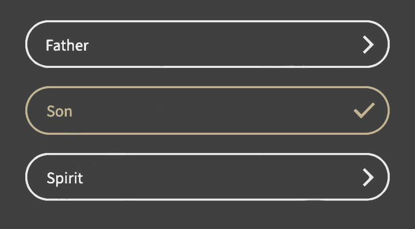
I currently have a UI where I have three optional buttons. By clicking on a button, it will go to another user flow and the button is "completed". Unclicked buttons are considered "incomplete". In the photo, the middle button is considered completed, while the 1st and 3rd are considered incomplete, and all are optional buttons to be clicked on.

I'm trying to style my buttons so that the incomplete buttons entice the user to click on them, despite them being optional. I've thought about lowering the opacity of the incomplete options, but I've received feedback that it hasn't been enticing for users.

I'm also trying to style the complete buttons so that they look complete, but also communicate "I don't need to be clicked anymore".

Any ideas how I can communciate these intents? Icon change? Changes in color or border? enter image description here
2
  • 3
    Are these checkboxes or buttons? If a user clicks on one of them will they be redirected somewhere or will that option just be checked? Commented Jun 26, 2020 at 9:58
  • I'd move the completed button to the top and put it in a completed section separated from those that still need completing. That way, users will immediately know which buttons still require completing without having to scan for ticks. Commented Jun 29, 2020 at 19:58

3 Answers 3

33

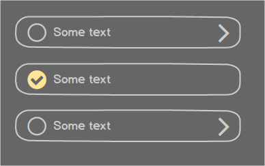
The design makes it look like a checklist and the buttons look like they are disabled. May I suggest something like this:

suggestion

4
  • 9
    Upvote. But maybe it's better to use a check-circle icon on completed button in order to better distinguish between check and greater-than signs at a glance. Commented Jun 26, 2020 at 11:50
  • 3
    Is it just me, or can anyone else see that "ghost tick" in the middle of the "Son" option?
    – musefan
    Commented Jun 26, 2020 at 11:53
  • 1
    @musefan Pls check your eyes with your specialist.... Nah! I was joking. It's there in the image. Your eyes are fine. Commented Jun 26, 2020 at 11:58
  • @musefan Good catch! I guess the room was too light to see it myself. I removed it.
    – jazZRo
    Commented Jun 26, 2020 at 12:01
26

First of all, lowering the opacity makes them look disabled. So I would suggest you don't do that, as users might think that they can't complete those sections, even if they wanted to.

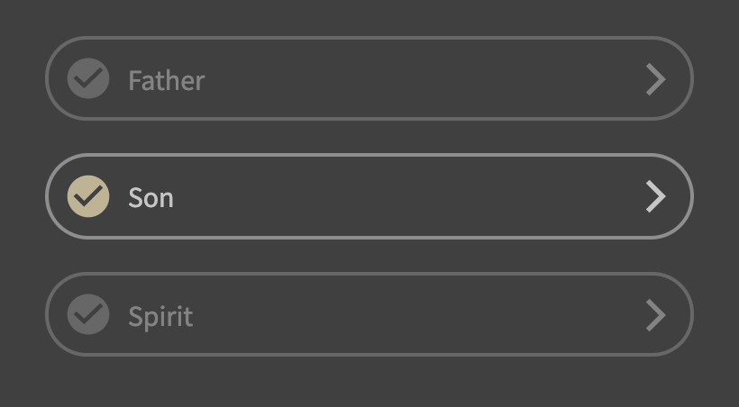
Using a tick/check icon for ones that are not complete is very misleading as it suggests the user doesn't need to do anything. I understand they are optional and technically the users doesn't need to do anything, but I would suggest changing them to a different icon. Perhaps an empty circle (border only) or maybe a a circle with 3 dots. Anything but the same tick/check icon.

If you want to differentiate the complete ones even further, consider removing the right caret/arrow for items that are complete. This will then emphasis the other items that there is something more that needs to be done.

Design wise, I would suggest making it look like all options need to be done. You can always put a disclaimer on the actual form page saying something like "this section is optional, but recommended".

Finally, understand that the feedback for this can be misleading. If you have optional fields you need to expect that people won't want to fill them in and no design change is going to make them act differently. Well, I suppose you could offer them a prize if they do, but that's a different story!


Something like this:

enter image description here

2

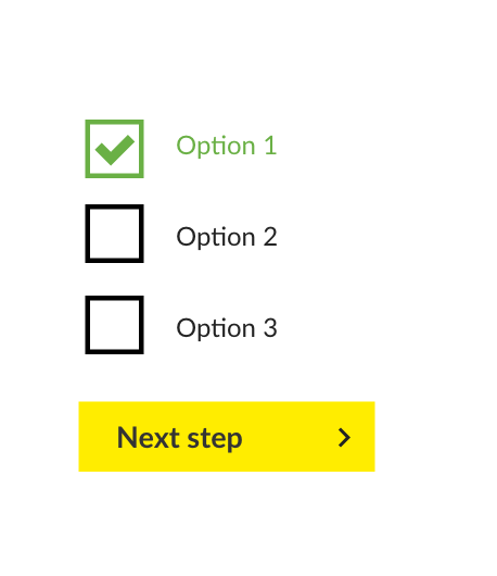
Seems like you're trying to make these elements do too many things by combining several elements into one. You have a check symbol (like a checkbox) and an outline and arrow (like a button).

I would suggest separating the two functions out into checkboxes and a button enter image description here

Obviously you'll want to style it to your brand colours.

I would also recommend reviewing the UK government design system. It's a great example of an accessible design system, and is considered by many as a gold standard for usability. https://design-system.service.gov.uk/components/checkboxes/

EDIT:

Regarding this comment:

"I'm trying to style my buttons so that the incomplete buttons entice the user to click on them, despite them being optional."

If you are trying to make users click on these optional checkboxes, are they really optional at this point? Perhaps you could make the user choose at least a certain amount? So perhaps you can say "Choose at least three options" before they can move on to the next stage?

3
  • 1
    I think you have misunderstood. That isn't a list of checkboxes. The check icons are there to indicate if a particular section has been completed or not. Well at least that is how I understood it, I guess we can wait for OP to clarify.
    – musefan
    Commented Jun 26, 2020 at 10:26
  • @musefan Aha! You are right, i must've misunderstood the initial sentence. I will upvote your answer as more relevant! Commented Jun 26, 2020 at 10:29
  • Yep! This isn't supposed to be radio boxes - check icon + lower opacity combo was to say it hasn't been completed Commented Jun 26, 2020 at 11:50

Your Answer

By clicking “Post Your Answer”, you agree to our terms of service and acknowledge you have read our privacy policy.

Not the answer you're looking for? Browse other questions tagged or ask your own question.