0

I'm currently working on standardising how read only form data is displayed. Right now, it can be stacked labels and values OR label left, value right. My preference is to go for the stacked view and it works pretty well everywhere except for fields that have a colour associated with the value. The value is presented in a pill format with a corresponding colour applied to the background.

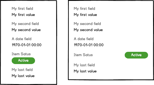
This was done so that it is easier to see at a glance and was a big hit with our users so not something I can take away at the moment. Having gone around a few options I have two layouts here that I can work with but I'm not really satisfied with either of them.

information panel layout options

The option on the left makes the content look like it's been indented and repositioning so the text aligns makes it look very untidy. The option on the right is OK but at odds with every other field in the same view.

I'm looking for guidance on how best to lay this content out so it works for all OR how best to make an exception for this field type without it looking as out of place as it does.

1
  • Why can't the text in the left option be aligned more to the left? And if you adjust the height of the pill to match the line-height of the text, would that make it look less untidy?
    – jazZRo
    Commented Jun 9, 2020 at 14:58

1 Answer 1

2

Try using an indicator that still keeps the alignment for the text, but stands out when scanning a form.

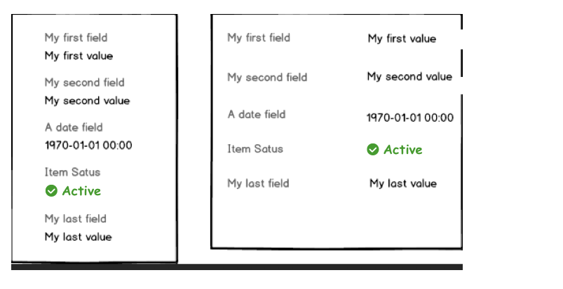
I actually don't find the alignment much of an issue, but thinking about status representation, you could get more specific with a second visual indication. As you scan the list, a shape and color appear, distinct from the text values in other fields:

enter image description here

This way you keep the unity of the form, but can account for color blindness, and if it's not interactive, it's harder to mistake for a button.

If you have more than one status in the future, it scales, because you don't have to rely only on color changes, but an icon as well.

1
  • I toyed with the idea of an indicator instead but elsewhere in the product the same data is displayed as a pill and that's done intentionally so that it really stands out on the page. Other iterations weren't as effective so I'm not comfotable demoting the visibility on one page. As much as I prefer the stacked label and value, the left and right variant is more flexible.
    – cchana
    Commented Jun 17, 2020 at 12:32

Your Answer

By clicking “Post Your Answer”, you agree to our terms of service and acknowledge you have read our privacy policy.

Not the answer you're looking for? Browse other questions tagged or ask your own question.