5

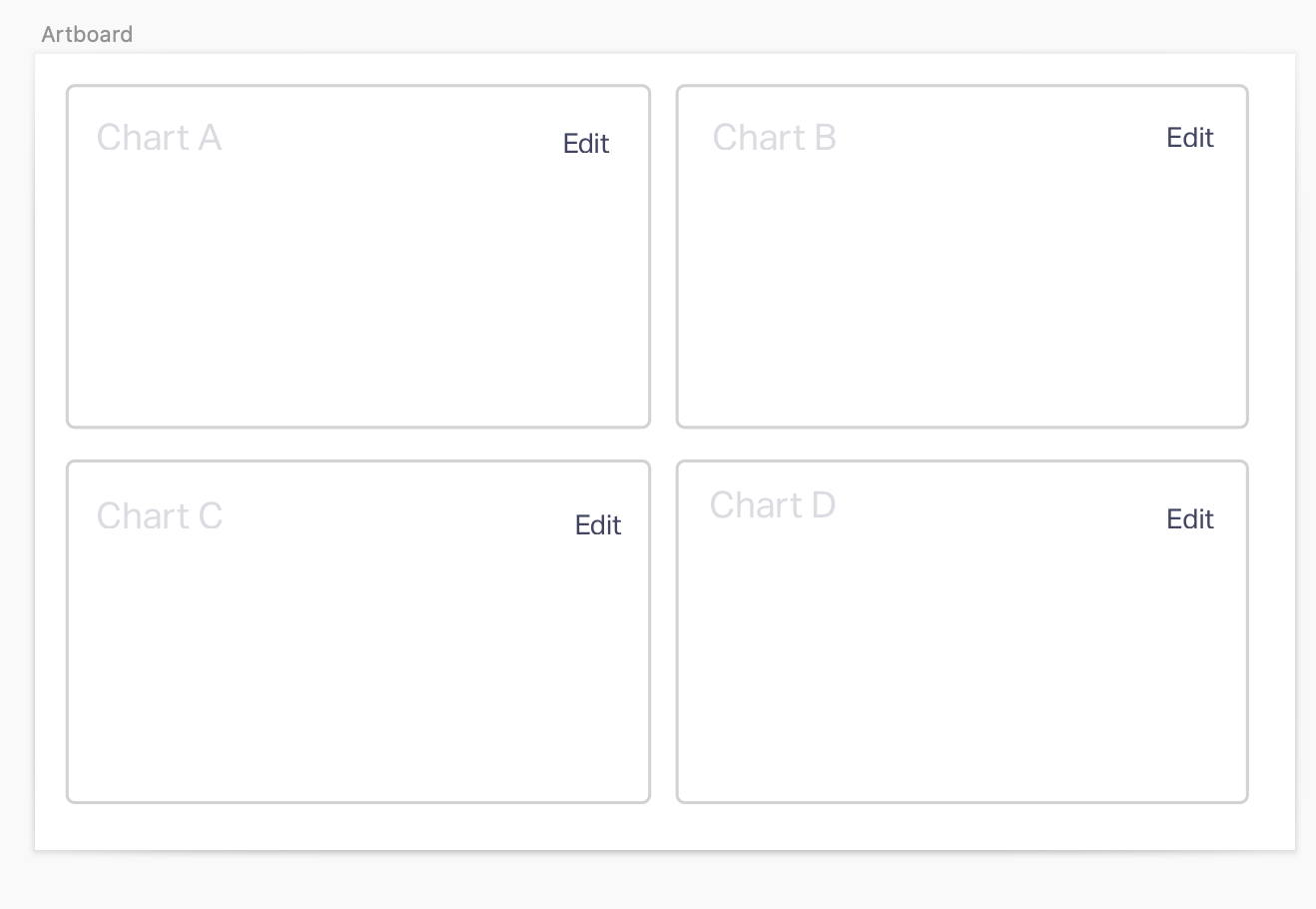
I am developing a dashboarding system that lets users drag and drop charts of interest. Some of our users may want to have 4-7 charts on a given page. For each chart, there are certain parameters that are needed to configure the chart (ie: use this data source, group by this factor, etc). A user will select a value for that parameter to configure the chart. A problem we have is there are over 90 parameters for all charts we support, where each chart only uses about 5 or so. Some parameters are used in nearly all charts. Some parameters are used in only one or two charts. Like this: Wireframe of parameter edit experience, with each chart having different parameters.
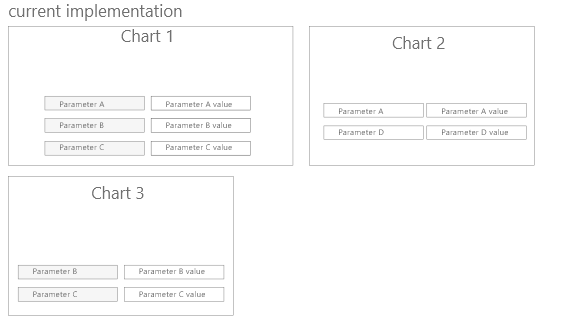
I am trying to develop a good UX for allowing users to quickly select the parameter values that they want. I want to allow users to specify parameters for specific charts, but also provide alternative ways to specify a parameter across the dashboard (such that the user doesn't have to select the same parameter value 7 times).

I am currently considering the following UI: Users select which parameters to "promote to global parameters". This offers the benefit of providing the users the ability to directly choose what parameters are easy for them to add. It's downsides are that it's clunky- promote buttons right next to every parameter is visually a lot. I'm also worried that someone might be confused why they can't edit the parameters directly on the charts any more. It's also possible that people will promote too many parameters to global level making it a drop down hell. enter image description here
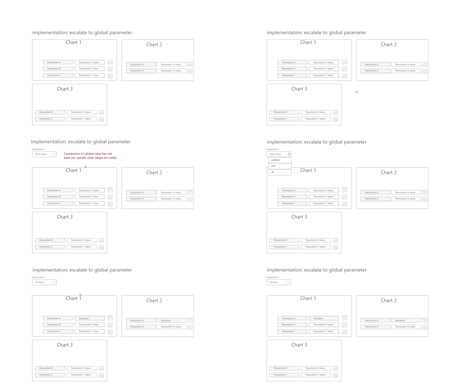
I have also been considering a UI where the developers designate certain common parameters (ones that are relevant on 85% of charts) to automatically be promoted to global level. When you add a chart that has one of those parameters, it will automatically be added to the page.

1 Answer 1

4

The idea that you are proposing does make sense visually. However, there are certain things that we can take care in a better way are:

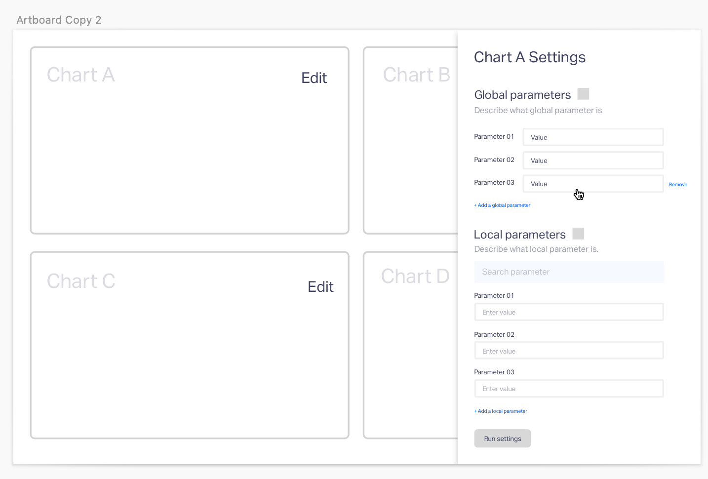
  1. Main view as preview: From our understanding, the user is constructing a dashboard and setting the parameters will help them build the chart. How about not disturbing the main view with setting and all on this page? Let the main view act as a preview once they run the parameter?

  2. Settings at one place: Instead of splitting the local and global settings at two different places, can we keep them in one place? IA wise they are part of settings. In the future, probably you can consider saving the settings feature to quickly build things.

If we consider 01 and o2, this is how I will go about this.

  1. Main view:

01. Main view

  1. Settings:

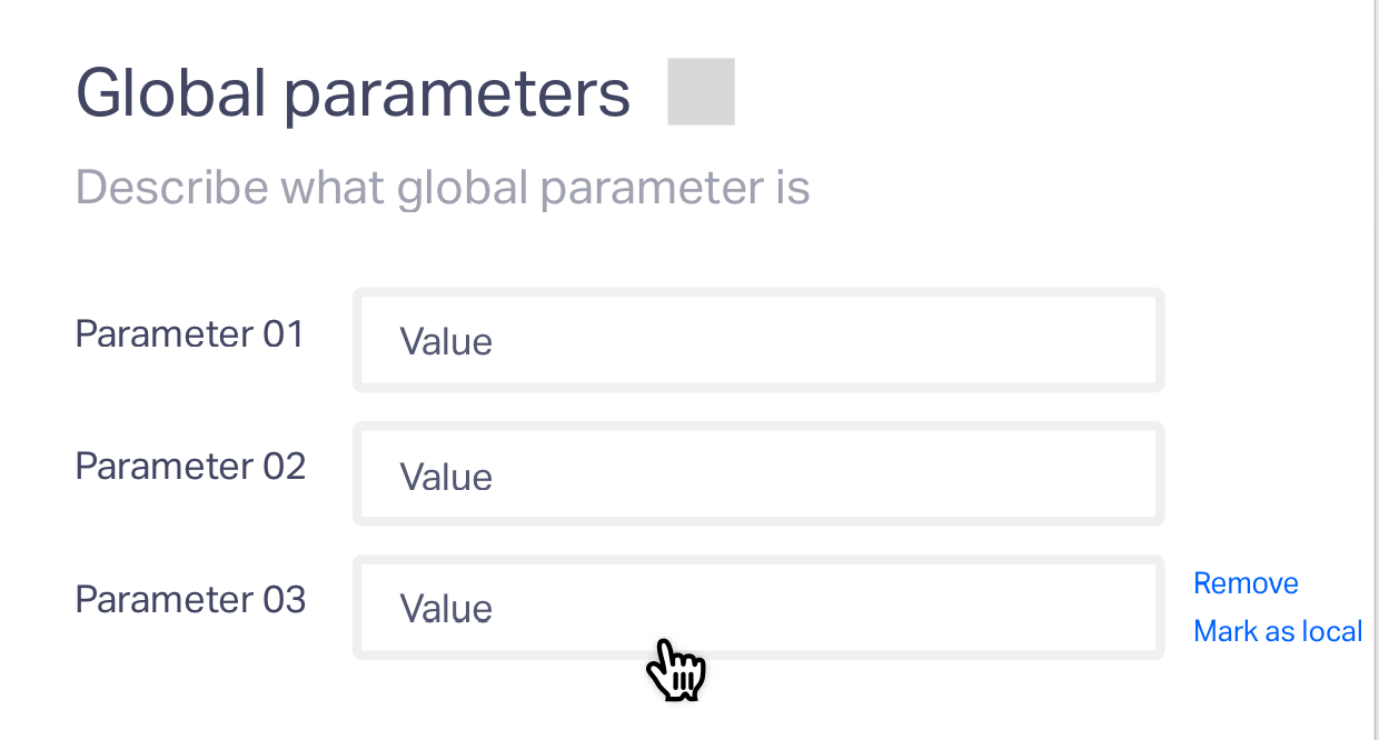
enter image description here

3.Interaction in global settings:

  • When adding the global parameter, inform the user how this gonna affect other charts.
  • Global settings can be collapsable.
  • If we are giving "Add global parameter", probably we can get rid of providing the users' option to mark any global parameter as local and vice versa

If you still want to have it, we can give this option

Showing the option on hover enter image description here

  1. Similarly, for local parameters, the possible action set could be

    1. Similar to the global parameter, we can show add local parameter and show them the list.

    2. Having a search bar or not depends on the number of parameters that each chart will usually have.

    3. Similar to the above point 3.2, the interaction can be something similar

Hope this helps.

2
  • 1
    Thank you for this thorough response! You did a great job understanding the design problem. A followup question I have is about the opting for putting the local parameters in the side bar. I have heard about direct manipulation being a interaction paradigm that is user friendly as it makes the user feel that they are interacting with the actual object. I put the parameter editing experience on the charts because of that (behind a 'edit chart' button). Is there a reason you opted to move the local parameters to the side bar? Commented Apr 22, 2020 at 16:37
  • Understood. The main reasons were to put information pieces as a group. The second reason was we never know how many parameters the user would be adding, hence space constraint would come into the picture. Having sidebar solves both the issues.
    – Swapna
    Commented Apr 22, 2020 at 16:48

Your Answer

By clicking “Post Your Answer”, you agree to our terms of service and acknowledge you have read our privacy policy.

Not the answer you're looking for? Browse other questions tagged or ask your own question.