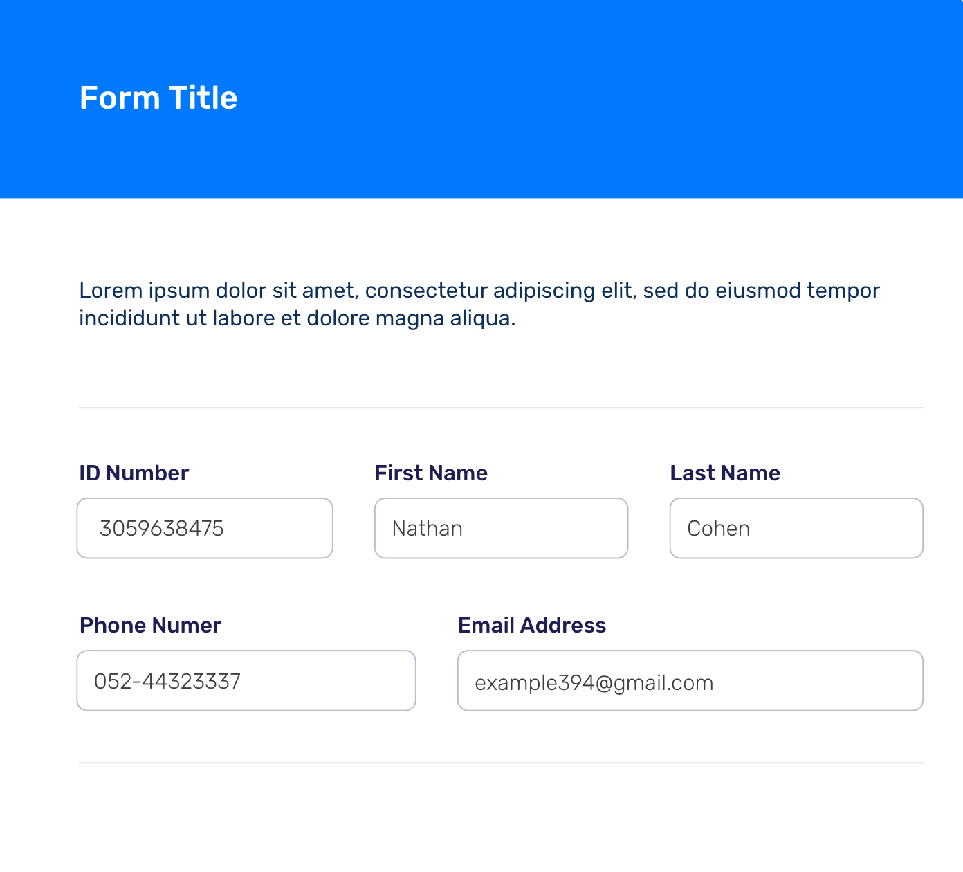
If you really want columns in your forms
Here is a quick rule to follow when designing forms with multiple columns:
double your font size and enter the largest realistic value that input would need to accept, if it fits then your input is large enough.
The reason for this is that a lot of people will increase the font size in their browser and WCAG 1.4.4, although not entirely clear, suggests that this should allow up to a 200% increase in size.
I say not clear as it says as long as the page can be zoomed and this has always been a point of contention as to what the rule actually means.
Even if this point isn't clear it is a good practice.
Assuming your are using rem or em units at 1rem / 1em, just set font-size: 200% on your HTML and enter the longest realistic information you can think of (i.e. for email address enter '[email protected]'), if it fits you are golden.
As font size is complex with rems, ems etc. you could just set the font size to 32px manually on each input as that would be the equivalent. Don't forget your labels as well to check they work.
If you find you end up with lots of space left over, then add another input to the row if it makes sense.
A couple of additional considerations
Also as this is marked 'accessibility' make sure that the border of your inputs has at least a 3:1 contrast ratio with the surroundings, it looks ok at a glance but it is borderline.
One final thing to consider is do items belong together? First Name and Last Name do but is ID Number related? I would be tempted to have ID Number on a different line.
Should you design forms with more than one column?
With all of the above being said.....put one input on one line.
The second you start adding error messages the above will all fall apart (as error messages tend to be longer).
Error messages still need to work at larger font sizes and tend to become unclear when they are 2 or 3 columns.
Also don't worry about vertical scrolling, it is convention nowadays and as a form will be ended with a submit button people will know when they have reached they end of your form (so you don't need to worry about people missing fields.)

