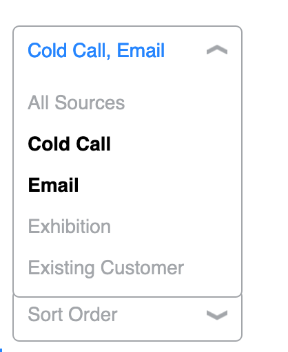
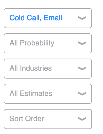
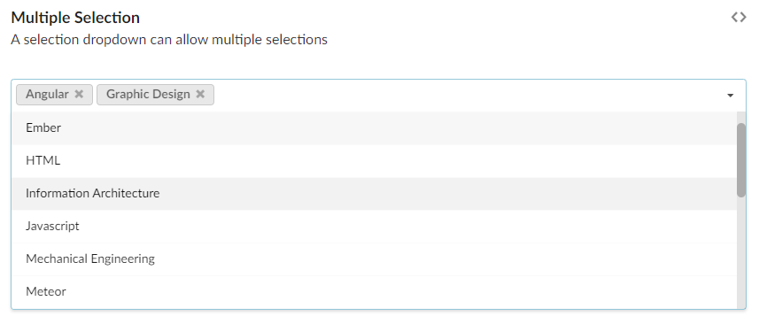
I have created a drop down, and on the drop down you are able to make more than one selection (similar to checkboxes).
However, it does look like an ordinary drop down. I was wondering what the best way is to make the user understand that you can select multiple items in the drop down.
Currently, when you make just one selection, the drop down closes (as the majority of time, I imagine one selection is enough). But perhaps if it didn't close, the user might either think there is something wrong with the drop down, or will realize you can make multiple selections.
So I want to make a great UX, whilst letting users know they can make multiple selections.
My ideas were:
Put some text stating that multiple selections are allowed
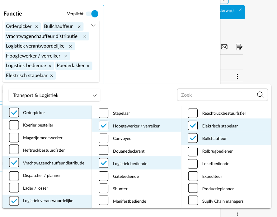
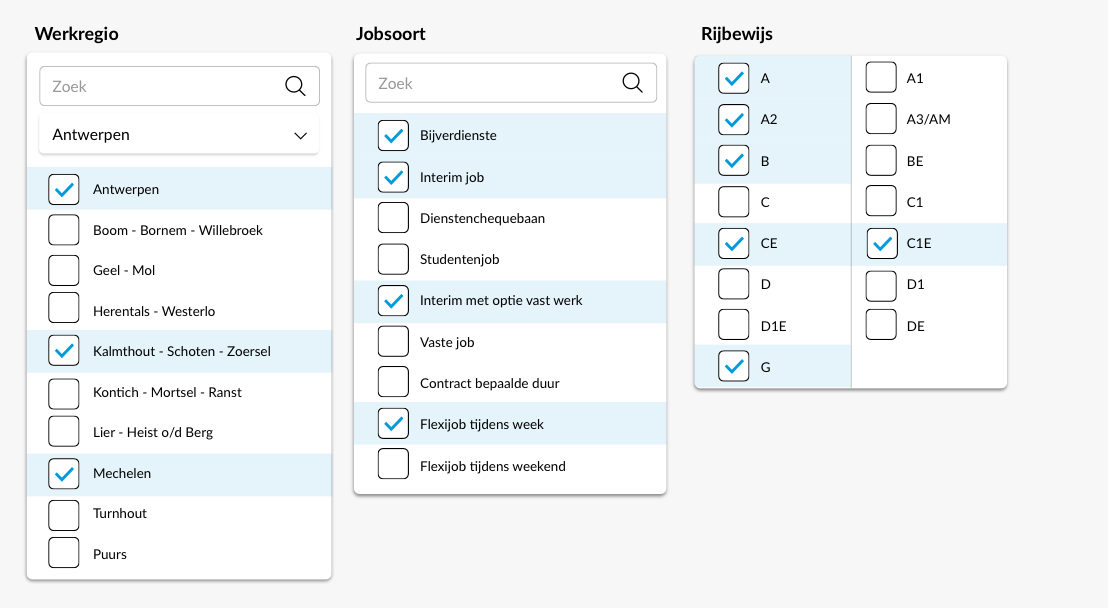
Make the options have checkboxes, so it looks like they can be selected multiple.
Keep the drop down open when someone makes a selection, rather than automatically close it each time.
Open to any other ideas.

