Well, I guess you're not going to post a picture. Who needs one anyway?
My recommendations pretty much summed up here:
What makes a good form?
A good place to start is Luke Wroblewski and his various writings on form design
eg http://www.lukew.com/presos/preso.asp?22
But to add: From my experience building hundreds of forms, I can recommend the following:
1.Minimize the number of fields in the system. This might require a bit of to and fro between you and the business analyst + a little bit extra user research but you'll be amazed at how many superfluous fields there might be.
2.Clear path to completion: arrange fields and field descriptions in a way that the eye is led down the screen to the call to action buttons.
3.If there are compulsory fields mark them clearly.
4.Validate fields as the user types not after submit; offer in-line instructions
5.If you have a stack of fields, either tab them into discrete sections (like you indicate) or walk the user through a sequence of pages to final completion. edit: tabs won't work for sequential information or when there is compulsory information in each tab. It is a good approach, I have found, for containing different types of content in a system that the user updates or uses over a period of time.
6.Progressive disclosure. I allude to this is in 5). This is a way of avoiding cognitive burden or information overload. Put simply, present information in a series of simple steps instead of one big whole.
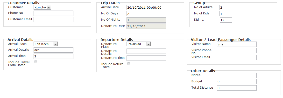
7.Break up longer forms into visually distinct regions. This allows you to group slightly different field sets together and will help the user build a mental model of the system, it is also a way of giving the impression that the system is less burdensome than it really is (again, this could be argued to be a type of progressive disclosure).
 , any ideas to simplify. some of the fields will be calculated those will be removed, and some unneeded things can be hidden (eg, if return travel is not required then return travel details are not loaded).
 . But i feel that in this design my tab movement would not be nice. it would go down 2 tabs, then right. Any more tips. The advantage being all is seen in one shot.