31

I have a situation in a web browser where I have a number (let's say 3-10) of alternatives to present to the user.

  • The end user must choose at least one of these options to be enabled
  • The end user must choose exactly one of the enabled options to be the "primary" option.

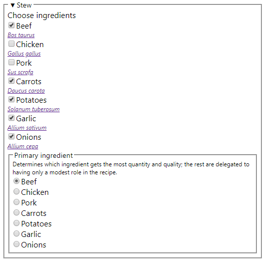
I'm not sure how best to do this, though. Here's a contrived situation about a stew that might help illustrate this better:

enter image description here

There are 7 potential ingredients, the user has to enable or disable each of them (cries out for a checkbox) but at least one of them has to be enabled; and exactly one of them must be the primary ingredient (cries out for a radio button).

  • If I choose a dumb form with no constraint checking, this is easy to implement, but they could choose Beef, Pork, and Carrots as the enabled ingredients and then Potatoes as the primary ingredient (which is a problem since they did not check the Potatoes box among the enabled ingredients)

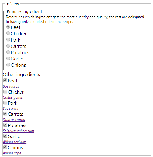
  • Or I could put the primary ingredient first, then allow them to select secondary ingredients, and force the primary ingredient to be selected in the list of secondary ingredients (beef in the example below) and not allow it to be unselected. Not too hard to implement in HTML / Javascript, but then there's some trickiness... what if I start with the UI state below, then select the primary ingredient as Onions, then as Chicken, and then Pork? What happens to the checkboxes for Onions, Chicken, and Beef?

enter image description here

Both of these options require duplicating the list twice.

  • Or I could try to use some kind of multichoice slider to select the primary ingredient... which would eliminate the need to duplicate the list... but this isn't a built-in HTML feature and I'd have to roll my own or try to apply some 3rd-party UI element.

  • Or I could place a radiobutton and a checkbox in front of each ingredient (radiobutton for primary ingredient, checkbox to enable non-primary ingredients) which is compact and simple in presentation, but most likely confusing in semantics.

Any suggestions?

6
  • 4
    other questions (NOT DUPLICATES) that I found: ux.stackexchange.com/questions/6586/… and ux.stackexchange.com/questions/102876/…
    – Jason S
    Commented Nov 6, 2019 at 22:15
  • 1
    @maxathousand's answer is beautiful to look at but if you want to use standard input elements, I would go for your second option. As a user this is the kind of form I am used to, and it is easy to understand. As to what should happen when switching primary ingredients: simply disable (grey out) the corresponding checkbox in "Other ingredients." This should make it clear to the user what's required of them. Just don't clear the checkmark, though, to allow easy reversion to the original state.
    – Seb
    Commented Nov 7, 2019 at 13:10
  • 2
    Why does the UI include the scientific name of the plant/animal the ingredient comes from? Commented Nov 7, 2019 at 22:11
  • 2
    "Why does the UI include the scientific name of the plant/animal the ingredient comes from?" -- because I'm quirky; it has nothing to do with this question other than positional filler that replaces my real situation that I can't share.
    – Jason S
    Commented Nov 9, 2019 at 1:35
  • What about drag and drop? One ingredient could be dragged to the box of the primary ingredient and the rest - in a list that accepts arbitrarily many options.
    – Džuris
    Commented Nov 9, 2019 at 21:11

6 Answers 6

87

As you know, you have to collect a combination of checkbox-style selections, and a filtered list of radio-style selections.

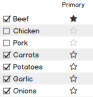
Combine them both into one list. Checkboxes enable the primary "radio button" (a star in this mock up, but fit it to your design).

List allowing checking many, but marking one as primary

Usually people tend to steer away from having a list of radio buttons with no default selected, but in your case, a "default primary" may not make sense, so that's why I chose not to use literal radio button elements, and instead chose stars.

Clicking a star replaces the primary selection, as a radio button would do, allowing only one star at a time. It may feel more comfortable for your users to want to unstar an item before starring the next. No big deal, let them do that, and enforce your requirements at the end.

If the list is long, maybe statically reproduce the designated "primary" option at the top.

Keep in mind that it may be difficult to communicate your requirements strictly through the input methods alone, so I'd add a bit of instructions to make your user aware of how to make their selections and fall back on some validation at the end.

17
  • Is there a recommended way in a set of checkboxes to enforce at least one must be selected? (or complain if none is)
    – Jason S
    Commented Nov 6, 2019 at 22:48
  • 1
    I'd usually follow my last paragraph for that. You could also play around with some ✓ 5 selected, 1 required versus ⨉ 0 selected, 1 requiredkind of feedback. Commented Nov 6, 2019 at 22:53
  • 2
    @JasonS be sure to test it with users and I would be keen to know how well it works (as an update to the question) :)
    – Michael Lai
    Commented Nov 6, 2019 at 23:28
  • 3
    Thanks for pointing out that verbal description is not something UX designer should avoid. I see so many "smart" UIs that I can't figure out, and just one sentence would help me appreciate them, instead of being frustrated. Commented Nov 7, 2019 at 16:49
  • 1
    @JasonS You should maybe prototype 2 or 3 suggestions in here and put them in front of your users as well, if possible.
    – Jeff Y
    Commented Nov 7, 2019 at 19:48
20

This might be a wording issue. If you start with the primary option (1 out of N, so radio button) you can then present an "additional options" list where it's legal to choose 0 additional options (so checkboxes make sense).

This makes additional sense because "primary" is semantically related to "first", so it's natural to start the dialog with "the primary option". As there's no ranking of additional options, we don't have a "secondary option" - they all are "additional options". We use words in the order that people expect to see them. This decreases the cognitive load.

4
  • 1
    Brilliant. Sometimes these kind of things don't come up in a logical approach to problem solving.
    – Kris
    Commented Nov 7, 2019 at 15:14
  • 1
    This is the right way. Once "Primary" is selected, either collapse the Primary section down to the single selection, or gray-out and disable the other Primary's while the "Additional" section is active minus the already-chosen Primary. It could even comfortably be two different pages as long as the Primary is carried over, read-only, to the Additionals page. In any case, an additional "back to Primary" mode-switch button is necessary. Probably preserve any "Additionals" already selected when Primary changes.
    – Jeff Y
    Commented Nov 7, 2019 at 16:45
  • I.e. never unselect anything automatically "for" the user. A conscious design decision is also required on the selection status of the Primary that was changed away from. The design default is to unselect it in Additionals. But it ultimately depends on whether the real application is more like "swapping out" an ingredient completely, or more like fine-tuning between primary and additional.
    – Jeff Y
    Commented Nov 7, 2019 at 17:04
  • 2
    @JeffY: that sounds like overkill. The cost of toggling a selection is low, the cost of correcting an error is also low. That does not justify a complex dialog. In fact, that's bad. It triggers people to think the selection dialog is more complex than just select/unselect.
    – MSalters
    Commented Nov 8, 2019 at 0:06
18

@maxathousand's answer is really nice and clean, but I thought I'd add another option.

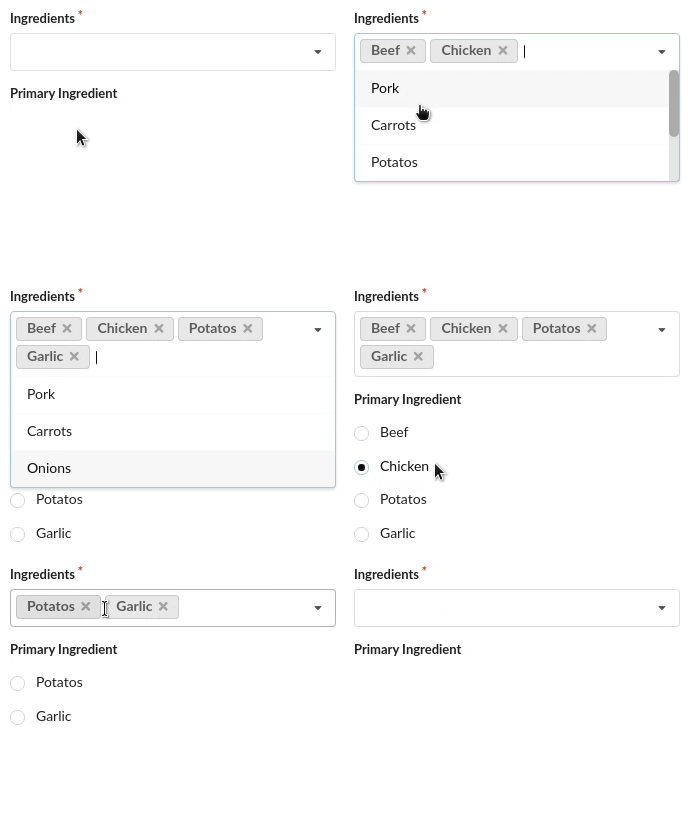
I think a multi-select dropdown with dynamic list of radio choices would be nice and clear. Here's a little gif I mocked up:

mockup

And a link to the mockup if anyone wants it: https://jsfiddle.net/gjudck24/

2
  • 2
    I'm impressed with how small that code example is. (Alas, I can't use libraries in my real situation. Long story.)
    – Jason S
    Commented Nov 8, 2019 at 1:55
  • 2
    @JasonS Yeah the code is really small because the library is decently large by itself. I didn't know what platform you were targeting, I just find web tech super easy and fast to prototype an interface.
    – GammaGames
    Commented Nov 8, 2019 at 2:08
7

I would:

  • present the user with a question "What is the primary ingredient?".
  • The user makes his selection from a dropdown menu (which doesn't allow multiple selection)

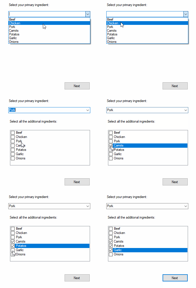
  • When the user choose the primary ingredient, the second question and the list of additional ingredients appear (either a list of checkboxes or a multi selection combo like in GammaGames answer.

Below is a quick mockup (done in c# as I code that faster than web script). Nothing aesthetically pleasing, just to illustrate the idea:

enter image description here

For the second list, you can keep it passive/static (so the main ingredient is still present in the full list below), and decide to:

  • automatically tick the main ingredient in the second list,
  • completely ignore the main ingredient in the second list (whether it is ticked or not)

Or more actively, remove the main ingredient for the secondary list (although this will require more coding, especially if the user decide to change the main ingredient half way through the process.

1
  • 2
    For your last point, I would suggest automatically ticking the main ingredient in the second list and disabling it. Commented Nov 9, 2019 at 23:12
3

It seems like your first design concept is the more logical of the two given the task described:

  • The end user must choose at least one of these options to be enabled

  • The end user must choose exactly one of the enabled options to be the "primary" option.

But I think the confusion comes from duplicating the second list which should only contain the ingredients that the users selected. This makes it clear that they have to select one or more items and then designate one of them as the primary ingredient (even if there is only one).

So the validation should be to provide a list that allow for a checkbox group behaviour and apply a validation for a single item to be selected (you may choose to populate the second list before or after the validation). Following that, you then validate the second list with a radiobutton group behaviour.

There are different ways to implement the look & feel (e.g. toggle buttons rather than radio buttons with customized behaviour), but it is important to get the logic right first.

4
  • OK, so if I'm understanding your answer, then you're suggesting validation rather than constraint... meaning that rather than NOT allowing someone to check/uncheck a box, the form would just highlight the problem (e.g. red border around offending choice)
    – Jason S
    Commented Nov 6, 2019 at 22:30
  • It is a trade-off in my opinion. If you want to simply the workflow then the validation is the constraint. If you want to create a more complex workflow (e.g. step-by-step wizard) then the workflow is the constraint (i.e. you can only move through the process in a defined way). Not sure which is the better strategy since you also have to design the pattern consistent to the rest of the application.
    – Michael Lai
    Commented Nov 6, 2019 at 22:34
  • I don't want a step-by-step wizard in my situation (e.g. page 1 lets you pick which options are enabled, page 2 lets you pick which option is the primary one)
    – Jason S
    Commented Nov 6, 2019 at 22:37
  • Ironically, this is almost exactly the situation as Windows 10 multiscreen support w/ extended desktop -- if I have 3 monitors, I can enable/disable them individually as long as one is chosen as the primary monitor, then at least one of them has to be enabled, and exactly one is the "main display" which has certain special behavior -- but Windows's UI is pretty bad IMHO
    – Jason S
    Commented Nov 6, 2019 at 22:41
2

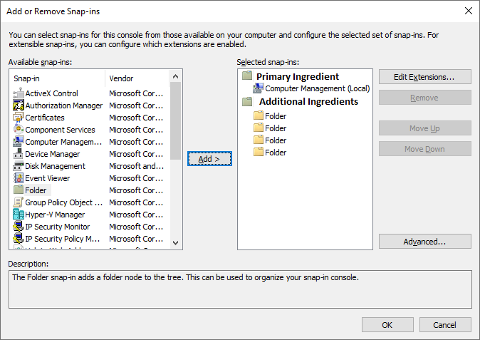
Another option to the ones above is to leverage an Add/Remove list pair with groupings. I've used the MMC Snap-in window as a lazy mockup. You can add ingredients from a list on the left which are grouped on the right. The first ingredient added would become the primary and additional ingredients would fall under the additional ingredients group. The primary could be switched by selecting another ingredient in the additional group and choosing "Move up" (or "Make primary" etc).

enter image description here

1
  • All the responses that I've seen so far are good, but this happens to be the one that I initially thought of too.
    – Pete
    Commented Nov 11, 2019 at 11:26

Your Answer

By clicking “Post Your Answer”, you agree to our terms of service and acknowledge you have read our privacy policy.

Not the answer you're looking for? Browse other questions tagged or ask your own question.