0

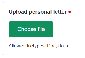
I'm trying to improve screen reader support on our webapp, but I'm struggling a bit with what the best practice is for our buttons. Our current pattern looks something like this

enter image description here

If I focus on the button, should the screen reader say...

...Choose file, required?

...Upload personal letter: choose file?

...Upload personal letter: choose file. Allowed filetypes: doc, docx. Required?

We're currently going for the more talky version, but our team has limited experience with screen reader users and how they're used, so a push in the right direction would be very helpful. Thank you. :)

2 Answers 2

2

Your last option is best. Everything that is visible should be conveyed to a screen reader. There's no need to try to make it a sentence or make it "polite" by saying "please".

I know this forum is more about design not implementation, but your code should look something like this:

<span id="upload">
  Upload personal letter 
  <span aria-hidden="true" style="color:#e00000">*</span>
  <span class="sr-only">, required</span>
</span>

<button id="mybutton" aria-labelledby="upload mybutton" aria-describedby="types">choose file</button>

<span id="types">allowed filetypes: doc, docx</span>

Notes

  • The "Upload" text is broken up into several parts. The '*' is hidden from screen readers (aria-hidden="true") because a screen reader user doesn't need to hear "star". However, they do need to hear that it's required (that's what the '*' means) so the word "required" is added but is visibly hidden (class="sr-only") but is read by screen readers. More info on the "sr-only" class is on stackoverflow. The <button> element does not support aria-required="true" nor the required attribute so the above solution is a work around.

  • The "required" text intentionally has a comma in front of it to force the screen reader to pause for a microsecond (just like you would when reading a sentence with a comma in it) before saying "required".

  • The asterisk color is changed from full intensity red (#FF0000) to a darker red (#E00000) because full red does not have sufficient contrast on a white background. The contrast ratio is 4:1 and WCAG requires a minimum of 4.5:1.

  • The <button> has an accessible name (aria-labelledby) that is composed of two elements (upload and mybutton). That will cause the screen reader to say "Upload personal letter, required, choose file".

  • And finally, the button has an accessible description (aria-describedby) that announces the file types. Some screen readers will read the description after the accessible name and others will tell you there is a description and to press a certain keyboard shortcut to hear it. It's up to the screen reading software to decide how it wants to present aria-describedby. But generally you'll hear "Upload personal letter, required, choose file, allowed filestypes: doc, docx"

That's the most "talky" version and is the correct thing to do.

1
  • I would personally use the text "Upload personal letter (required)". This doesn't need to be made clear somehow and somewhere for anyone.
    – jazZRo
    Commented Aug 6, 2019 at 11:15
0

"Select document file to upload"

You can keep "allowed filetypes" for clarity and extra help.

Your Answer

By clicking “Post Your Answer”, you agree to our terms of service and acknowledge you have read our privacy policy.

Not the answer you're looking for? Browse other questions tagged or ask your own question.