1

I am developing a web application for a business that will be used by employees. Employees will input the effective date of a "policy". Effective date can only range from current day to 30 days from current day. Most "policies" will take effect on current day, with a significant minority within the first week.

I am wondering what your thoughts are on the best date select UI in this scenario.

My thoughts:

  • Calendar is not bad because it gives feedback on day of the week and since user inputs will take place on the same month or the next (max is 3 months but only if current day is January 31st). If effective date != current date, I anticipate an average of 2-3 clicks.

  • Dropdowns, while usually annoying, might not be so annoying if I limit the day and month dropdown options depending on current day. For eg., if current day is June 12, the month dropdown has two options, and the day dropdown has 12-19 options depending on which month is selected. I see an average 2-4 clicks here, but it might go to 6 clicks if current day is on December because the year needs to be changed too.

What are your thoughts on this, and what do you think of limiting dropdown options strategy, is it confusing to see different days available for different months (eg. June range is 12 (current day) to 30) or is it good?

Is datepicker better?

Are there better UI options I've overlooked?

1 Answer 1

1

Here are my thoughts.

Drop-down: Terrible option almost every time and especially in this case. People do not think about dates as a list, calendar idiom is ingrained in our brains and designers can benefit from it. When users pick the date, they consider not only date, they consider the day of the week, is it this week, next week or the week after that. In case of drop down, starting from option number 5, none of it is possible and users will reach for the calendar elsewhere. Most calendar controls support date range limitations, but do not try to explain the logic to people.

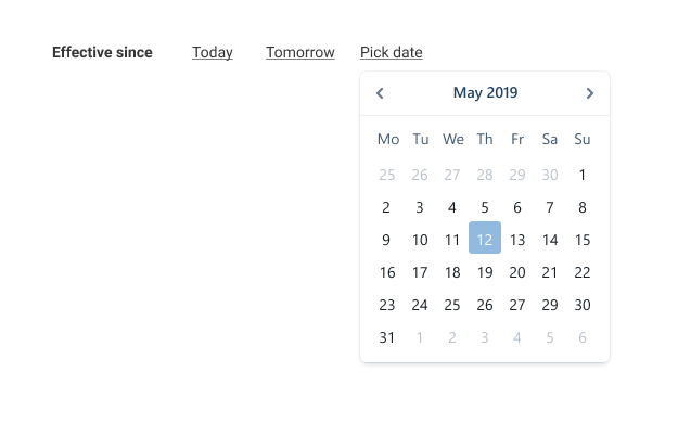
'Most "policies" will take effect on current day' Add 'Today' shortcut option, add 'Tomorrow' if it makes sense.

Do not optimize for click only: think about scenarios, existing knowledge, and try not to surprise the user. You no not need wow effect in this case.

enter image description here

Side note: Calendar (Date picker) in its current form (one month at the time) is also a relic of paper era calendars and can be improved for digital age, but I do not think it makes sense to reinvent the wheel in this case.

3
  • Thanks so much for the suggestion. I think you make really compelling points and it just proves to me how important usability testing will be even though the client "pretends" to not care much about it and is just rushing me to project completion. Quick question, would use the same datepicker UI for inputting dates that can be in different years? Eg. its common for user to input a date from 3 years ago
    – whoshotya
    Commented Jun 13, 2019 at 9:27
  • What did you have in mind for improving the calendar (in your side note)?
    – typo
    Commented Jan 27, 2020 at 2:46
  • @typo The way how calendar controls usually implemented are very skeumorphic. One month per sheet of paper. We no not have this limitation in pixel world. We can show 2 months at once, or show month starting with 2nd or 3rd week if they are not applicable anymore. Commented Jan 29, 2020 at 9:31

Your Answer

By clicking “Post Your Answer”, you agree to our terms of service and acknowledge you have read our privacy policy.

Not the answer you're looking for? Browse other questions tagged or ask your own question.