2

I am designing for a e-commerce website that sells eTextbooks.

I am trying to figure out if we need to have a default select state for products that have only one option available versus multiple options. Where I am struggling is that stakeholders wants the one option to look selected as well. It would almost seem counter intuitive to me that one option looks like a radio toggle, as radio toggles visual denote another selectable option. I have scoured the internet and found only examples that reiterate one option as having no selectable state versus multiple options as either a dropdown or multi-select/radio.

See attached images below.

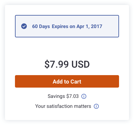
How I envision this:
Single Variant Multivariant
How stake holders envision the single option: enter image description here

The question is... what is the best practice? Should PDPs with one option show a selected state, or should it look more not selectable?

3
  • So what is exactly the question? Are you asking which design is better? Your design or the other (stakeholders) design?
    – Mo'ath
    Commented Apr 17, 2019 at 15:38
  • Just curious what is the best practice? Should one option look like a radio selection or should it just have a button to add to cart?
    – user125331
    Commented Apr 17, 2019 at 17:00
  • Thank you for clarifying and updating the question.
    – Mo'ath
    Commented Apr 17, 2019 at 18:10

2 Answers 2

3

Alan Cooper wrote in his book "About Face 3. The Essentials of Interaction Design":

In his seminal book The Design of Everyday Things, Donald Norman gave us the term affordance, which he defines as “the perceived and actual properties of the thing, primarily those fundamental properties that determine just how the thing could possibly be used.” ... On computer screens, canards and false impressions are very easy to create. ... Make sure that your program delivers on the expectations it sets via the use of manual affordances.

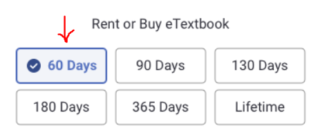
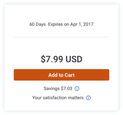
Applying to your case that means that if something looks like a button (which is an affordance) it must act as a button. The stakeholders' version looks like a button which creates an affordance of clickabilty. Moreover, this affordance is reinforced by the style of the chosen option (on the mockup with several options).

enter image description here

Thus a user may think that "60 says Expires on..." is a button and he/she can press it. So, your vision is correct. It doesn't create false impressions.

0

Let's take a step back for a second.

Let's evaluate what you've shown us:

Option 1

enter image description here

There is only one option from this screen and it's to either click the button or (i)s, or at least it look like it. If you're hoping that users will click "60 days expires on..." then they will more than likely miss it. Why? Because you have a clear CTA with other tertiary CTA's (the "i" icon) thus making that text as plain text.


Option 2
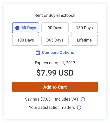
enter image description here

Holy buttons batman! Taking it from the top:

I like the obvious options, but this is weird because lifetime? For renting? Maybe that's to buy? But that's not obvious because of the other options being for rent (why not separate it between buy and rent with a radio button as an example - or maybe just change the label to "own it" or something like that). I'm kind of torn between this design because I really like how obvious it is, but it really is cluttering the UI. Why can't we just allow what's in option 1, but then when the user explicitly asks to change the duration, you open that option.

Compare options? Wait, isn't this what I'm doing now by playing with every button and seeing their prices? Curious to see what testing will return, if people will click on that at all.


Option 3

enter image description here

I don't like this option at all. Visually you're giving something prominence that doesn't need to have that visual heaviness. The button should be the visual ruler in this component. Plus, it doesn't look like it's editable and that this option is the only option you have (I feel trapped in this).


What I recommend

Just a side note, the best way to move forward is maybe A/B test these. See which one yields the best results.

Anyway, my recommendation:
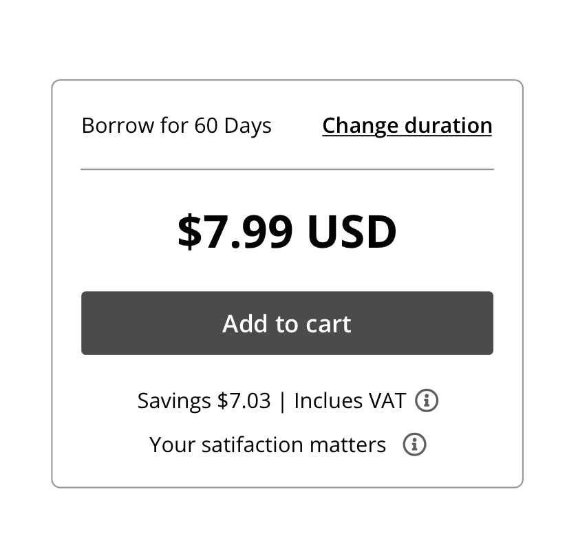
enter image description here

It clearly labels the duration at the top but that interaction doesn't take too much space unless the user explicitly wants it to (clicking it will show the option or open up a modal). The button and the price get all the prominence needed.

I wouldn't be a UXer without saying this: user test these options. You might be surprised by how people respond to each variation, and heck, my option might not be what the users are accustomed to. That's the best way moving forward.
Your Answer

By clicking “Post Your Answer”, you agree to our terms of service and acknowledge you have read our privacy policy.

Not the answer you're looking for? Browse other questions tagged or ask your own question.