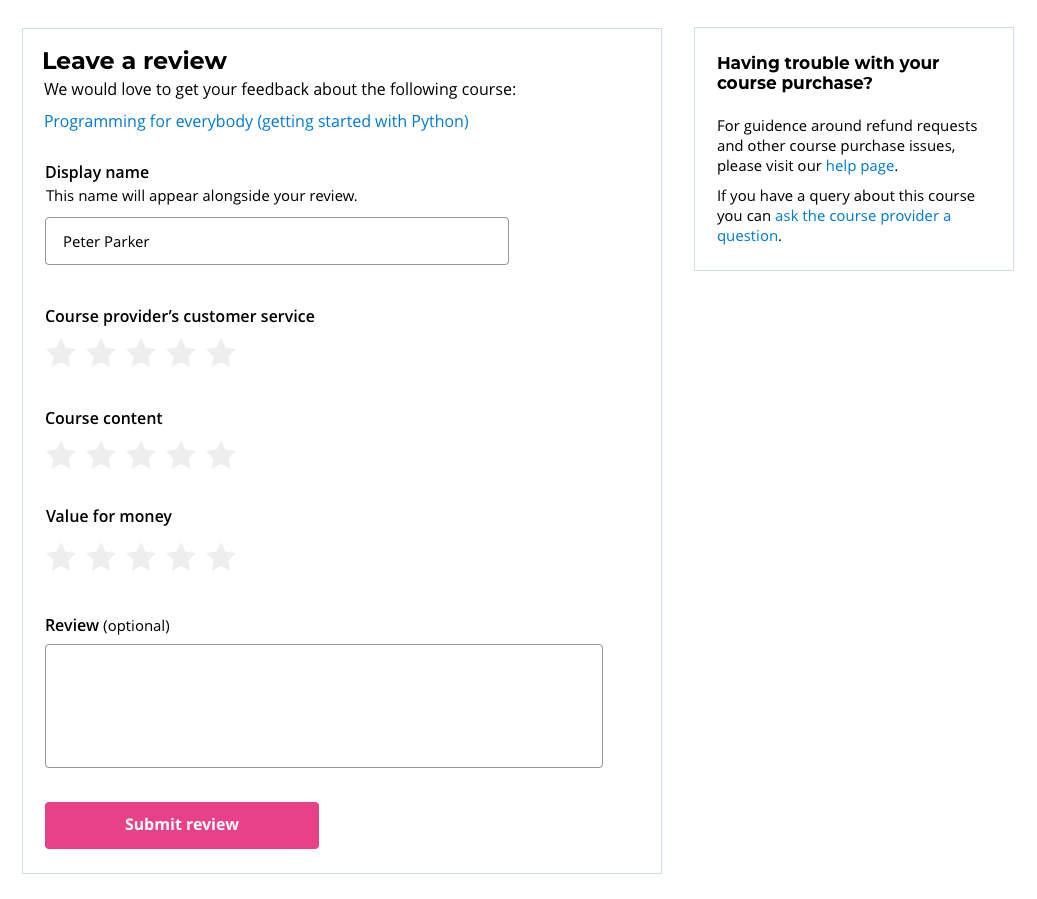
I'm updating a review page where users are asked to leave feedback on their recent course purchase.
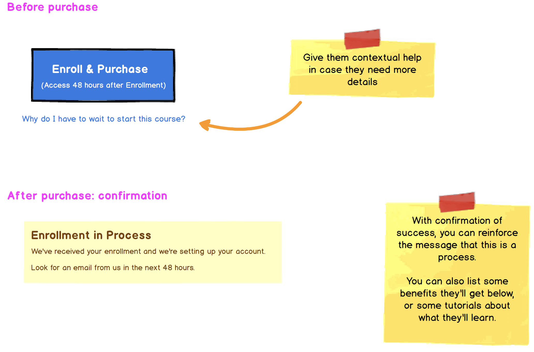
Students who purchase courses on our site don't instantly get access to their course.
Some users may have to wait up to 2 days to get access. Because of this we have users leaving negative reviews because they haven't received their login details.
To try and aid users who are about to leave a negative review due the delayed delivery of course credentials, I've added a purchase help section to the page. On desktop I've placed this content in the sidebar, so the focus is still on the review form, but I'm having difficulties positioning this section on mobile.
I've come up with two designs, the first is a collapsing panel, the idea features an anchor link which scrolls the users to the bottom of the page where the panel is positioned. Am I approaching this in the right way?


