2

I am creating an application for a client, it's essentially a large data table with many rows that they use to monitor the status of systems (each row is a different system). Some of the columns track when the system needs a person to physically go and attend to that system, failure to check the system when indicated to do so would be catastrophic and so the indication to do so has to be clear and always visible. The client has specified this information must be presented in a sortable data table.

I feel like the best way to present the important items so they are visible at all times is to move these rows to the top of the table when they require user action (e.g. someone to go and physically conduct the system check), there will only ever be a maximum of 2 or 3 rows that need checking at any given time.

The issue I'm struggling with is how to show that these rows are not being included in the table sort. For example, if the table is sorted by System Name - Alphabetically, but the top two rows are important, so System X and System Z are shown before System A.

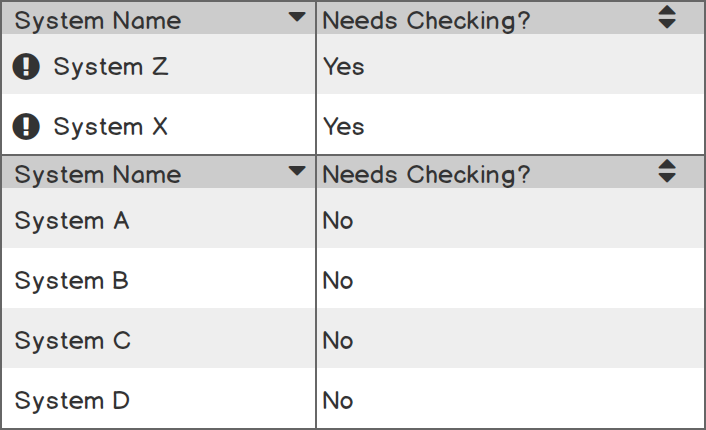
I could show a visible cue, like when you freeze a table in Excel:

example 1

But I feel like that might not be a strong enough visual clue - especially as in Excel, the columns would still obey the table sort, they would just be froze to the top.

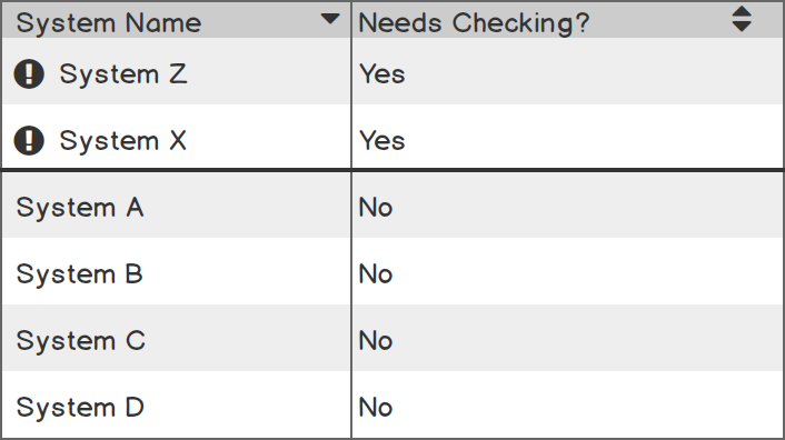
Or I could perhaps use two tables on top of each other:

example 2

Although, I feel this is much less elegant, and my client is incredibly twitchy about vertical space. I'm also not sure this is any more intuitive than the first example.

Does any one know of a way this has already been achieved elsewhere? or suggest how I might handle this type of situation?

Note: The above screens are incredibly simplified version of the actual tables, which are 12 columns, 5 of those columns are related to a different check on the systems.

2
  • Hi Jon. Why do you mention Excel? Is it part of your use cases that users export the table and work outside of your design? Do you want users to go and check the system no matter what their role/experience/current task is?
    – Andy
    Commented Mar 25, 2019 at 15:39
  • Hi @Andy. No, Excel isn't part of the workflow, this is a standalone system for specialised users in a job role. I only mentioned it because it's where I've seen a thick line used to denote a difference in the fields above and below it. The users using the system will be seeing this screen all the time, it's their 'start' point in the application, to give an overview of things. I wonder if perhaps using the solid line, and ! icons, and red colours etc on the fields pushed to the top would suffice, if when they open the application for the first time, we use a onboarding note to explain...
    – Jon Kyte
    Commented Mar 25, 2019 at 16:00

2 Answers 2

3

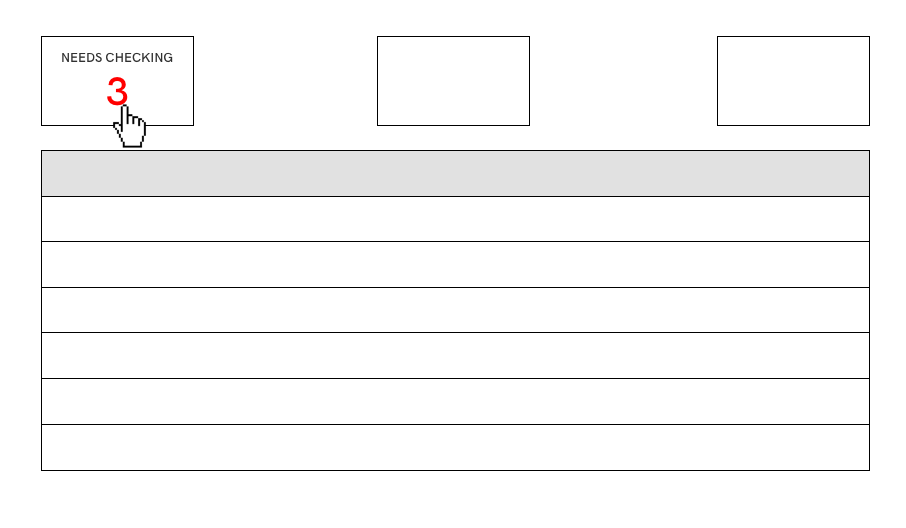
Another possibility is to show some kind of overview or statistic at the top that shows the number of current problems, and clicking on the stat essentially filters the entire table down to those three rows (or opens a new table in a modal, or on a new page, etc.). It could be done in an elegant way.enter image description here

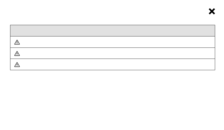
And clicking on the summary above would give you the following table:

enter image description here

What's best depends on who's using it, what their goals are, how often they're using it, etc. This is just another way of doing it that hasn't been mentioned already.

2
  • Thanks @sharkonaut - really interesting approach, this would seem like the best of both worlds - keeping the table sort intact whilst allowing the most urgent items to be visible at all times. I could possibly put the alert in a floating action (like a FAB type component or sticky header) so that even when scrolling the long table, you can always see it.
    – Jon Kyte
    Commented Mar 26, 2019 at 9:57
  • That sounds like a cool idea. Yeah, I think as long as you think it through and make it elegant, it could work. My wires are certainly not elegant, lol. Good luck!
    – mnearents
    Commented Mar 26, 2019 at 15:59
2

Your first solution to keep these items sticky on top is good already.

You are showing a symbol to distinguish them, optionally you can also use a background-colour (often a yellow highlight is used) to highlight them even more. Don't rely on colour only to make a difference, though.

As long as you communicate that those items are special, I don't see an issue with removing them from the regular sorting-order for the use case "decide which system to work on next".

If you document relevant use cases for your table, you should be able to identify if removing these items from the regular sorting order might pose an issue in other contexts.

I could imagine that there is situations where the user is not interested in the urgency at all, because it's not their role, they are lacking experience to fix the system, or somebody else is already on it.

They easily skip those items, and you would need to validate if it is an issue that the items are missing in the ordering important to the respective use case.

You can do that by user testing, in which you'll provide them with a test scenario based on the use case.

For a work around, the attribute that determines the stickiness is actually available for sorting, so users could restore the initial sorting any time.

Your Answer

By clicking “Post Your Answer”, you agree to our terms of service and acknowledge you have read our privacy policy.

Not the answer you're looking for? Browse other questions tagged or ask your own question.