4

I am designing an interactive timeline that shows the durations of events visually categorized into a small set (<8 categories). This timeline is very long compared to the length of events: events may have a duration as short as 1, while the timeline has a duration of 10-30k.

At a particular level of zooming out, I may be representing 10 or more units in a single pixel width. In this case I'd like to differentiate between a single event category covering the time versus many events occurring within this time period. However, additionally, I'd also like to indicate what event category was predominant during that period.

The timelines must be horizontal, and I have up to 20 vertical px to work with.

How would you visually convey both predominant category and 'there exist subcategories' to the user?

Here are my current design ideas:

One idea is to display "there are one or more events less than 1px wide here" as a small black bar not filling the height fully. For example:
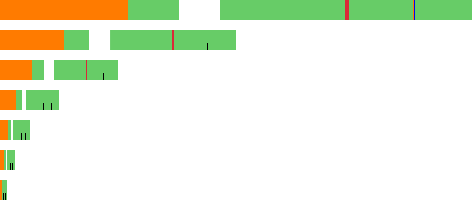
Timeline zoomed to different levels

Another idea I had while writing the question was to use the vertical space more fully: have one bar at top representing the predominant event category during the period, and then separate rows for each type of events below that. This has the added benefit that you can see exactly which three event categories occupy a single pixel. There is the added benefit that--since it can be hard to see the color of a single pixel--the vertical row placement shows the event category also.

2
  • labeling each event will be pretty awesome..you can just pull a line from the time line and attach it to the event number(and when mouse over it shows the event details) or you can provide only numbers with the numbered event on a side bar for example..
    – wdalhaj
    Commented Oct 8, 2011 at 12:34
  • Generally i would recommend changing the timeline into another thing.. text-based for example..OR you can limit the time line to a +10 days events only.. another solution is to make a group of time lines for example 1~6 months events and bellow it +1~30 days events..etc
    – wdalhaj
    Commented Oct 8, 2011 at 12:42

3 Answers 3

1

How long are the inter-event-block times? If there is enough "pause" in between events, just use one pixel width even for shorter events; communicating the existence of an event at a certain point is more important than correctly communicating its relative duration.

I do have a problem with single-pixel lines of different colors near each-other. They may perceptually overlap, resulting in another perceived color altogether, or in an uncomfortable focusing of the eyes. The red-blue combination in your top-right example is representative of this; my eyes are already burning while focusing on it.

Finally, re-consider what are the real, hard, requirements for this timeline. Is existence or relative duration more important to show? Why is it important to show the categories? Is the exact information important, or the "trend" information? If the trend is more important, then a heat-map visualization of your timeline could be more useful. You may be able to combine it with a lens on mouse-over to show the fine-grained detail in a visualization similar to what you have above.

1
  • Despite the white area in my mockup above, there are no pauses between events. (The 'events' are actually the different execution states of a process.) Good advice in general, thanks.
    – Phrogz
    Commented Oct 9, 2011 at 0:06
1

Do your users need to interact with the visualisation or just interpret it?

If interaction is necessary, things that are a single pixel wide are going to be pretty hard to target.

Another thought - do you necessarily need a linear scale, that is do your users need to be able to identify that a particular period was 6x another one, or is it sufficient if it's merely clear that one period was longer.

To illustrate, here's your same sequence of tasks, using a logarithmic scale:

Colour Bar

You can still clearly see the sequence of events, and the relative length of events can be judged (i.e. the blue event was shorter than the red).

0

It is always a challenge. As a starting point, consider using colour to distinguish - as you seem to have started doing. So orange for a single event, and red for mutliple events.

Using the height does not work for me, unless you swap it around, so have it smaller representing fewer items, and higher representing more. Of course, this means you have to know what proprotions to use and it becomes complex. For me it is the wrong way round and so does not work.

4
  • So your answer is "use colors, and I don't like one of your ideas"? Seems like a comment, not a design.
    – Phrogz
    Commented Oct 8, 2011 at 13:57
  • No., I am saying that colours are probably better than sizes, but if you want to use sizes, then the other way around may be better. Use colours rather than sizes is an answer, I think. Commented Oct 8, 2011 at 14:03
  • OK, I see. If using only colors, how would you differentiate different kinds of events versus the number of different categories?
    – Phrogz
    Commented Oct 8, 2011 at 14:05
  • OK, it wasn't clear that you were already using colours. If you are, then either a colour not in the usual range, rethink how sizes might work. Commented Oct 8, 2011 at 16:06

Your Answer

By clicking “Post Your Answer”, you agree to our terms of service and acknowledge you have read our privacy policy.

Not the answer you're looking for? Browse other questions tagged or ask your own question.