2

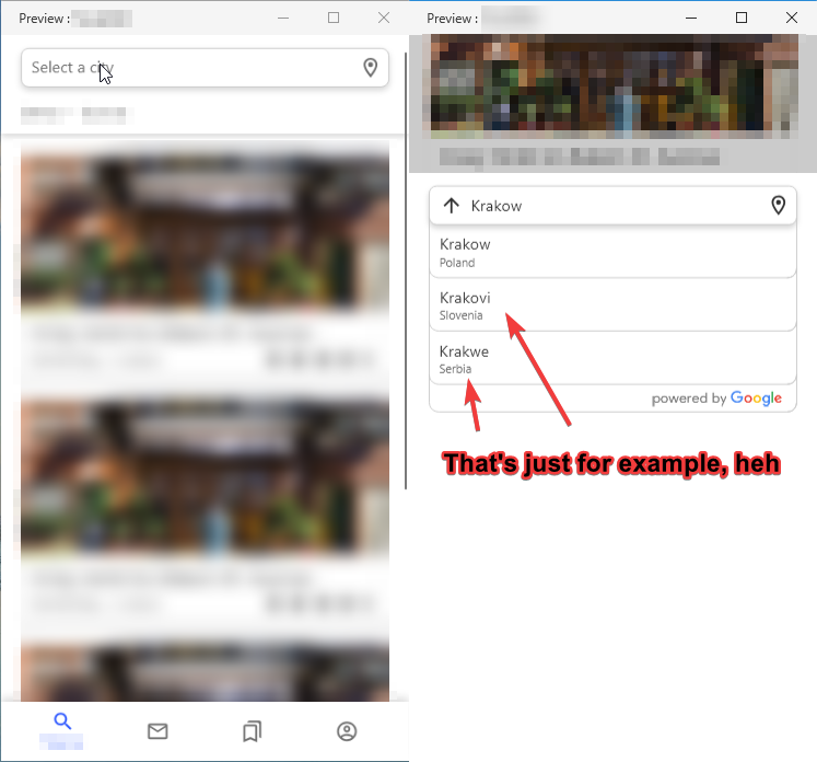
When I was designing something in Adobe XD I thought about an icon which will display in search bar to go backwards in app. My activity uses slide up to open another activity with search bar. Let me explain via screenshots:

first is main activity, second is search activity

So, when I click on "Select a city", search screen slides up. I think it would be strange if I used an arrow pointing to the left, although the activity itself comes out from the bottom. So I use the top-looking arrow to return to the previous screen.

Since I am a complete zero in this, I would like to learn a more professional opinion.

P.S. The design is built for the mobile user experience.

UPD: Although now, for reasons of logic, I thought that it would be better if it looks down.

UPD2: That's how I managed this (750 Kb):imgur gif

UPD3: Heh, a little better result: imgur gif

1 Answer 1

2

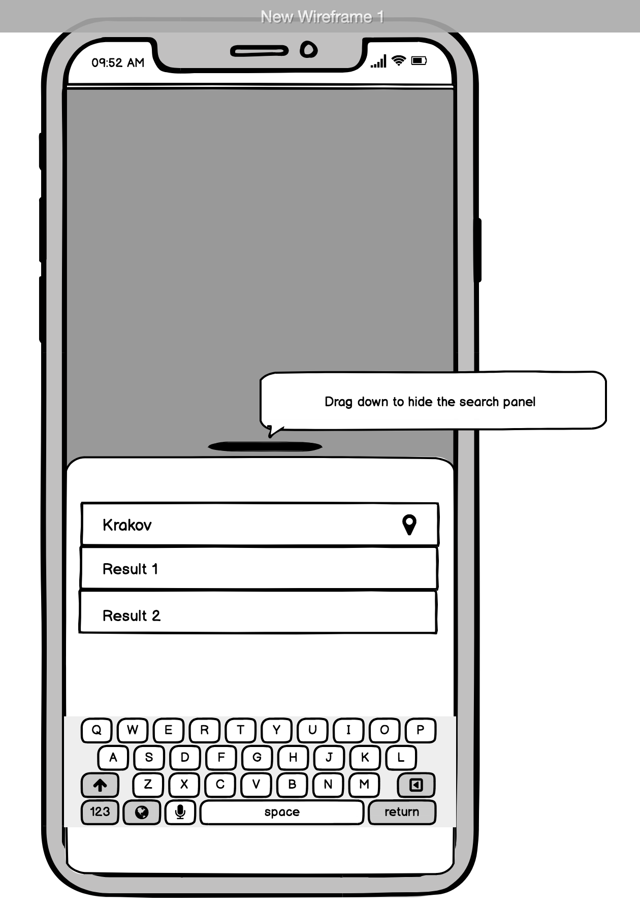
The up/down arrow is not common in search field. If you want to use an icon inside the search field you can use an "X" that means close. Or, if the panel slide up from bottom and the back page is still visible (like it the panel was a modal) you can use the pattern that Facebook uses for external link. Here an example enter image description here

I'd suggest to put the search bar in the bottom part of the screen, because is more reachable and in addition is it a bit strange to tap on the search bar in the top part and have the same search bar filled in the bottom (I've taken in example screenshots you've attached.)

4
  • Yeah, I agree that just using an "X" would be much more understandable. Using direction arrows for overlay closing can only lead to confusion. **In my opinion, the overlay is only temporary, so it is not a whole new step in the navigation histoy, unlike anormal activity. ** Which is why it is simply closed/dismissed, instead of "going back" in the timeline.
    – Big_Chair
    Commented Aug 1, 2018 at 14:00
  • Oh, it's not modal, I forgot to add third screenshot where it is fullscreen. But even if I move the search bar down, there will be two buttons on top (for some reason I've covered them, sorry). Also, at the bottom is the bottom navigation bar. When these two elements are combined, it is most likely that the user will mess up and/or this is simply cannot be implemented by the built-in tools. Commented Aug 1, 2018 at 15:09
  • @Big_Chair my bad, I forgot to say that it's not modal, so, literally it's a new step in the navigation history (In the figurative sense). Hope for understanding Commented Aug 1, 2018 at 15:12
  • 2
    But thanks @Matteo-Vacca. Thanks to you, I made a decision to do everything just like you suggested. The result will be later. When I can vote, I will certainly not forget about you. Commented Aug 1, 2018 at 15:25

Not the answer you're looking for? Browse other questions tagged or ask your own question.